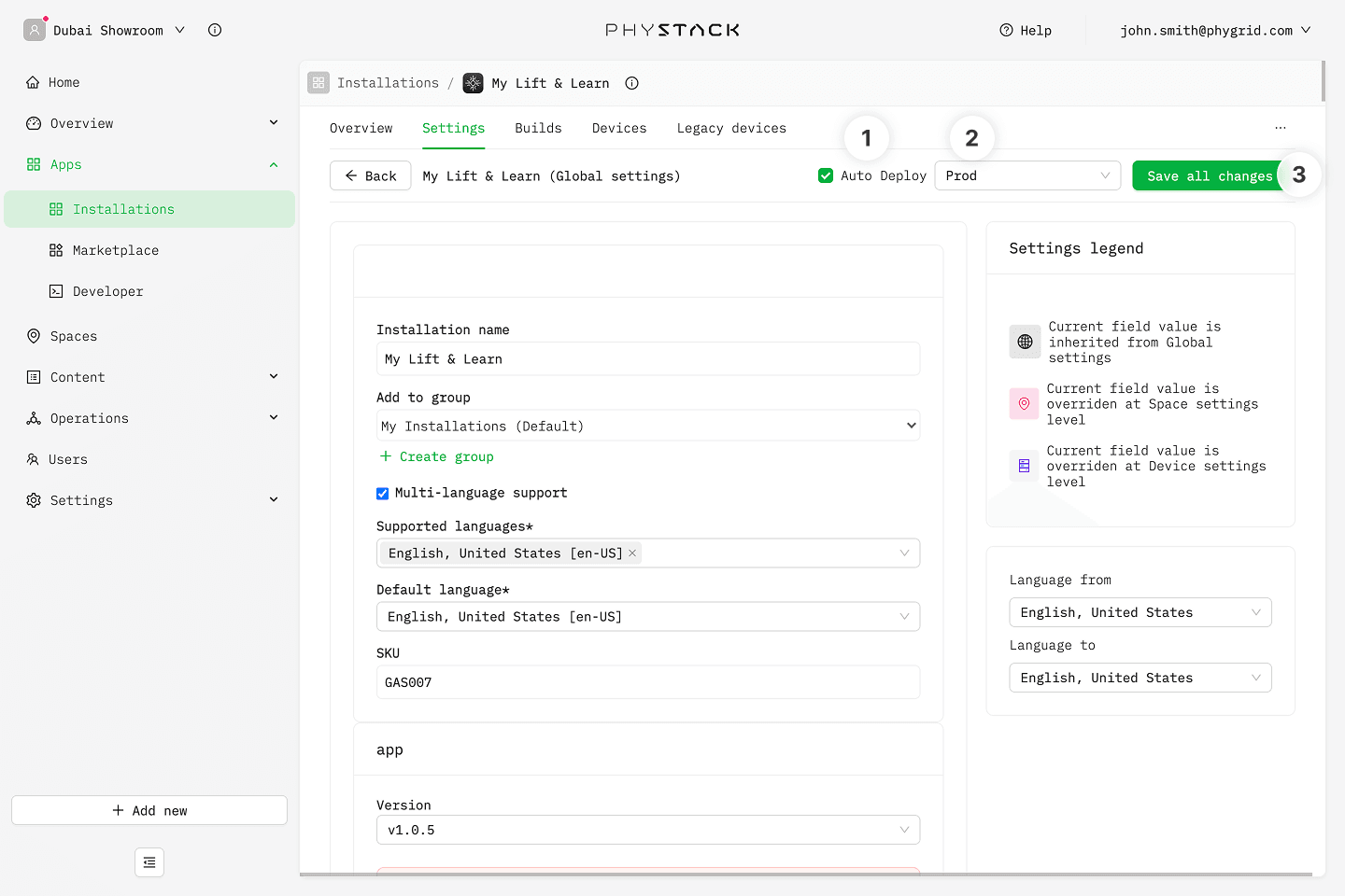
Console settings
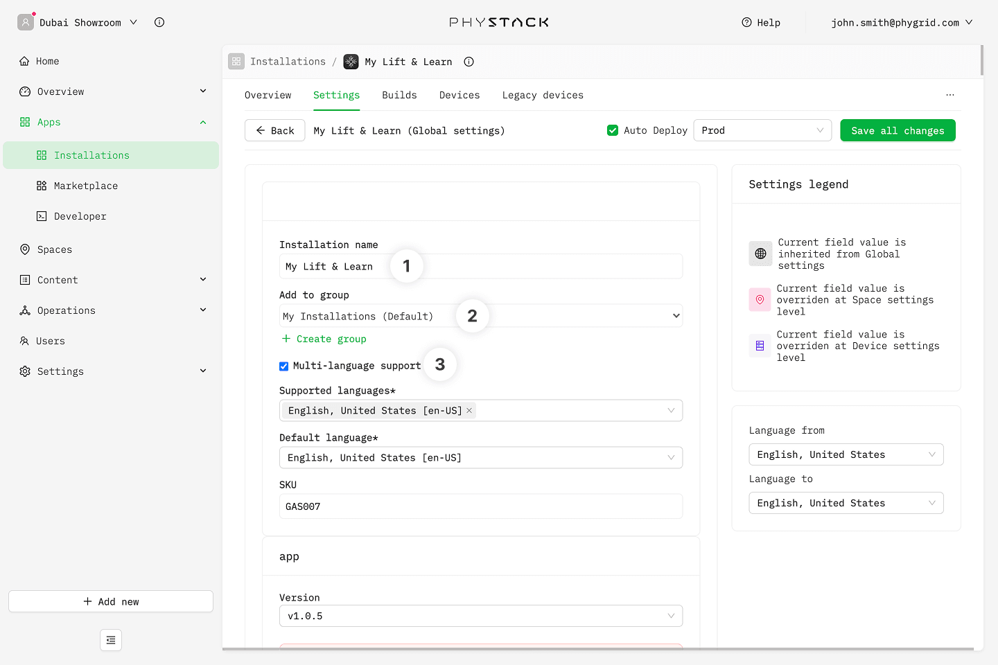
- Installation name: Edit the installation name that will be displayed in Apps → Installations
- Add to group: Change the installation group it belongs to and will be shown in Apps → Installations
- Multi-language support: Enable one or more languages. This applies to multi-language text fields such as omnibar CTA texts, promo text, and QR code CTA texts
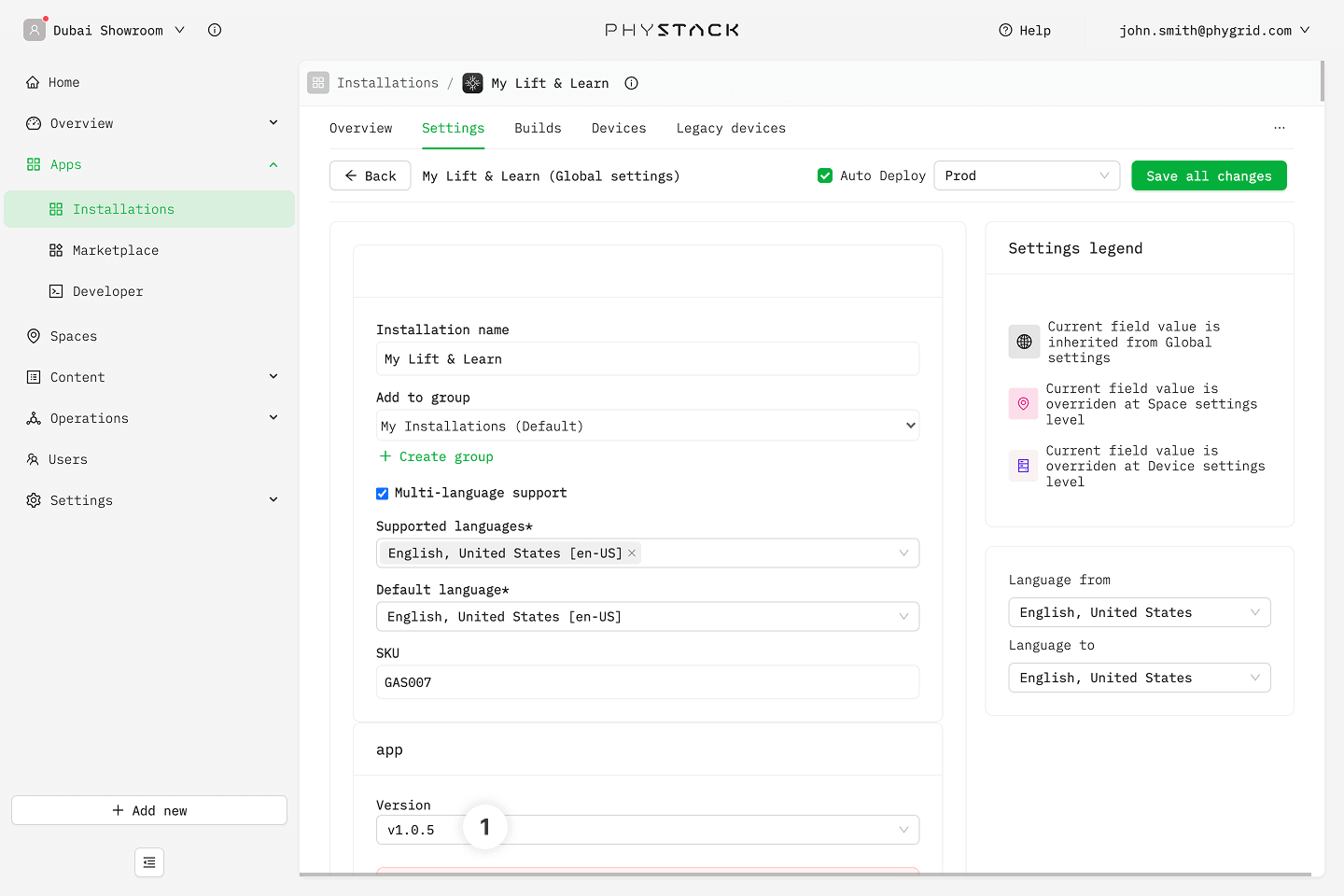
App settings
Changing the app version can add or remove certain options related to the specific version.
- Version: Select a specific app version for your installation
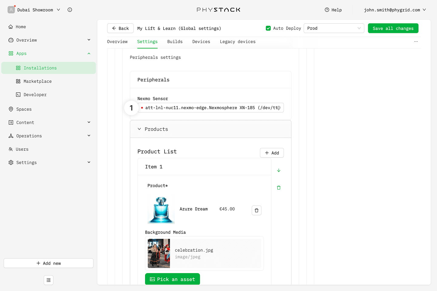
Peripherals
- Nexmo Sensor: Pick the Nexmosphere sensor connected to the device
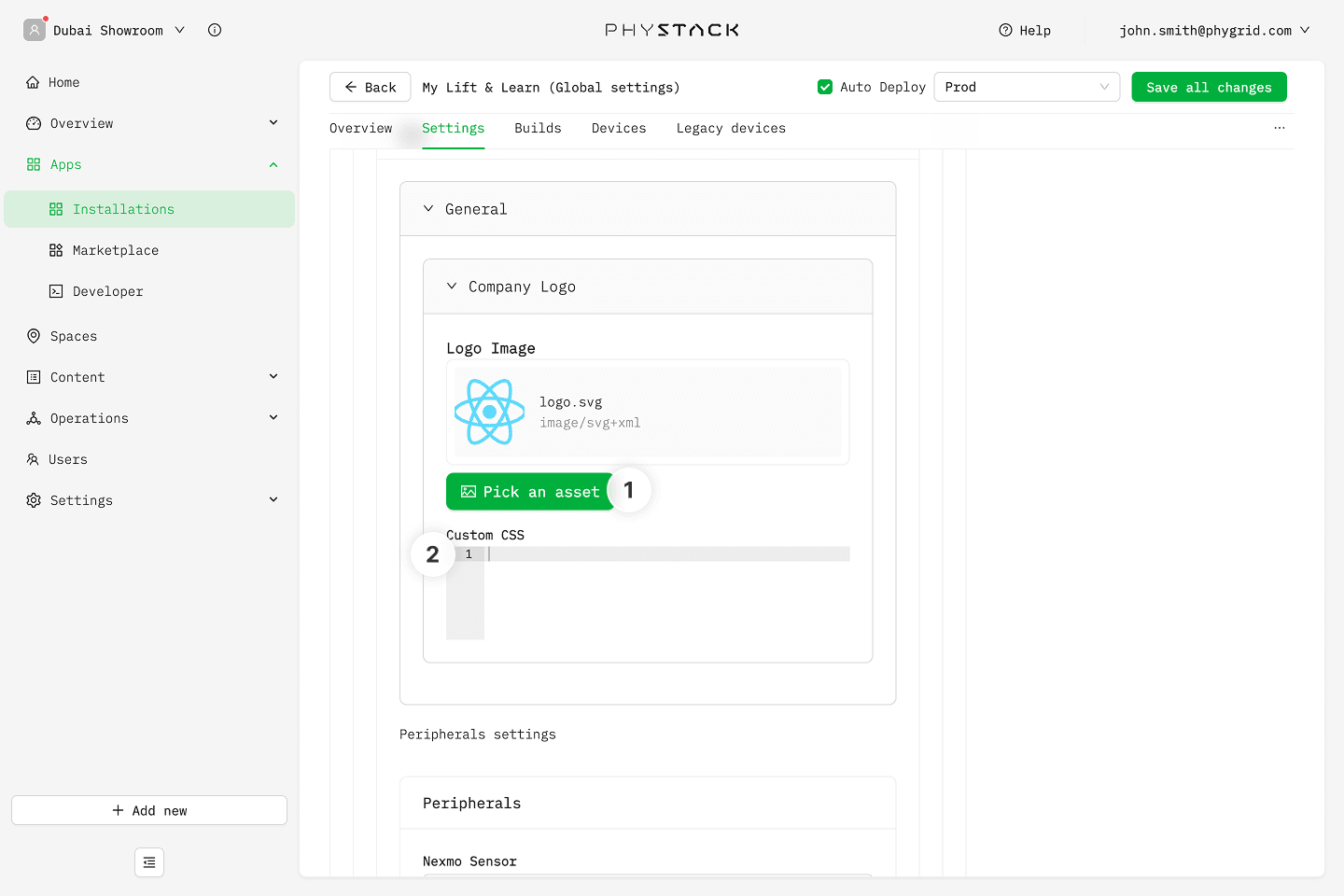
General
- Company Logo → Pick an asset: Upload the logo image displayed on the screen (PNG, JPEG, GIF, SVG, or WebP)
- Company Logo → Customize CSS: Custom CSS targeting the
.company-logo-containerclass
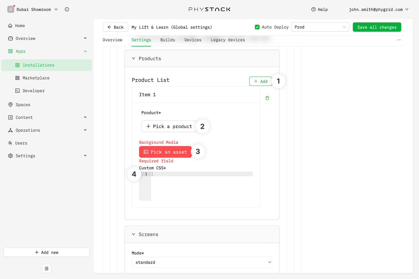
Product list
- Add: Creates a new product entry in the list
- Pick a product: Pick a product from the catalog. The selected product's RFID tag (its
NEXMO-{number}EAN) is what triggers the screen content - Background Media: Upload an image or video shown in the background of the product details screen (PNG, JPEG, WebP, MP4, or WebM)
- Custom CSS: Custom CSS targeting the
.product-info-backgroundclass for the individual product entry
Screens
- Mode: Choose how the screen behaves when products are lifted
- Standard: Only one product is shown on the screen at a time
- Compare: Lifting two products shows a side-by-side comparison layout
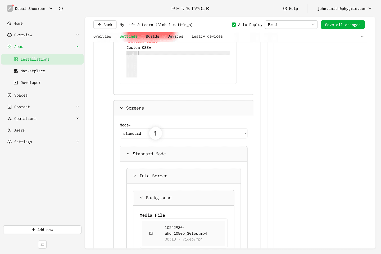
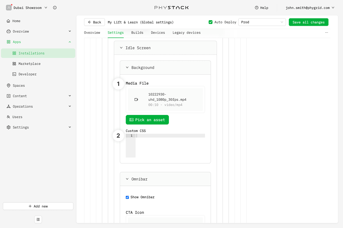
Standard mode: Idle screen
- Background → Media: Upload the image or video shown when no product is lifted
- Background → Customize Style: Custom CSS targeting the
.idle-containerand.idle-mediaclasses
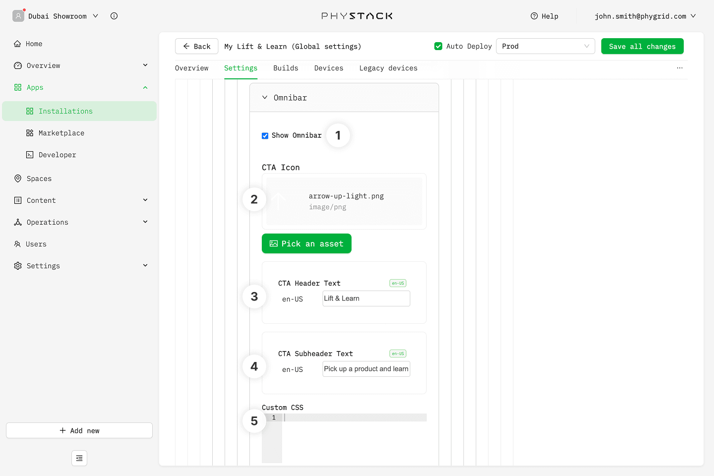
Standard mode: Idle omnibar
- Enable: Toggle the omnibar overlay on the idle screen on or off
- CTA Icon: Upload an icon displayed in the omnibar. If empty, a default built-in icon is used
- CTA Header Text: Multi-language headline text shown in the omnibar
- CTA Subheader Text: Multi-language secondary text shown in the omnibar
- Customize Style: Custom CSS targeting
.omnibar-container,.cta-header-text,.cta-subheader-text, and.cta-iconclasses
Standard mode: Motion-triggered overlay
A camera is required for motion detection to work. Additional configuration is available under Advanced Settings → Motion Detection Configuration.
- Active: Toggle the motion-triggered wakeup overlay on or off
- Customize Style: Custom CSS targeting
.motion-detect-container,.cta-header-text,.cta-subheader-text, and.cta-iconclasses
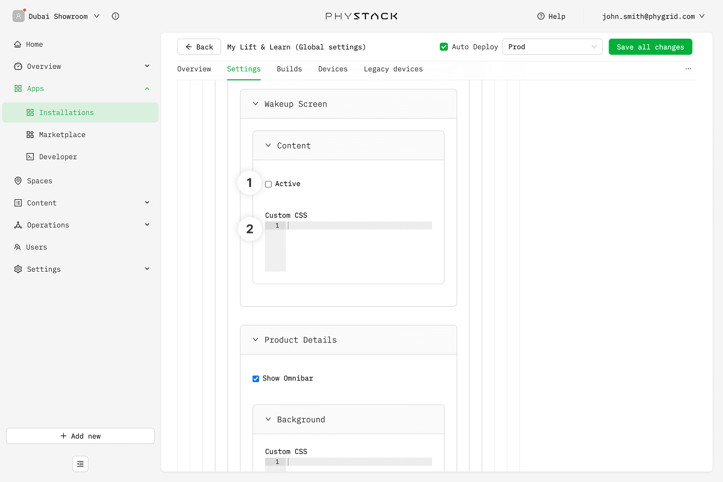
Standard mode: Product details
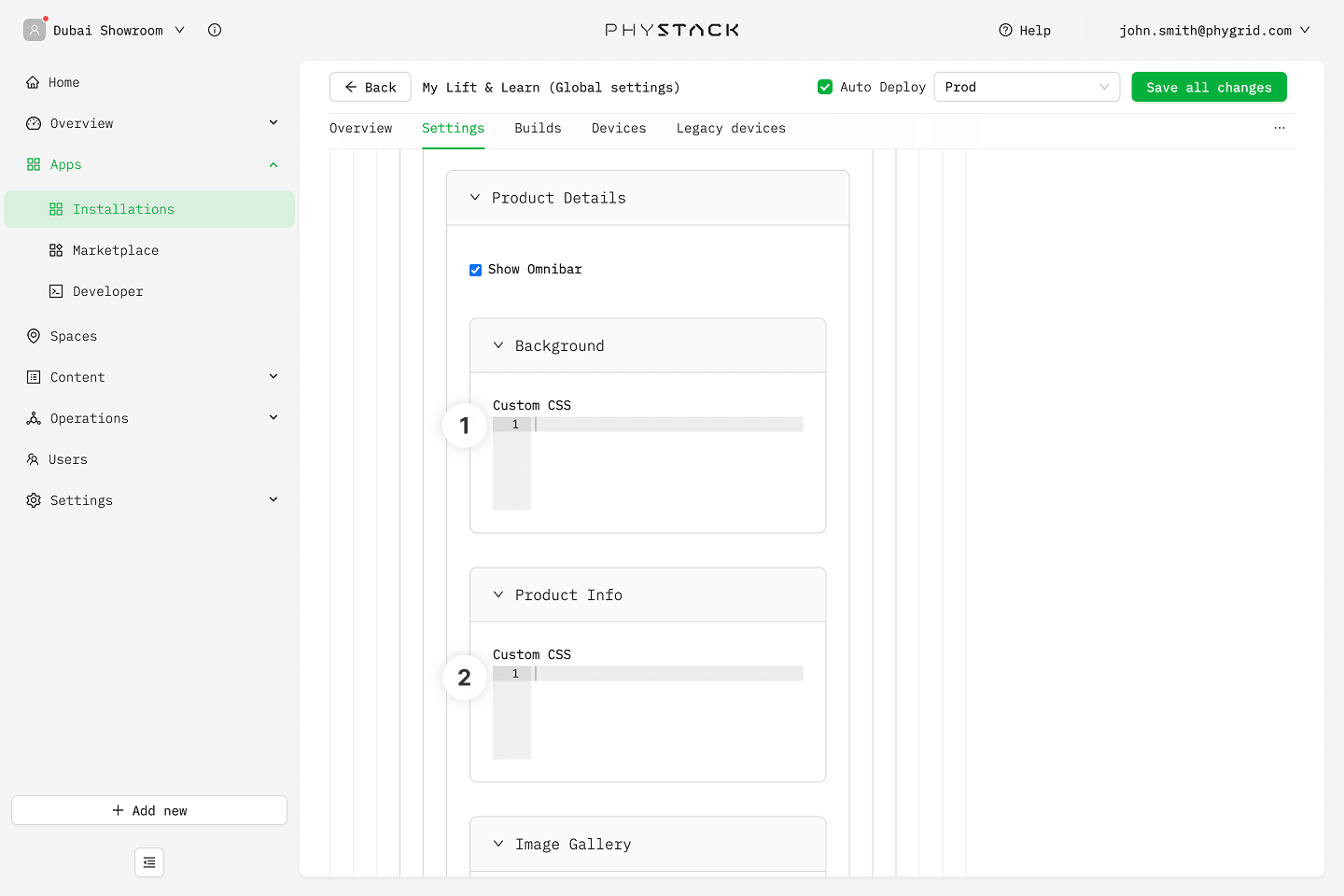
- Background → Customize Style: Custom CSS for the product details background
- Product Info → Customize Style: Custom CSS targeting
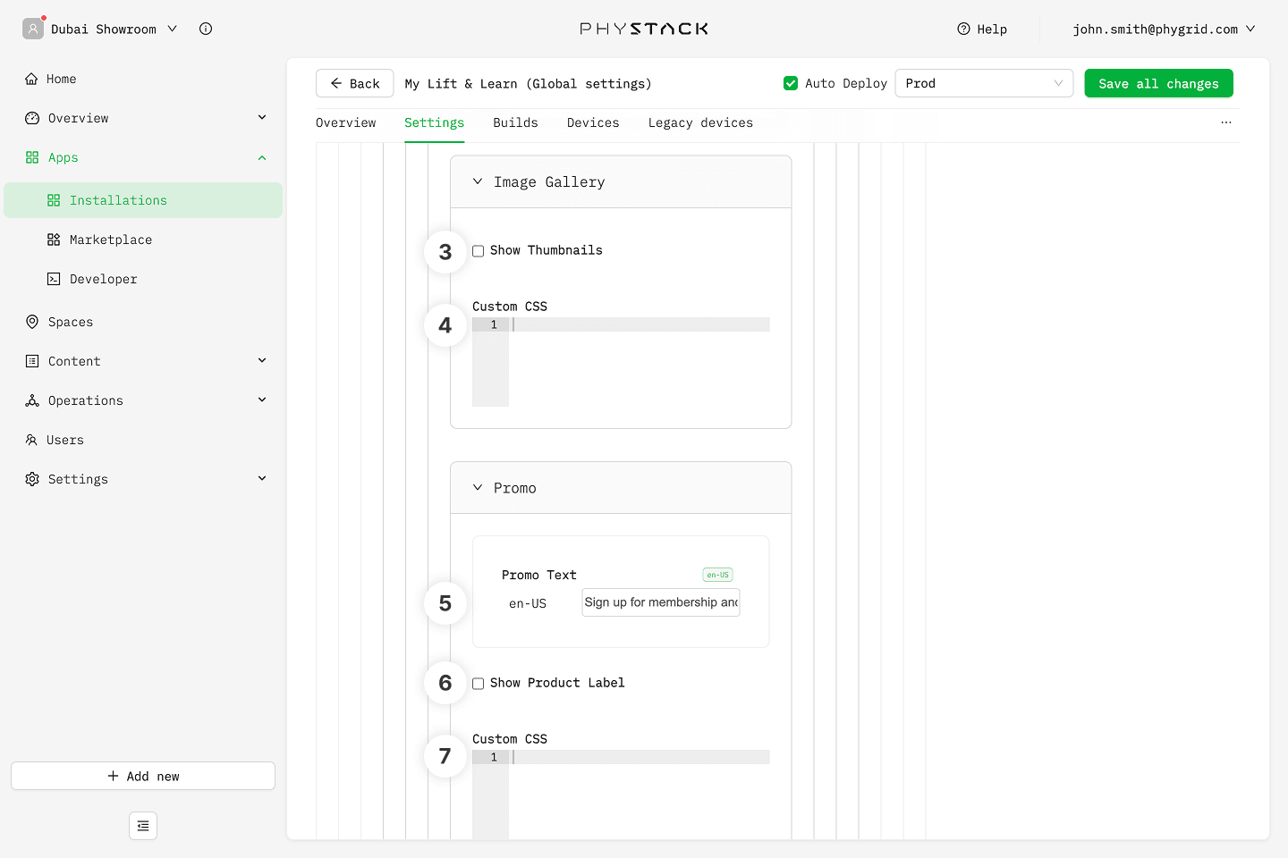
.product-brand,.product-title,.product-category, and.product-description - Image Gallery → Enable Thumbnail Images: Show thumbnail navigation alongside the main product image gallery
- Image Gallery → Customize Style: Custom CSS targeting
.gallery-container,.gallery-dots,.gallery-carousel,.gallery-thumbnails, and.image-card - Price and Promo Section → Custom Promo Text: Multi-language promotional text shown in the pricing area
- Price and Promo Section → Enable Product Label: Show or hide the product label tag in the pricing area
- Price and Promo Section → Customize Style: Custom CSS targeting
.price-container,.retail-price,.slashed-price,.promo-custom-text, and.promo-product-label - Key Selling Points → Customize Style: Custom CSS targeting
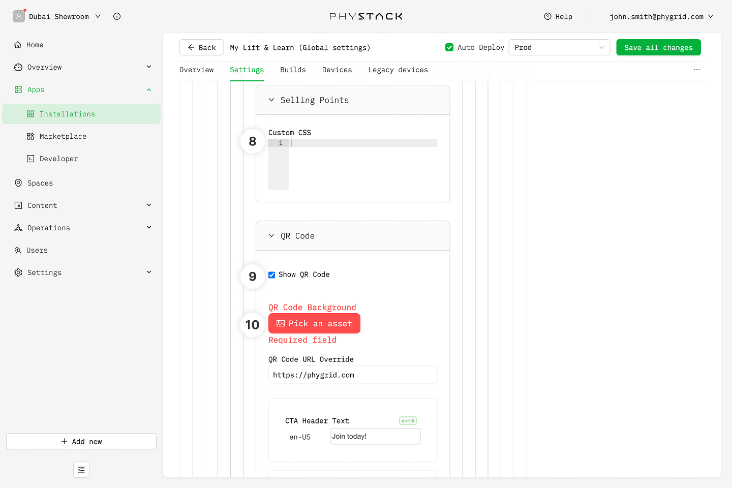
.selling-point-details - QR Code → Enable: Toggle the QR code display on or off
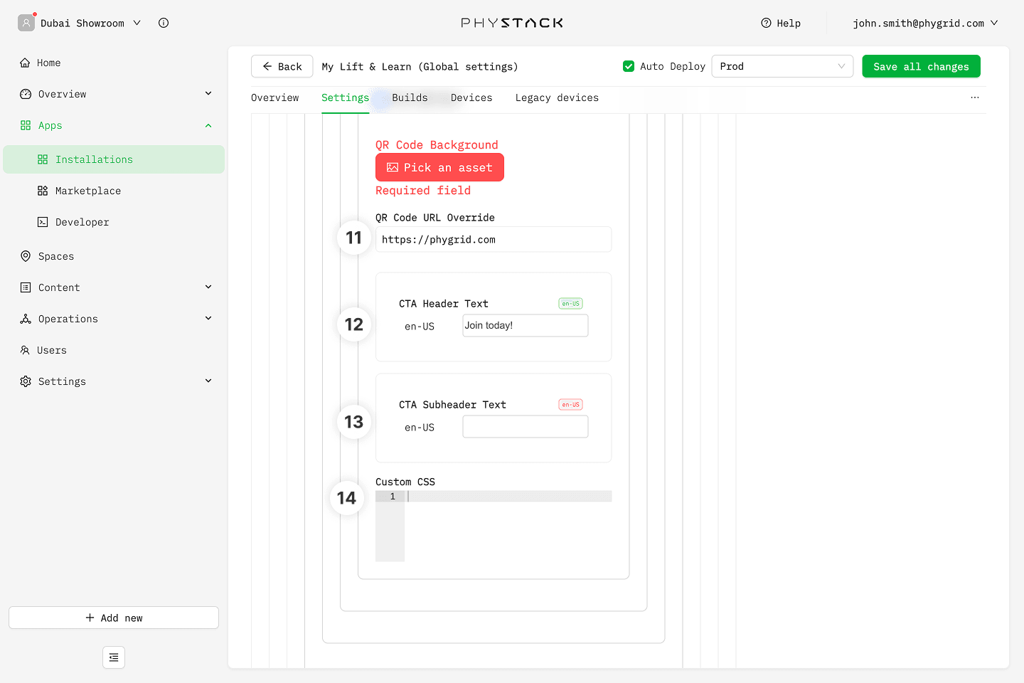
- QR Code → QR Code Background: Upload an image used as the QR code background
- QR Code → QR Code URL: The destination URL encoded into the QR code
- QR Code → CTA Header Text: Multi-language headline text shown next to the QR code
- QR Code → CTA Subheader Text: Multi-language secondary text shown next to the QR code
- QR Code → Customize Style: Custom CSS targeting
.qr-media-background,.qr-code-container,.qr-code,.cta-header-text, and.cta-subheader-text
Compare mode: Idle screen
- Background → Media: Upload the image or video shown when no product is lifted in compare mode
- Background → Customize Style: Custom CSS targeting the
.idle-containerand.idle-mediaclasses
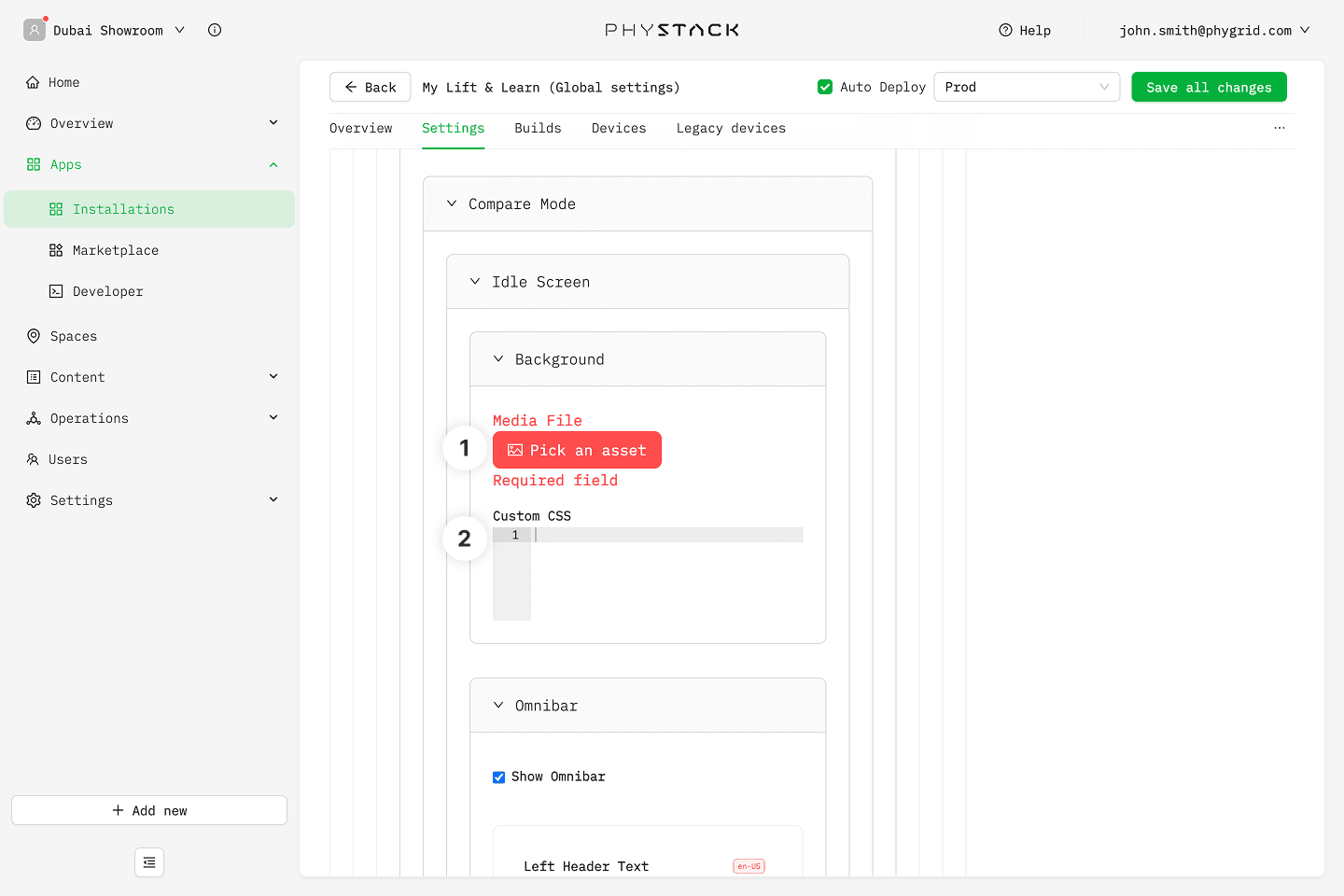
Compare mode: Idle omnibar
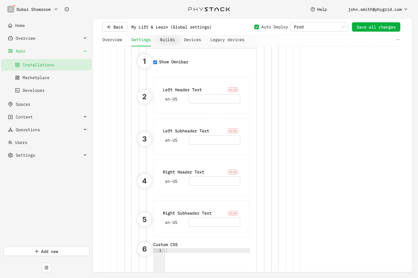
- Enable: Toggle the omnibar overlay on the idle screen on or off
- Left CTA Header Text: Multi-language headline text for the left side of the comparison omnibar
- Left CTA Subheader Text: Multi-language secondary text for the left side
- Right CTA Header Text: Multi-language headline text for the right side of the comparison omnibar
- Right CTA Subheader Text: Multi-language secondary text for the right side
- Customize Style: Custom CSS targeting
.omnibar-container,.cta-left-header-text,.cta-left-subheader-text,.cta-right-header-text, and.cta-right-subheader-text
Compare mode: Motion-triggered overlay and Product details
Compare mode reuses the same Motion-triggered Overlay and Product Details settings as Standard mode.
Themes
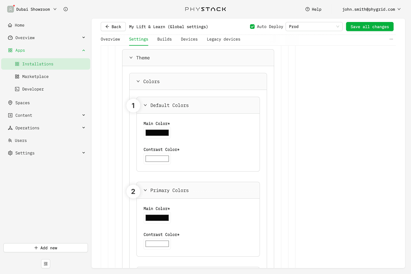
Colors
Each color slot has a Main Color and a Contrast Color used for text or icons rendered on top of the main color.
- Default: Base color pair used across the app.
- Primary: Accent color pair.
- Secondary: Secondary accent color pair.
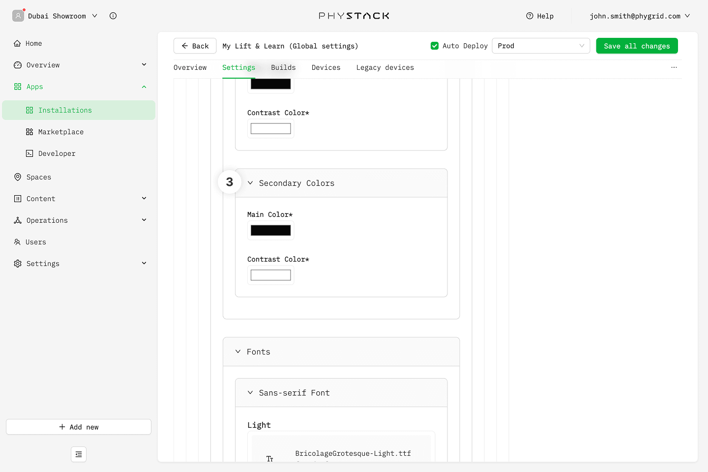
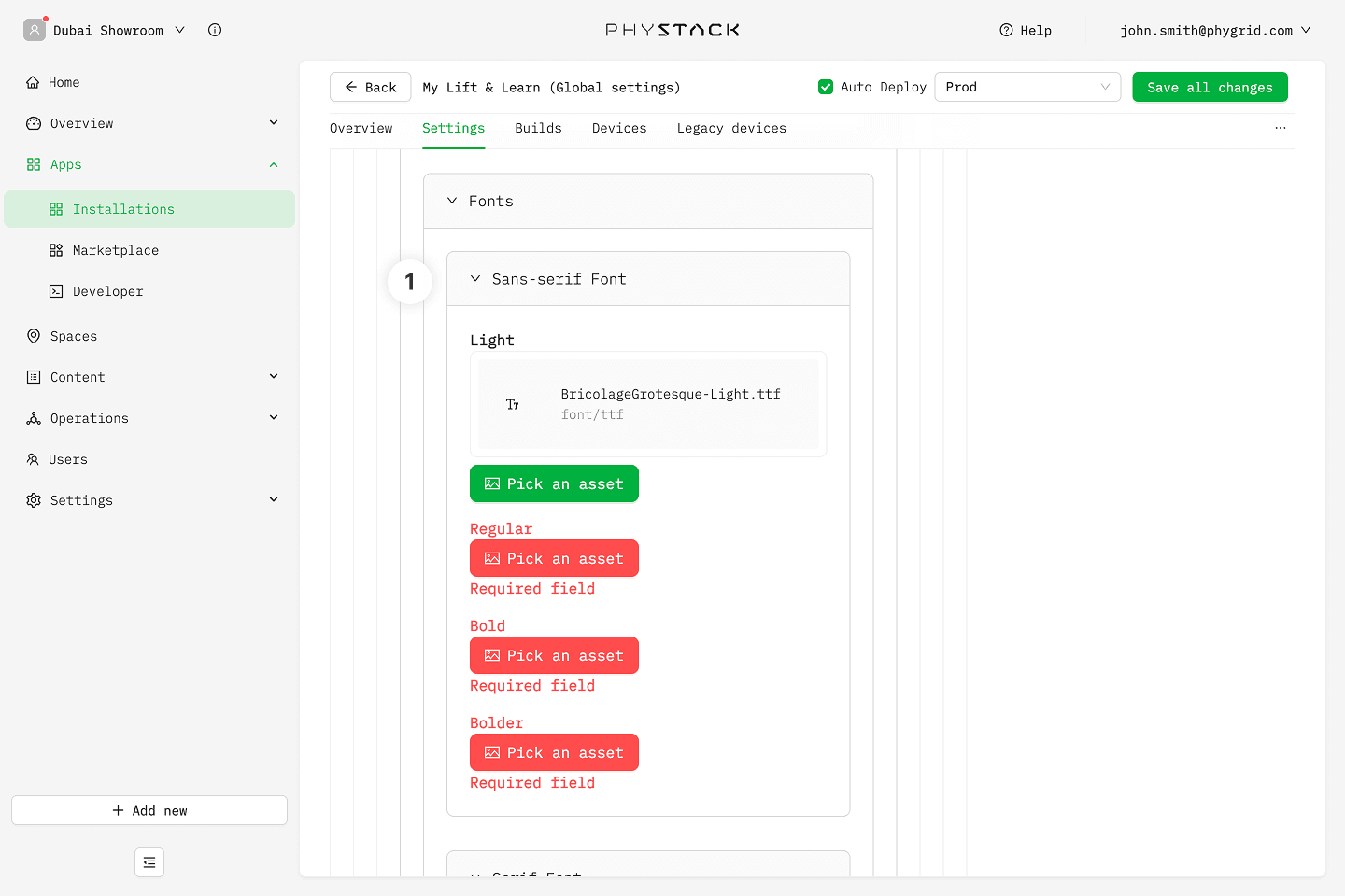
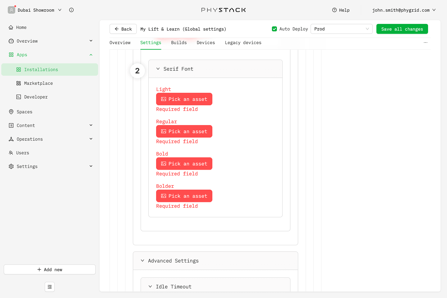
Fonts
If a font weight is left empty, the default built-in font for that weight is used. Custom fonts can also be referenced from CSS using font-family: 'AppFont Sans-serif' or 'AppFont Serif' with font-weight: light | normal | bold | bolder.
- Sans-serif (default) → Light / Regular / Bold / Bolder: Upload custom font files (OTF, TTF, WOFF, or WOFF2) for each weight of the sans-serif family
- Serif → Light / Regular / Bold / Bolder: Upload custom font files for each weight of the serif family
Advanced settings
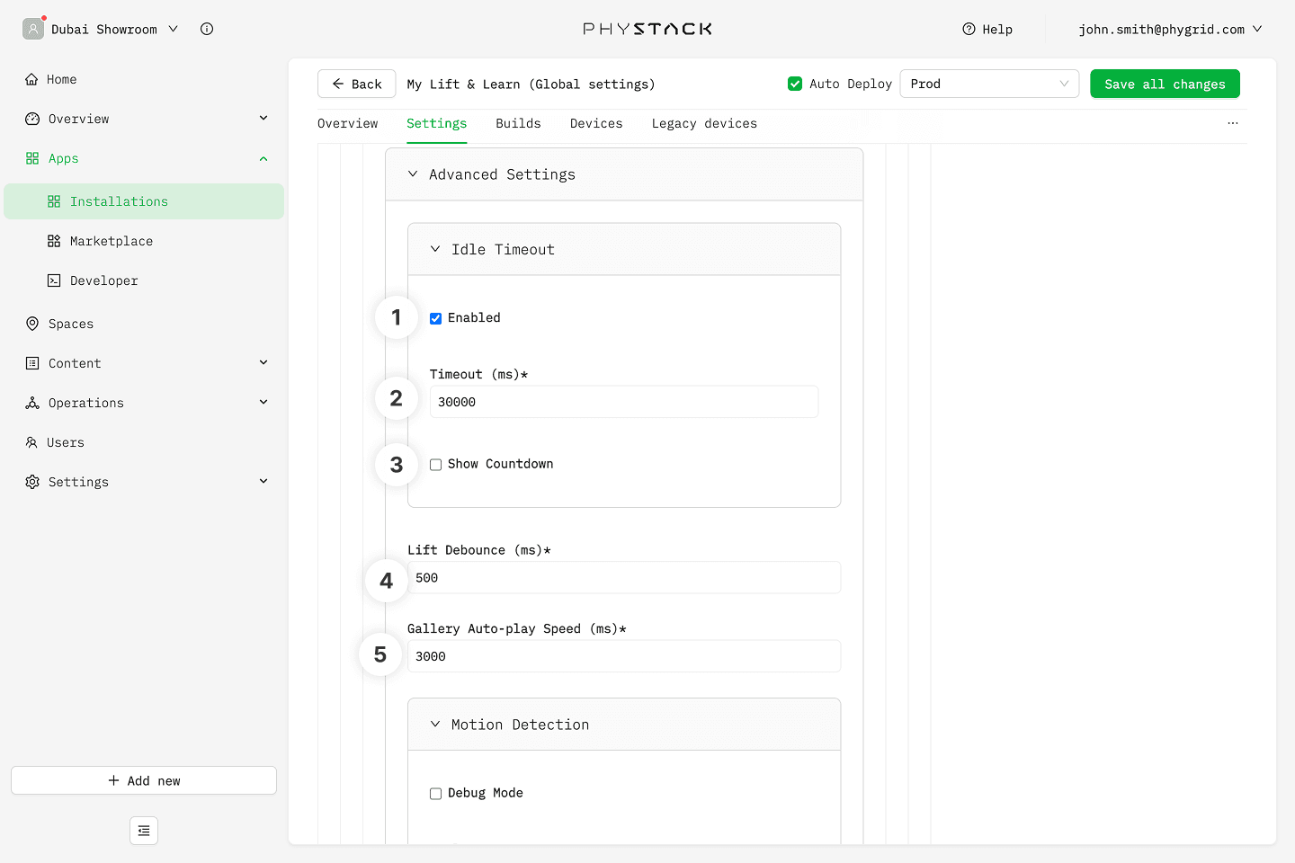
- Idle Timeout → Enable: Toggle the auto-return-to-idle timer on or off
- Idle Timeout → Timeout (in ms): Time in milliseconds before the screen reverts to the idle state if a product is not placed back. Minimum 10,000 ms, default 60,000 ms
- Idle Timeout → Show idle countdown timer: Display a visible countdown to idle on the screen
- Lift Delay or Debounce (in ms): Time in milliseconds the app waits before reacting to a lift event. Used to handle consecutive lifts so the screen settles on the final lifted product instead of switching every time a product is moved. Minimum 200 ms, maximum 5,000 ms, default 500 ms
- Image Gallery Auto-play Speed Duration (in ms): Time in milliseconds each image is displayed before advancing in the product image gallery slideshow. Minimum 500 ms, default 3,000 ms
- Enable Custom Styling: Master toggle for all Customize Style CSS fields. When off, custom CSS is ignored across the app
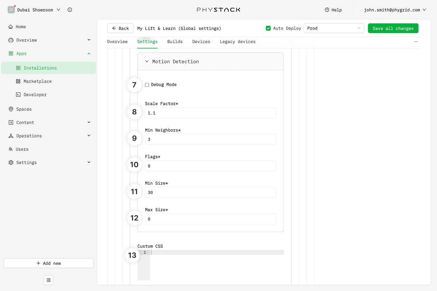
- Motion Detection Configuration → Enable Debug Mode: Show motion detection debug overlays on the screen
- Motion Detection Configuration → Scale Factor: How much the image size is reduced at each detection scale. Default 1.2
- Motion Detection Configuration → Minimum Neighbors: How many neighboring detections are required to retain a candidate. Higher values reduce false positives. Default 6
- Motion Detection Configuration → Flags: Detection flags passed to the underlying classifier. Default 0
- Motion Detection Configuration → Minimum Size: Minimum size of detected motion regions in pixels. Default 5
- Motion Detection Configuration → Maximum Size: Maximum size of detected motion regions in pixels. Default 112
Save options
- Auto Deploy: If selected, changes will be saved, a build will be created and automatically deployed to connected devices
- Environment: Select the deployment environment
- Save all changes: Save your current configuration