
Settings are listed in the order the Console shows them. Multi-language texts are written per language.
Console settings
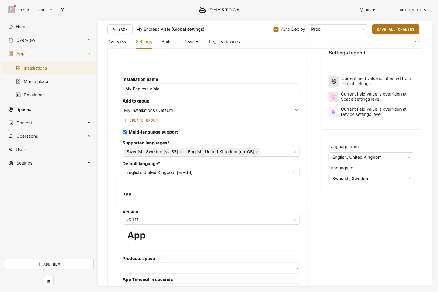
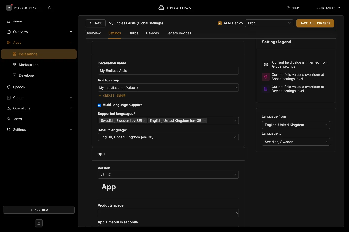
- Installation name: The installation name shown in Apps → Installations
- Add to group: The installation group it belongs to in Apps → Installations
- Multi-language support: The languages the kiosk can show and you can write texts in. Languages come from the installation, not from the app settings below. A text missing in the active language falls back to English (en-GB) (see Glossary)
App version
- Version: The app version used by your installation
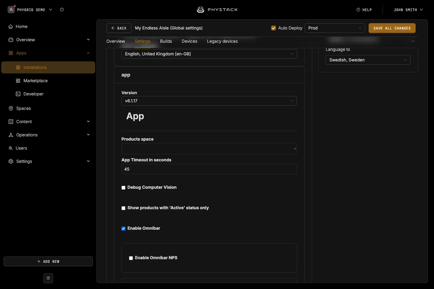
App
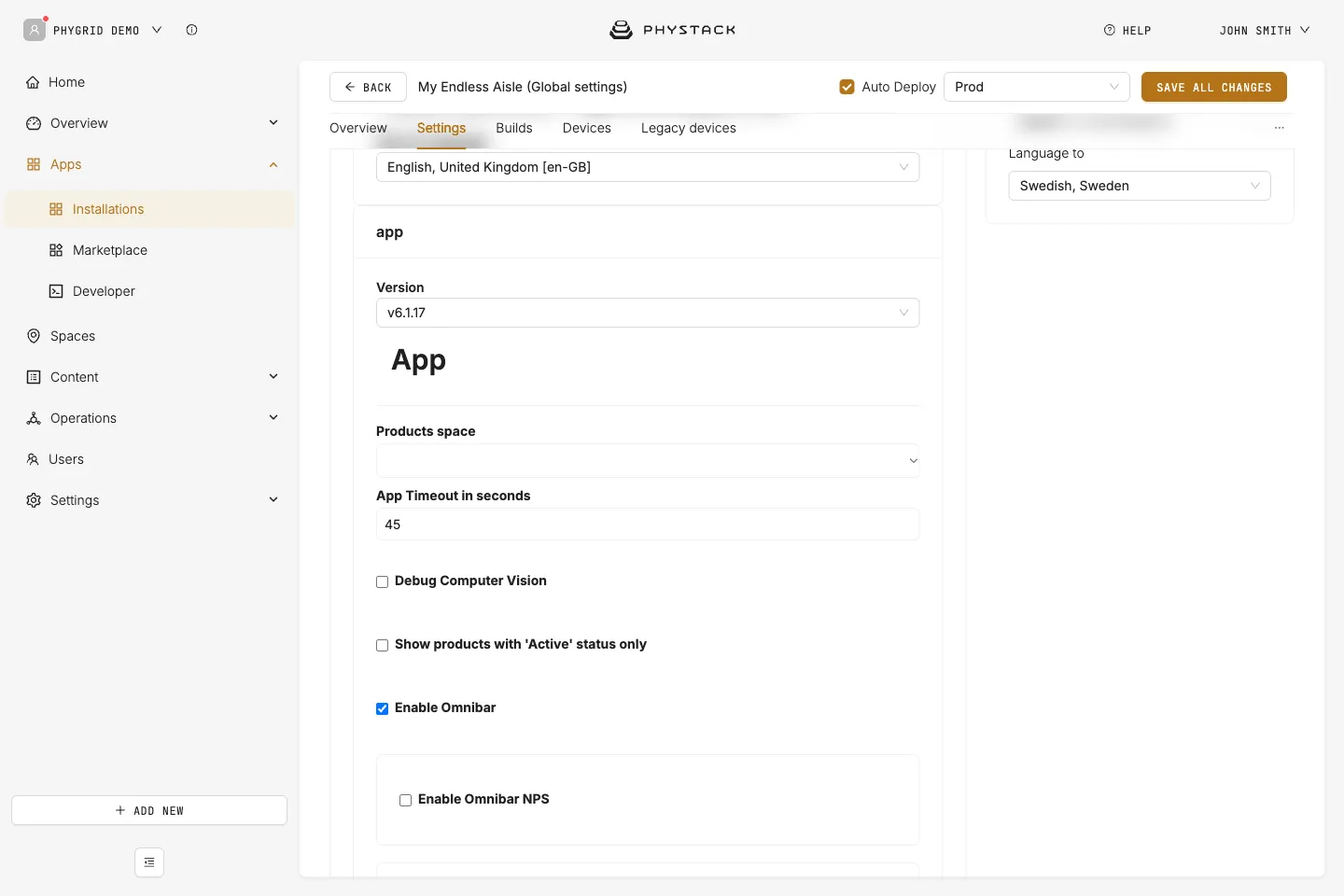
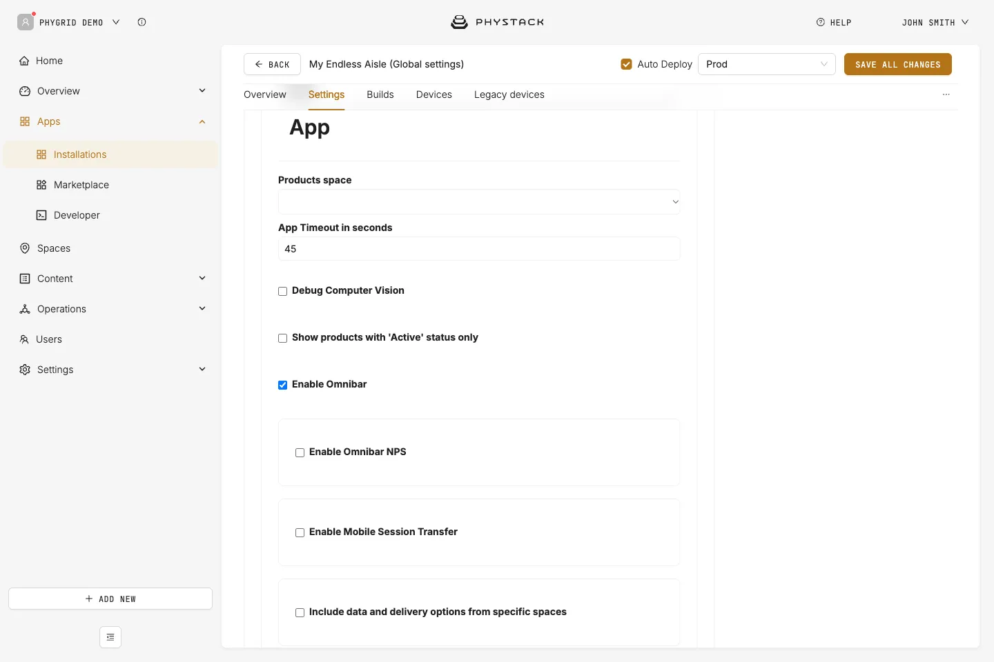
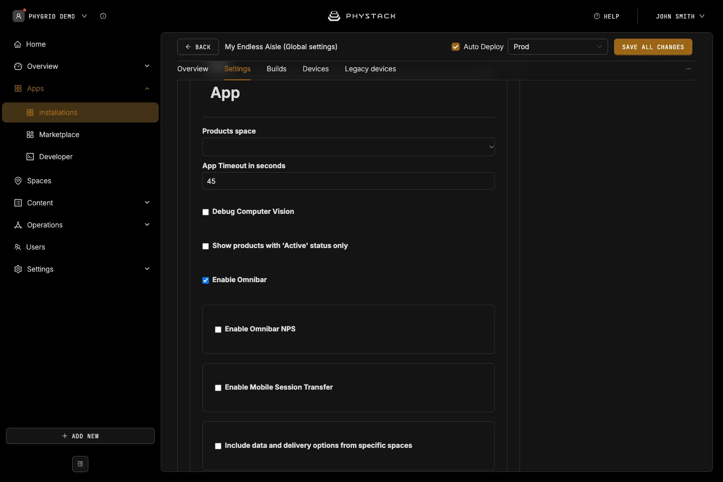
- Products space: The space whose products the kiosk shows. If empty, the device’s own space is used. See Integrate your product catalogue for Endless Aisle
- App Timeout in seconds: Time without a touch before the kiosk clears filters and returns to the idle screen. Default: 45
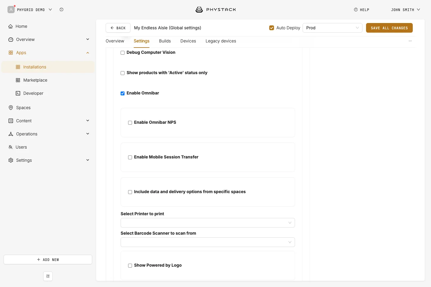
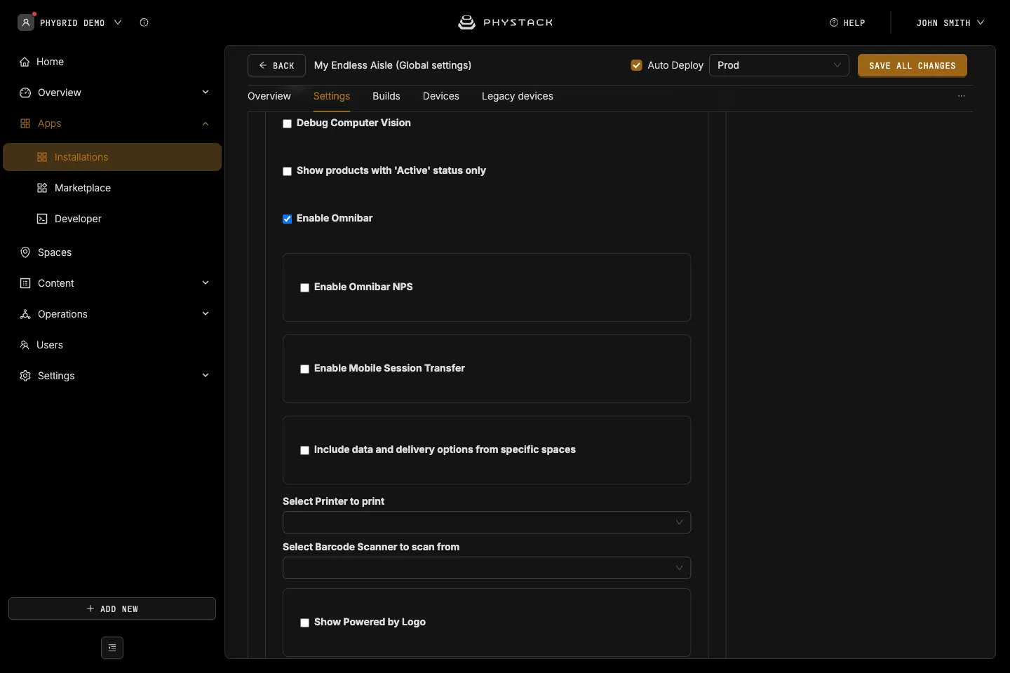
- Debug Computer Vision: Shows camera detection debug output on the idle screen. Only relevant with Wake on motion on. Default: off
- Show products with ‘Active’ status only: Hides products that don’t have the status Active for the kiosk’s spaces, in product lists, banner lists, and search. Default: off
- Enable Omnibar: Shows the bottom bar with search, Home, Bag, and other buttons. When off, only a Back button is shown. Default: on
- Enable Omnibar NPS: Collects customer feedback (NPS) from the omnibar. Default: off
- NPS display type: Omnibar Button (default) adds a Feedback button. Auto NPS shows the feedback prompt automatically after 40 seconds of use
- Enable Mobile Session Transfer: Shows a QR code in the omnibar that continues the session on Endless Aisle Mobile. Default: off
- Show a modal message on QR code click and Modal HTML content: Optional HTML message shown when the QR code is tapped
- Remote endpoint: The mobile endpoint the QR code opens, per environment. See Set up Endless Aisle Mobile
- Include data and delivery options from specific spaces: Adds products from other spaces, shows stock per space, and groups bag items by space. Default: off
- Device SpaceId (the one configured in device settings for In-store): Title to be displayed and Delivery Options for the kiosk’s own space
- Additional Spaces: Space ID, Title to be displayed, and Delivery Options for each extra space
- Select Printer to print: The thermal printer peripheral used by the receipt printing checkout methods. See Set up receipt printing
- Select Barcode Scanner to scan from: The barcode scanner peripheral. A scanned EAN or UPC barcode opens the product page
- Show Powered by Logo: Shows a small logo at the bottom of the idle screen. Default: off
- Logo: Your own logo. If empty, the built-in logo is used
- Customize with CSS: CSS for the logo wrapper. Available class:
.powered-by-image
- Styles: Not used by the current app version
Layout
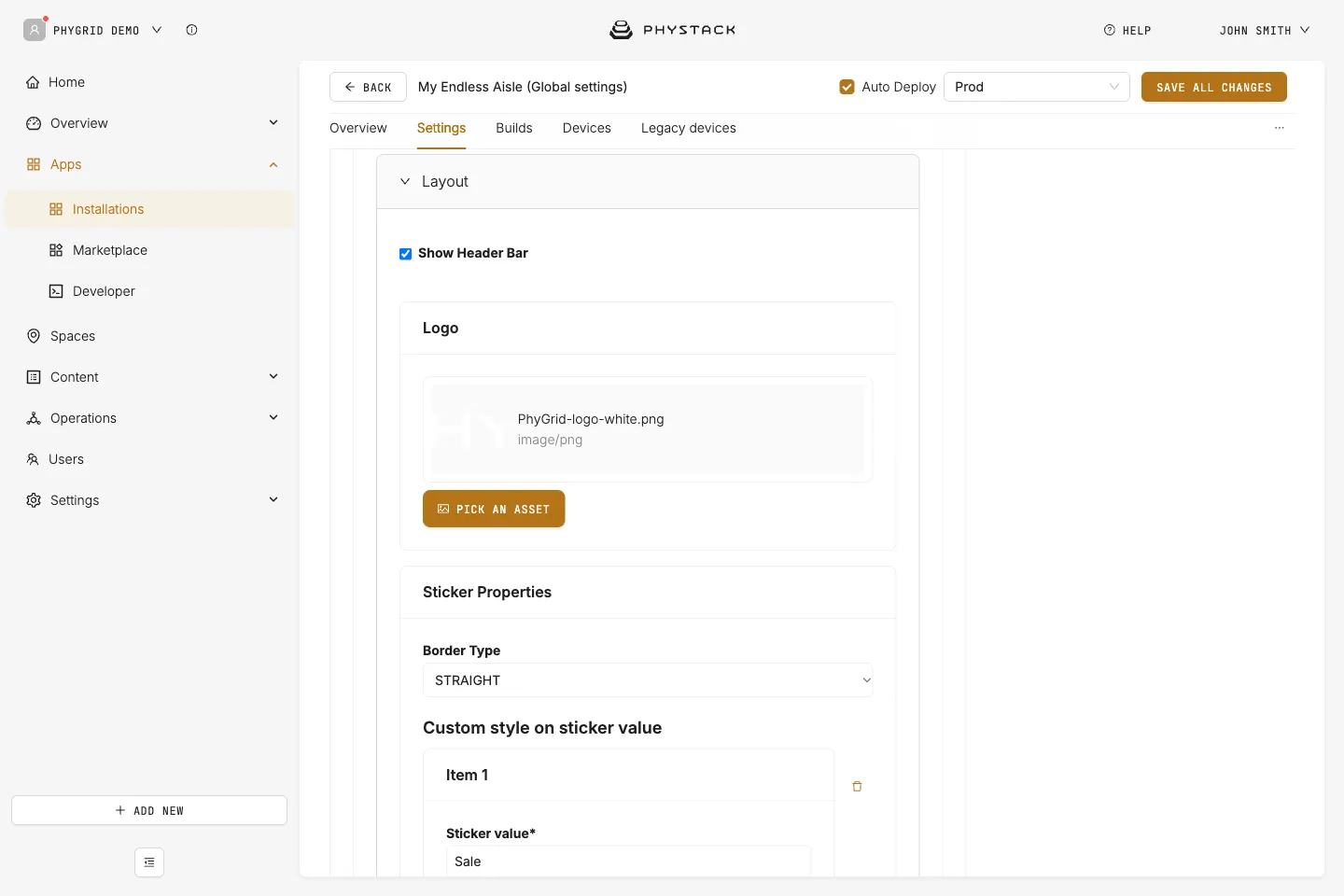
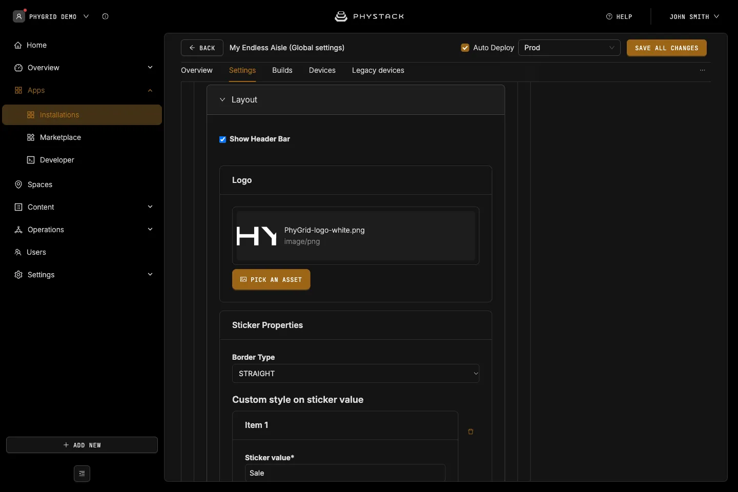
- Show Header Bar: Shows the header bar in the Primary colour at the top of each screen, with the page title. Default: on
- Logo: Shown on the home and explore screens. Maximum height 48 px
- Sticker Properties → Border Type: Shape of the product label stickers on product cards, ROUNDED or STRAIGHT. Default: STRAIGHT
- Sticker Properties → Custom style on sticker value: Colours a sticker whose text matches Sticker value, with a Background color (default #cf2b1f) and Text color (default #ffffff)
- Sticker Properties → Sticker Display Type: How labels show on the product page, Text Only (default) above the name or Beside Price
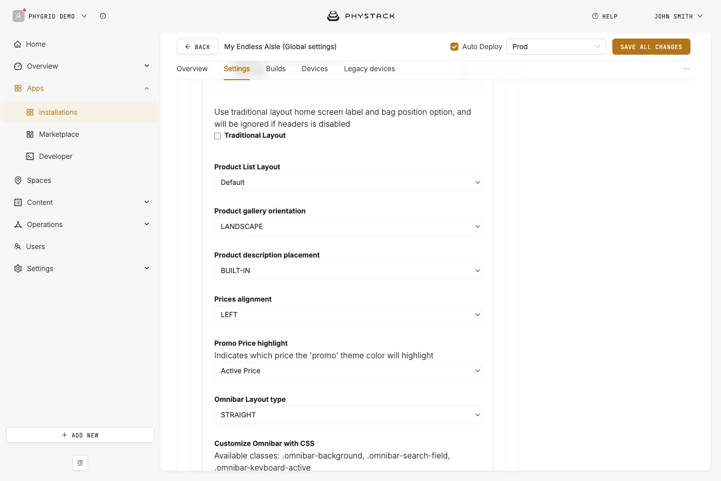
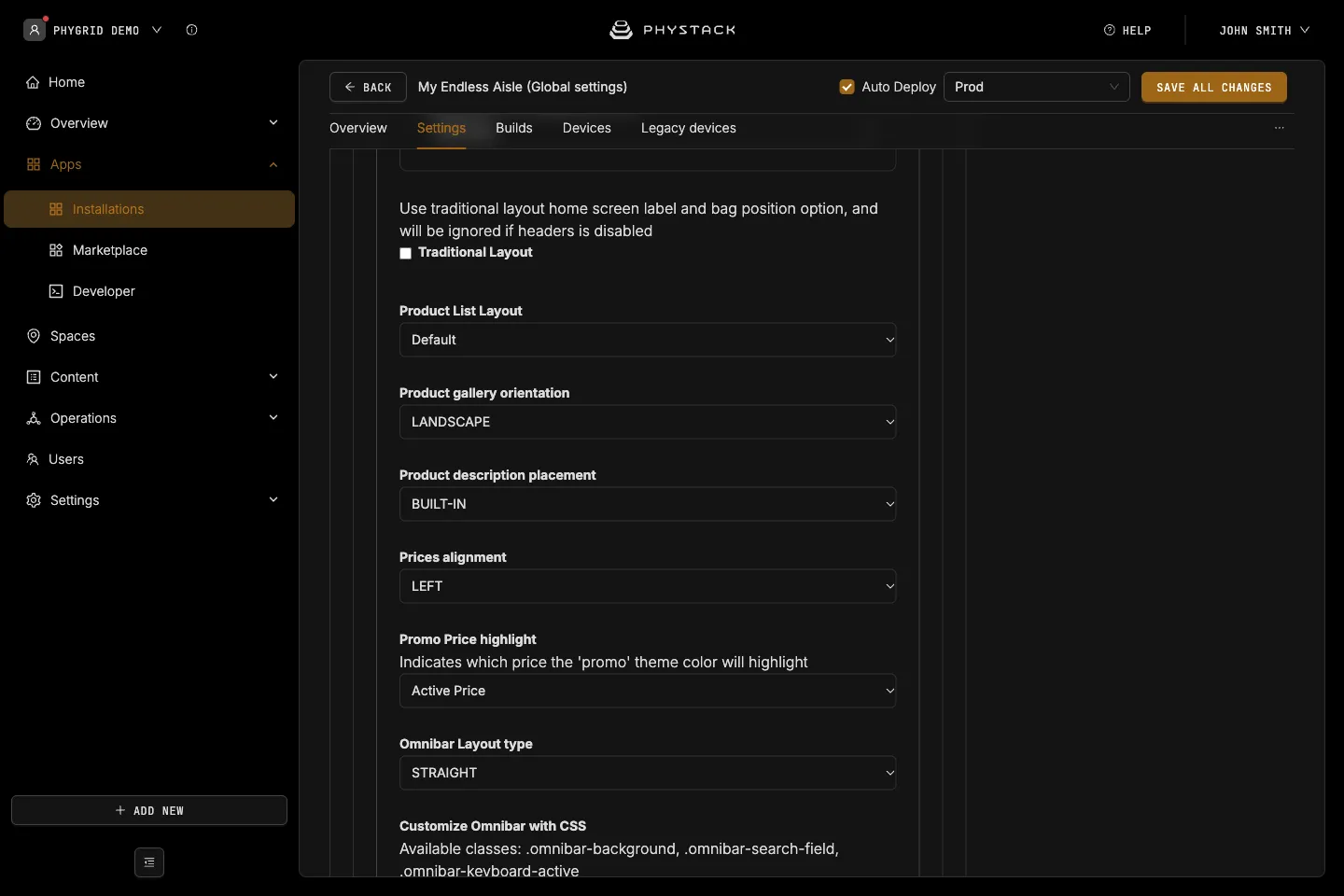
- Traditional Layout: An alternative home screen look with the logo centred above the content. Ignored when the header bar is off. Default: off
- Show background color (traditional layout on): Fills the page background with the Primary colour. Default: off
- Home Screen Label (traditional layout off): Large text next to the logo in the home screen header. Required
- Place bag on header (traditional layout off): Not used by the current app version
- Product List Layout: Default shows a filter bar, sort, and category menu. Filter Focused shows filters in a side panel and always sorts by ranking. Default: Default. See Configure product browsing
- Product gallery orientation: Image gallery style on the product page, LANDSCAPE or PORTRAIT. Default: LANDSCAPE
- Product description placement: Shows the description inline (BUILT-IN, default) or in a slide-out panel (SLIDE-OUT). Only used by the DEFAULT product page layout
- Prices alignment: Price alignment on product cards and the product page, LEFT or RIGHT. Default: LEFT
- Promo Price highlight: Which price gets the Promo colour, Active Price (default) or Slashed Price
- Omnibar Layout type: Shape of the omnibar and back button, ROUNDED or STRAIGHT. Default: STRAIGHT
- Customize Omnibar with CSS: CSS for the omnibar on every screen except search. Available classes:
.omnibar-background,.omnibar-search-field. See Customise Endless Aisle with CSS
Features
See Configure in-store features.
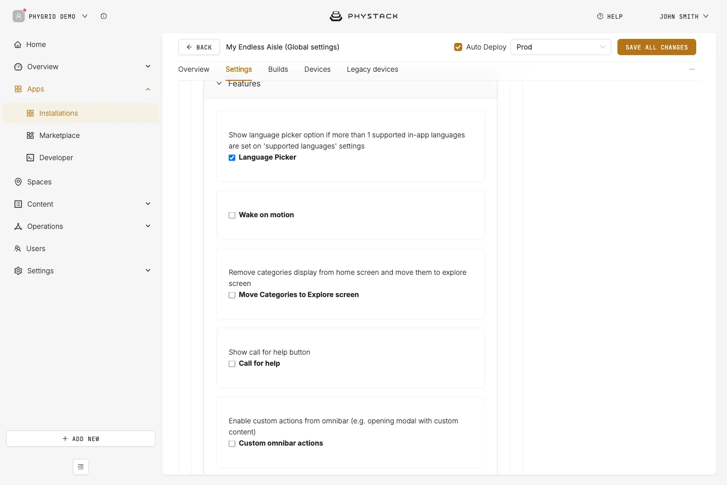
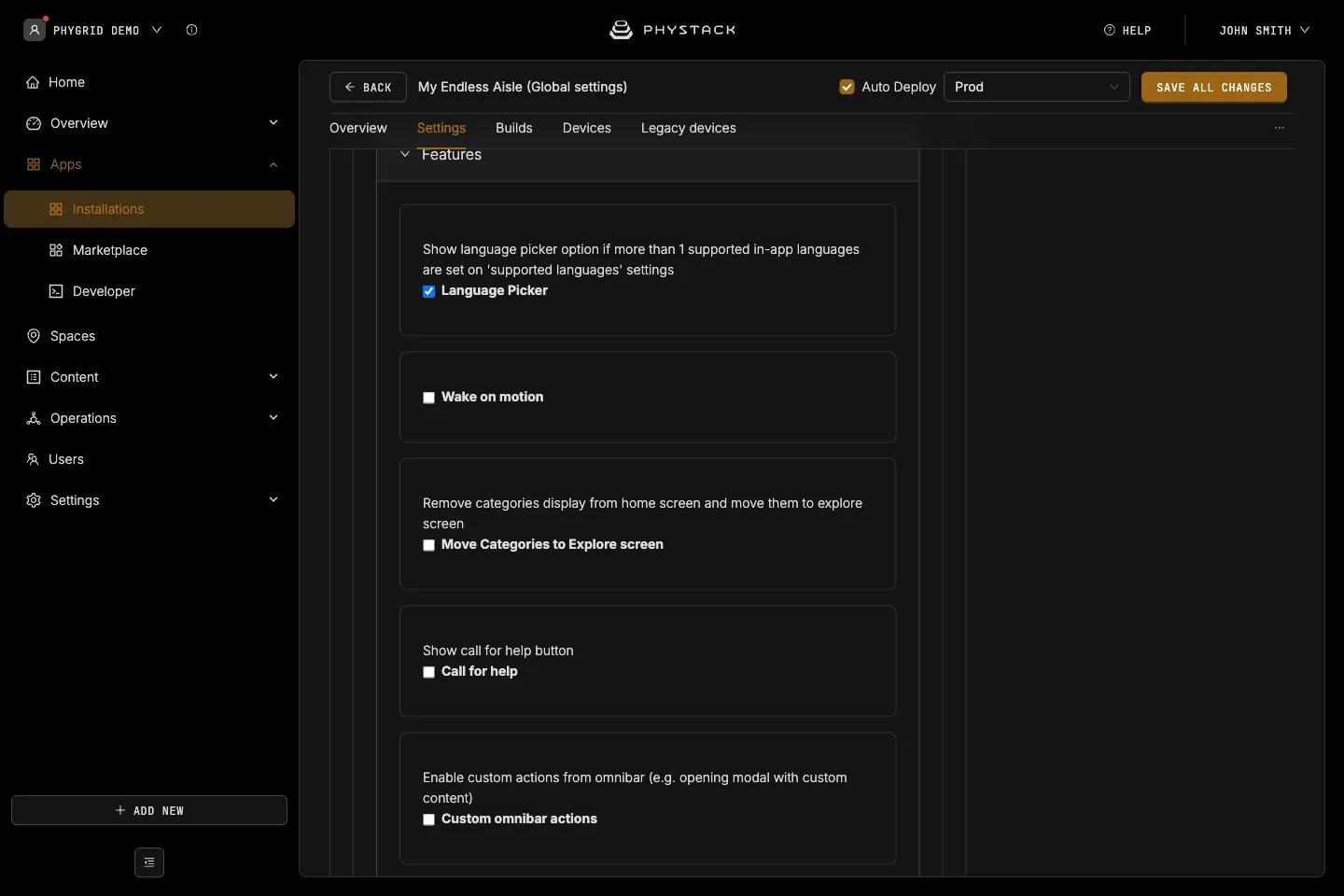
- Language Picker: Adds a Language button to the omnibar when the installation has two or more languages with built-in translations. Default: off
- Wake on motion: Uses the device camera to start a session when a face is detected in front of the idle screen. Default: off
- Move Categories to Explore screen: Removes the category tiles from the home screen and adds an Explore button to the omnibar that opens them. Default: off
- Call for help: Adds a Help button to the omnibar. Confirming sends a POST request to notify staff. Default: off
- API URL, Request Headers, Request Query Parameters, Request Body: The request sent on confirm. API URL is required
- Label, Staff is notified, Unable to find help, Finding some help: Override the texts of the help dialog
- Custom omnibar actions: Adds your own buttons to the omnibar. Default: off
- Omnibar Actions: Each action has an Image displayed as button in the omnibar, a Title in Omnibar, and Modal HTML content shown when tapped. Action type is always Display Modal
Bag
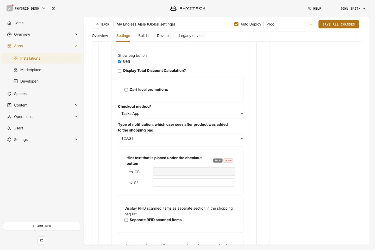
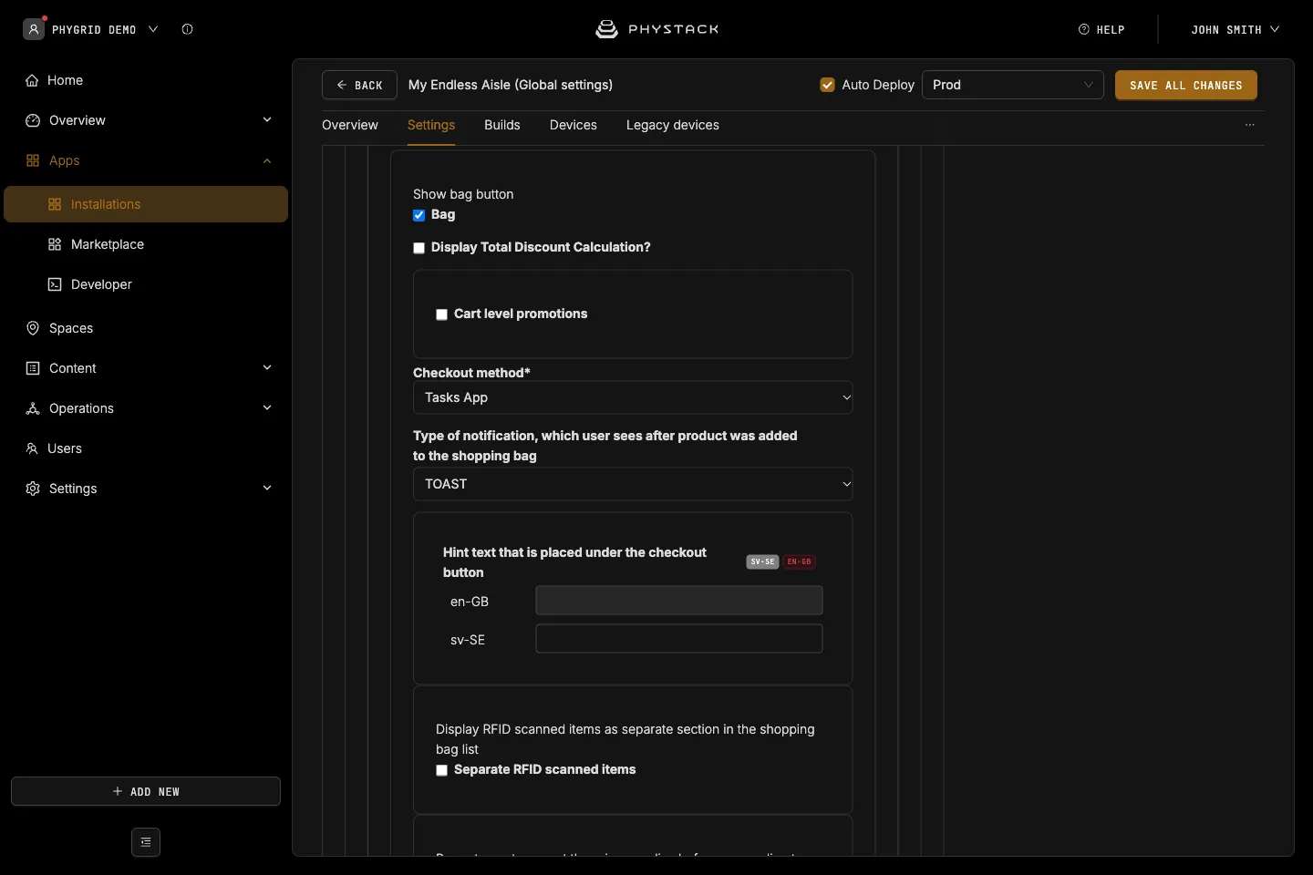
- Bag: Shows the Bag button and lets customers add products to a bag and check out. Default: off
- Display Total Discount Calculation?: Shows the original total and discount lines in the order summary and on printed receipts. Default: off
- Cart level promotions: Rechecks bag prices against the promotions API. Default: off
- Custom Store id: Overrides the store ID sent to the promotions API. If empty, the space’s external ID is used
- Checkout method: How the customer completes the order. Required. Default: Grid Checkout. See Choose a checkout method
- Type of notification, which user sees after product was added to the shopping bag: TOAST (default) shows a message on the product page, OMNIBAR shows it in the omnibar search field
- Hint text that is placed under the checkout button: Optional text under the checkout button in the bag
- Separate RFID scanned items: Lists RFID scanned items in their own section of the bag. Default: off
- Show privacy policy acceptance on checkout: Asks the customer to accept the Privacy Policy text before checkout. Only works with Print Barcode with Customer Info, and Tasks App. Default: off
Checkout method: Grid Checkout
The customer scans a QR code and pays on their phone. See Set up Grid Checkout.
- Modal title and Modal sub title: Texts on the payment screen. Default: “Checkout” and “Scan the QR code and checkout on your phone, and have the items delivered to your home.”
- Select Payment Method: The payment type from Settings → Checkout & payment. Use a Stripe online checkout type. Required
- Enable sales employee model: Adds a Staff button to the omnibar so staff can link their employee ID to the sale. Default: off
- Force show sales employee modal during checkout process: Opens the employee ID dialog automatically when no employee is linked. Default: off
Checkout method: External
The customer scans a QR code that opens your own web shop with the bag contents. See Set up external checkout.
- Checkout Label: Heading of the checkout screen. Required
- Checkout URL: Your checkout address. The bag is added as a
cartparameter. Required - Customize Options Label: Replaces the default “Home Delivery” heading and description with Scan QR option label and Scan QR description. Default: off
- Additional Checkout Parameters: Key and Value pairs added to the checkout address
Checkout method: Print Barcode
The kiosk prints a receipt with item barcodes that the customer takes to the till. Needs Select Printer to print. See Set up receipt printing.
- Receipt Logo: Logo printed at the top of the receipt (PNG or JPEG)
- No. of receipts to print: Copies printed per order. Required. Default: 1
Checkout method: Tasks App
The order is sent to a Tasks queue, and the customer gets a QR code and order number. See Set up checkout with Tasks.
- Exclude RFID scanned items on checkout: Leaves RFID scanned items out of the order. Default: off
- Tasks App → Queue: The queue of the Tasks installation that receives the orders. Required
- Enable Short Id Tag: Adds a short order ID tag to the ticket, with an optional Tag Icon and Tag Color. Default: on
- Checkout title, Modal title, Modal subtitle: Texts on the checkout screen
Checkout method: Print Barcode with Customer Info, and Tasks App
The customer fills in their details, the order is sent to a Tasks queue, and a receipt is printed. See Set up checkout with Tasks and Set up receipt printing.
- Displayed Delivery Options: Both Store Pickup and Home Delivery (default), Store Pickup only, or Home Delivery only
- Space Label: Maps a Space ID to a store name printed on the receipt
- Tasks App → Queue: The queue of the Tasks installation that receives the orders. Required
- Enable Short Id Tag: As for Tasks App. The short ID is also printed on the receipt. Default: on
- Receipt Logo and No. of receipts to print: As for Print Barcode
- Include VAT Number and Fiscal Code: Adds these fields to the form and the receipt. Default: off
- Shipping Cost: Adds a shipping cost from up to three Shipping Cost Calculation rules. The first matching rule is used. Default: off
- Promo Codes: Lets customers enter a promo code. Promo Codes Source is a public URL that returns the codes as JSON. Default: off
Product list, stock, and other features
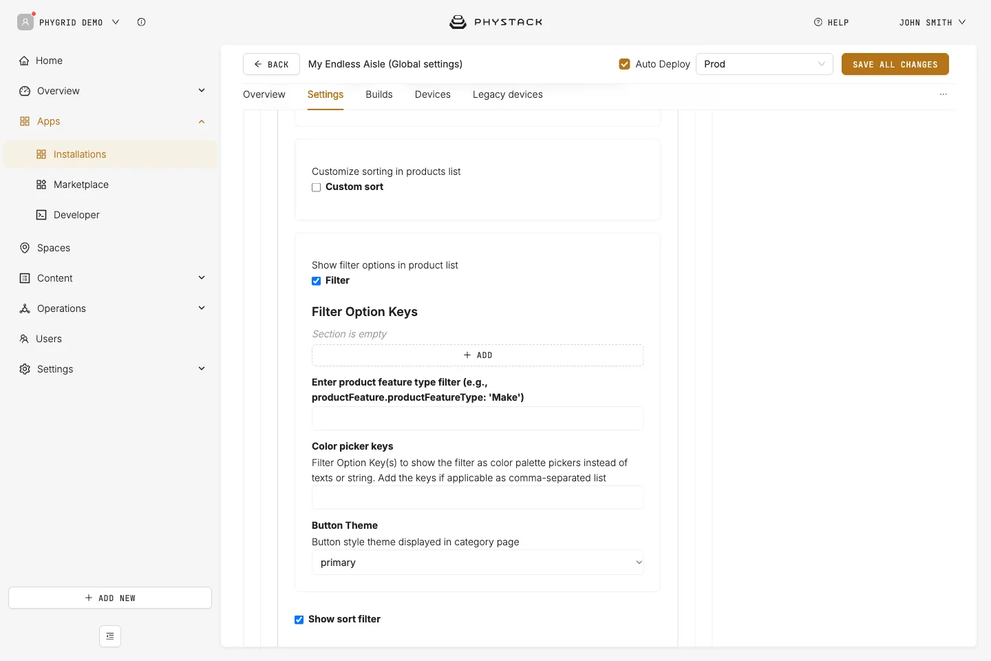
- Custom sort: Customises sorting in the Default product list. Default: off
- Use ‘ranking’ field as default sort: Sorts by the products’ ranking instead of name A to Z. Default: off
- Ranking sort label: Label of the ranking sort option
- Filter: Shows filters in the product list. Default: off
- Filter Option Keys: Each filter has a Label and a Key, a product feature type from your catalogue. Filters show in list order
- Enter product feature type filter: A parent filter key that narrows the other filters’ options, for example Make before Model
- Color picker keys: Comma-separated keys shown as colour swatches. Filter Focused layout only
- Button Theme: Style of the filter buttons, primary (default), secondary, light, or custom. Default layout only
- Show sort filter: Shows the sort dropdown. Default layout only. Default: on
- Show price filter: Shows the price range filter. Default layout only. Default: on
- Product external availability check: Adds Current Store, Online, and Nearby Stores stock tabs on the product page. Needs an external inventory integration. Default: off
- Market ID, Store Sales Channel ID, Radius meter: Required. Radius meter default: 5000
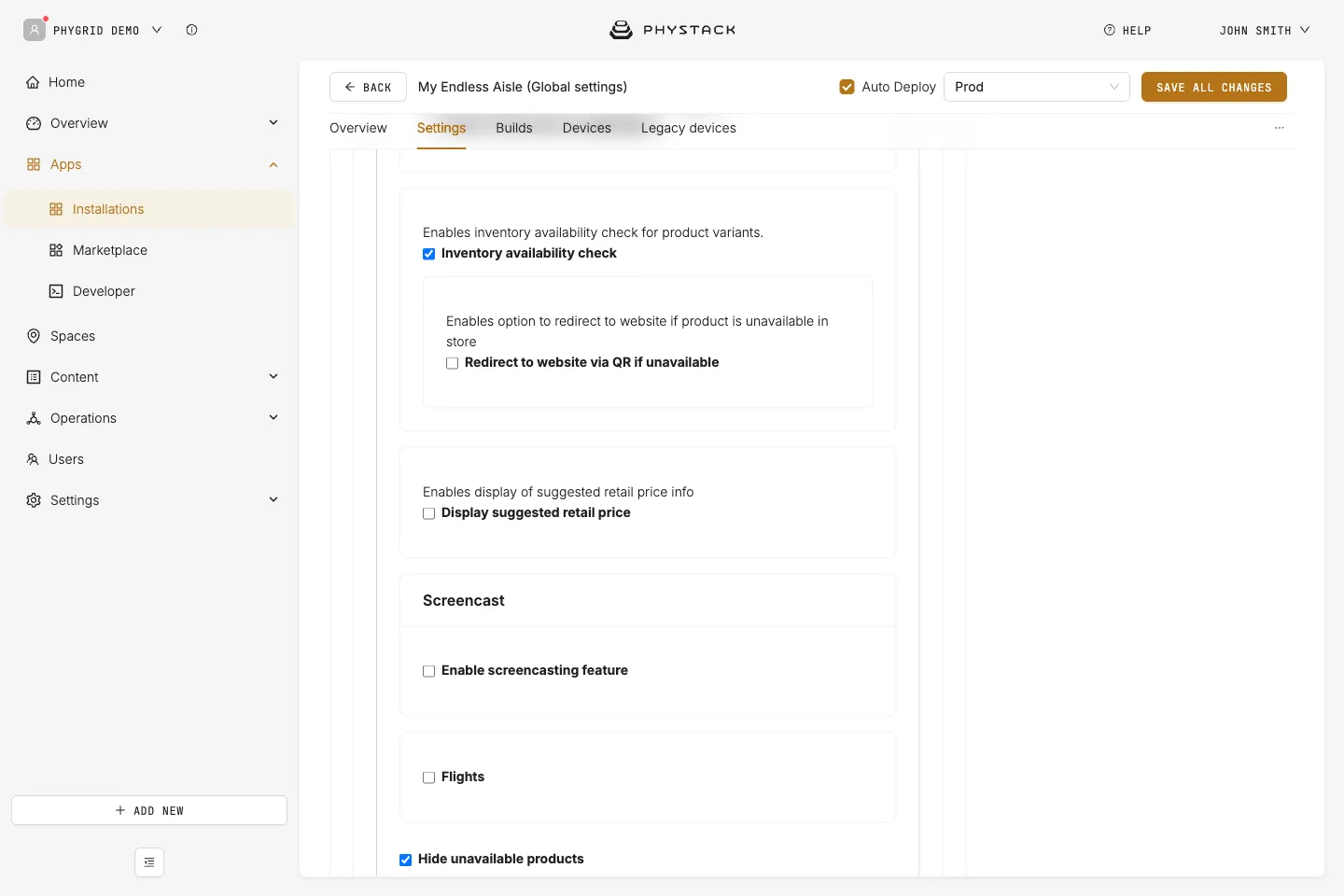
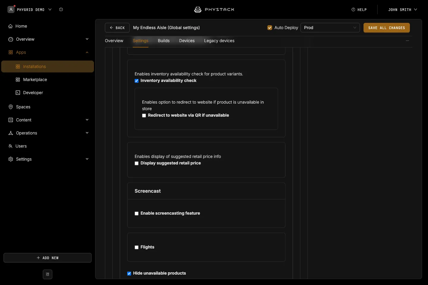
- Inventory availability check: Shows variants without stock in the kiosk’s spaces as out of stock and disables Add to bag for them. Default: on
- Redirect to website via QR if unavailable: Shows a QR code to your web shop next to the out-of-stock button. Redirect website URL (the product group ID is added to it), Redirect Label, and Redirect QR instruction are required. Default: off
- Display suggested retail price: Shows the suggested retail price on product cards. Default: off
- Use suggested retail price as base price: Uses it as the product’s base price. Default: off
- Screencast: Lets customers send a product to a nearby signage screen. Default: off
- Enable feature to all devices under the installation: Default: on
- Force to screencast to this deviceId and Specify endless aisle device IDs allowed to screencast: Not used by the current app version
- Flights: Opens a flight information page when a boarding pass is scanned. Departure Airport Code and Aviationstack api key are required. Default: off
- Hide unavailable products: Hides products without stock from product lists, search, and recommendations. Not applied to the Filter Focused layout or banner product lists. Default: on
Idle
The screen shown while nobody uses the kiosk. Returning to idle clears the bag and resets the language. See Set up the idle screen.
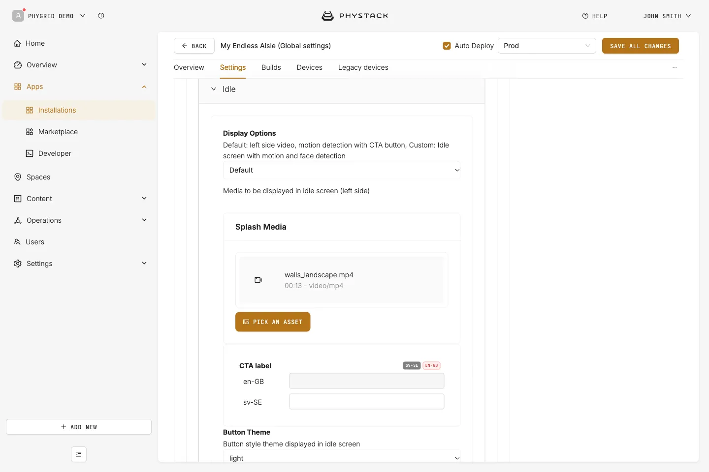
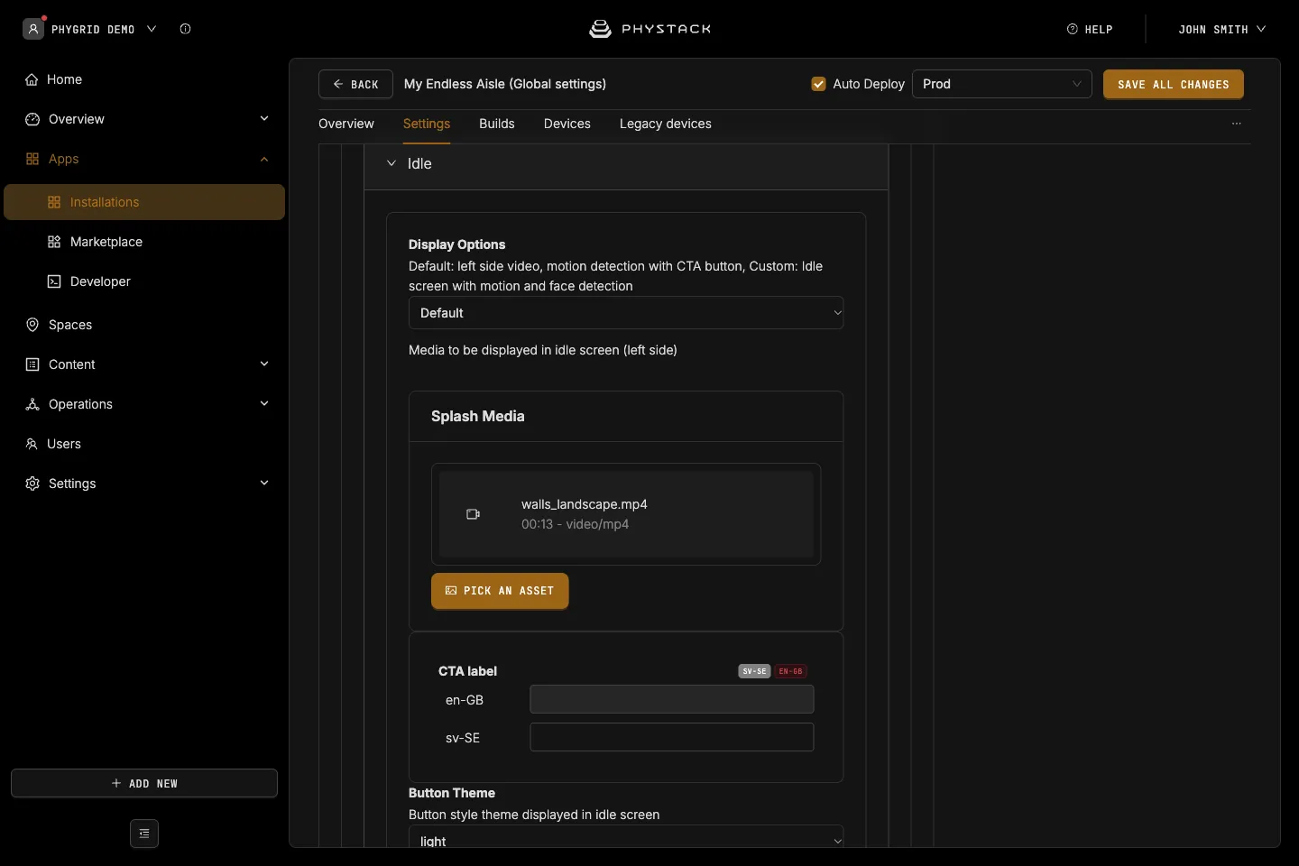
- Display Options: The idle screen type. Default: Default
- Default: Splash Media on one side and a call-to-action button on a coloured panel
- Full Screen: Splash Media across the whole screen, with an optional button
- Custom (Home Screen): The home screen banners and categories, which start a session when tapped
- Splash Media: Image or video shown on the idle screen. Videos play muted in a loop
- CTA label: Text of the call-to-action button. Default: “Tap to get started”
- Show CTA Button (Full Screen only): Default: on
- CTA Button Position (Full Screen only): top, center (default), or bottom
- Button Theme: Style of the button, primary, secondary, light (default), or custom
- Background Theme: Theme colour of the panel next to the media, primary (default), secondary, light, dark, mainScreen, or secondaryScreen. Not used by Full Screen
- Customize Container with CSS, Customize Content with CSS, Customize Banner Container Section with CSS, Customize Category Container Section with CSS: Not used by the current app version
Product types
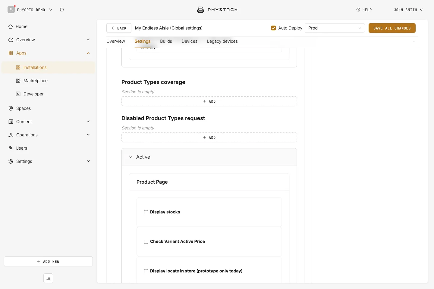
- Product Types coverage: Product type IDs the kiosk includes in search, product pages, barcode scans, and recommendations, with their child types. Shows all product types if empty
- Disabled Product Types request: Product type IDs, with their child types, whose products can’t be added to the bag
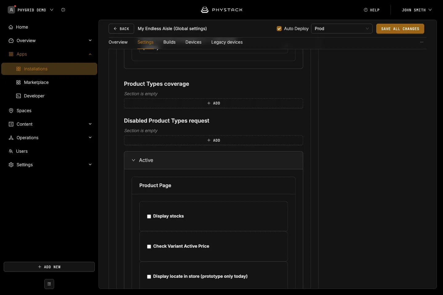
Active
Product page
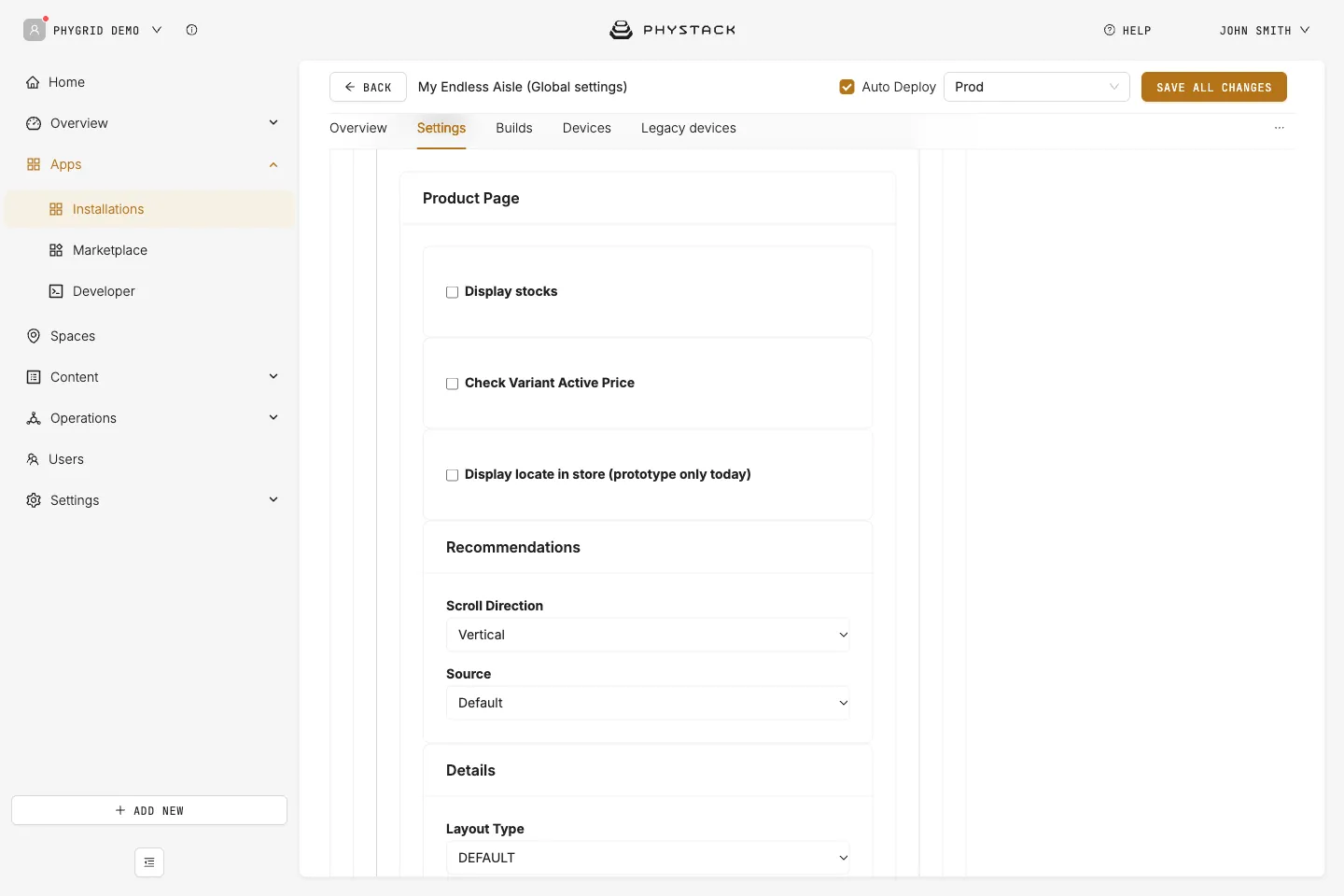
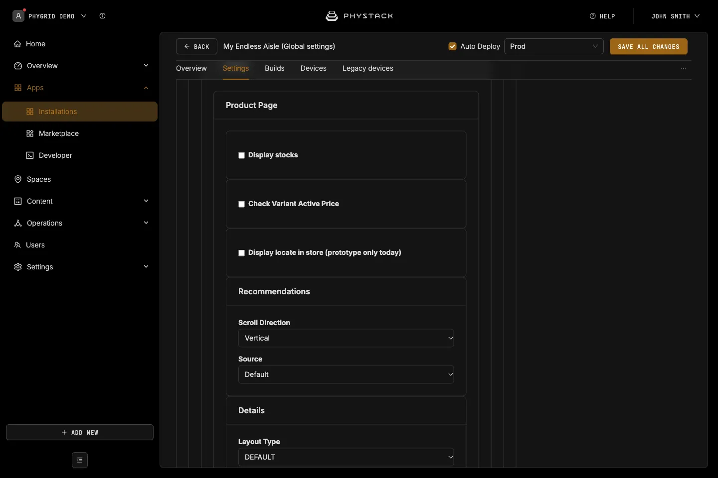
- Display stocks: Shows the stock quantity on the product page, per space if you include other spaces. Default: off
- Check Variant Active Price: Rechecks the selected variant’s price against the promotions API. Default: off
- Original active price to bag: Adds the catalogue price to the bag instead of the rechecked price. Default: off
- Custom Store id: Overrides the store ID sent to the promotions API
- Display locate in store (prototype only today): Adds a Find in Store panel next to Add to bag. Default: off
Recommendations
- Scroll Direction: Vertical (default) or Horizontal
- Source: Where recommendations come from, Default (your product catalogue), Streamoid, or UNBXD. Default: Default
- Streamoid Refresh Token or UNBXD API Key and UNBXD Site Key: Credentials for the selected source. Required
- Inclusion: Similar Items and Complete the Look, Similar Items, or Complete the Look. Required
Details
- Layout Type: The product page design, DEFAULT (default) or VERSION 1
- Color picker border type: Shape of the colour swatches, ROUNDED (default) or STRAIGHT
- Show QR code for product link: Shows a QR code to the product’s link from your catalogue. Default: off
- Product QR code title and Product QR code subtitle: Texts next to the QR code
- Additional query strings: Query string key and Query string value pairs added to the link
- Show custom details content (DEFAULT layout): Shows the HTML Content below the price. Default: off
- Custom HTML content if product is available in store (VERSION 1 layout): HTML shown below the short description when the product is in stock in the store
- Display Other Product Features Content (VERSION 1 layout): Product feature type keys whose values are shown on the product page
- Display Features Info: Groups of product features shown above the description. Each group has a Title and a Features List of Feature Title and Key pairs. In the DEFAULT layout, Product features info placement shows a group inline (BUILT-IN, default) or in a slide-out panel
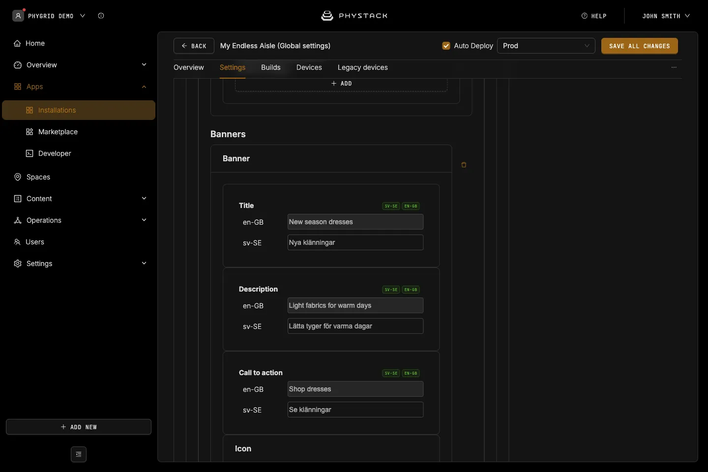
Home: Banners
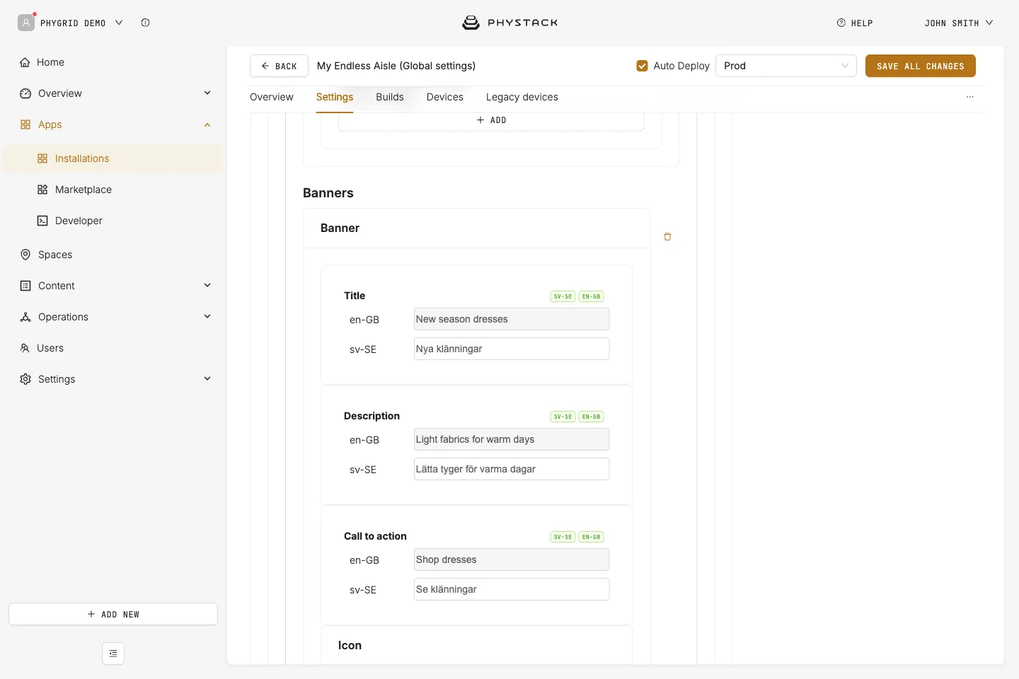
Full-width tiles at the top of the home screen. See Set up the home screen.
- Title, Description, Call to action: Texts on the banner
- Icon: Image shown after the call-to-action text. Set as Active is not used by the current app version
- Background → Type: IMAGE or VIDEO, then the media file. Videos play muted in a loop. CSS is not used by the current app version
- Styles: CSS for the banner’s Title, Description, Call to action (class
.icon), Container, and Content - On click → Type: What tapping the banner does. Required
- Show Category: Opens the product list of a Category ID (a product type ID). Enable Category Menu and Enable Filters (both default on) show the category menu and filter bar in landscape. Enable Guided Selling Assistant adds a chat box from a conversation script that applies filters
- Show Product: Opens the product page of a Product ID (product group ID)
- Show list from Product Ids: Lists the products for a Banner ID from a Banner Excel File with the columns bannerId, spaceId, and productId
- Custom Home Screen: Opens a secondary home screen with its own Custom Home Banners and Custom Home Categories, identified by Home screen ID
- Display Custom Modal: Shows Modal HTML content in a dialog
- Show Flight departures: Not used by the current app version
- Show installation, image, or video in modal: Plays an image, video, or another installation in a dialog
- None: The banner isn’t clickable
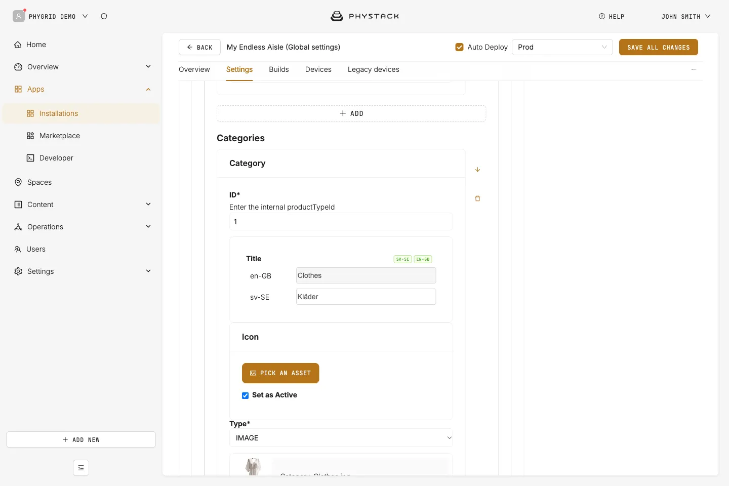
Home: Categories
Tiles below the banners that open a product list. Required in practice: add at least one category so the home screen has content.
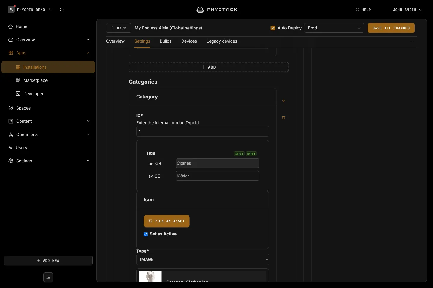
- ID: The product type ID the tile opens. Required
- Title: Text on the tile. Required
- Icon: Image shown next to the title on the home screen. Set as Active is not used by the current app version
- Background: IMAGE or VIDEO, as for banners. CSS is not used by the current app version
- Styles: CSS for the tile’s Container, Content (class
.icon), and Title
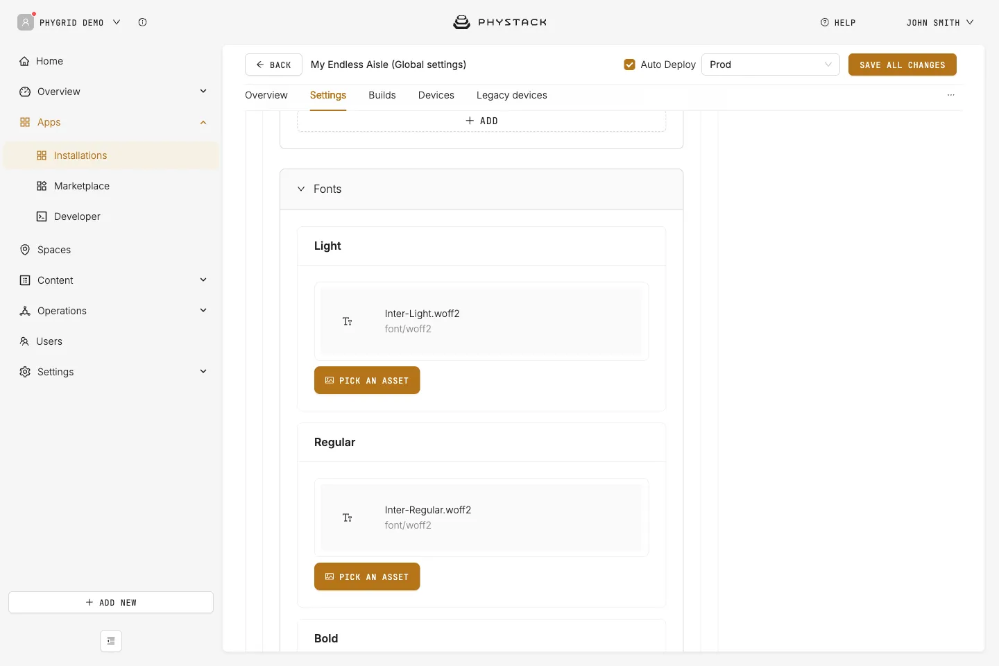
Fonts
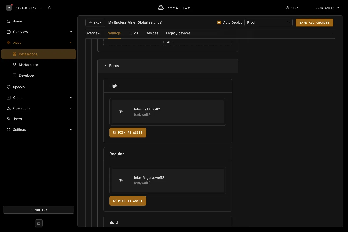
- Light, Regular, Bold: Font files (WOFF2, TTF, or OTF) applied to all text. Required
Product Card Style Override
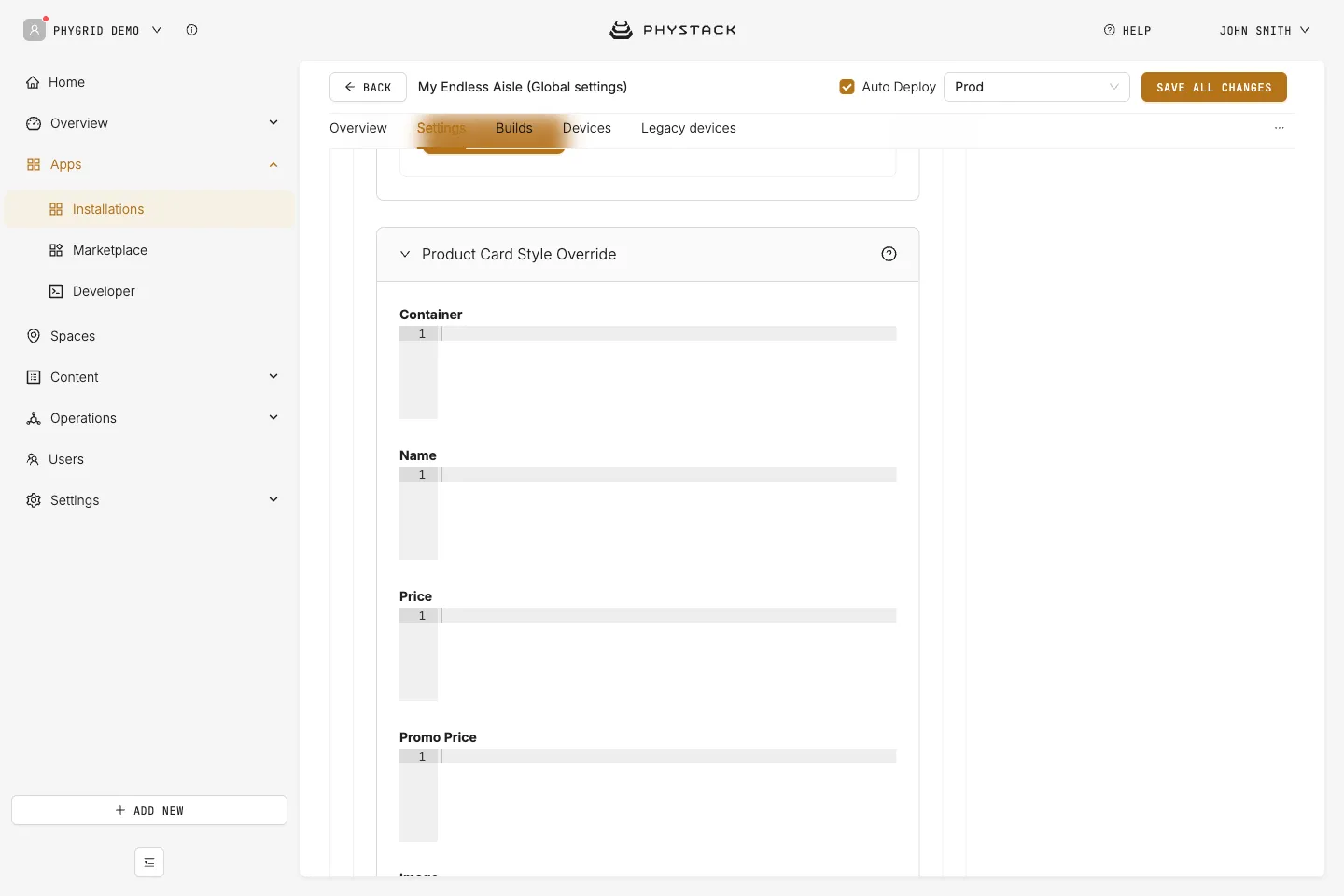
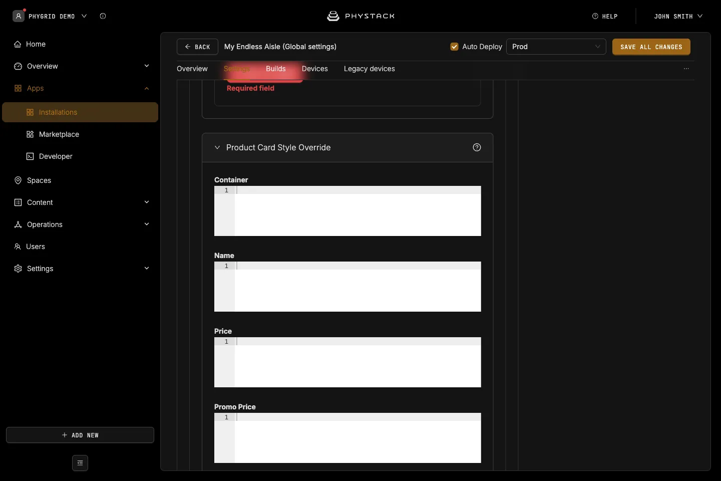
CSS applied to every product card in product lists, search, banner lists, and recommendations.
- Container, Name, Price, Promo Price, Image, Brand: CSS for each part of the card. Promo Price replaces Price styling when a product has a slashed price
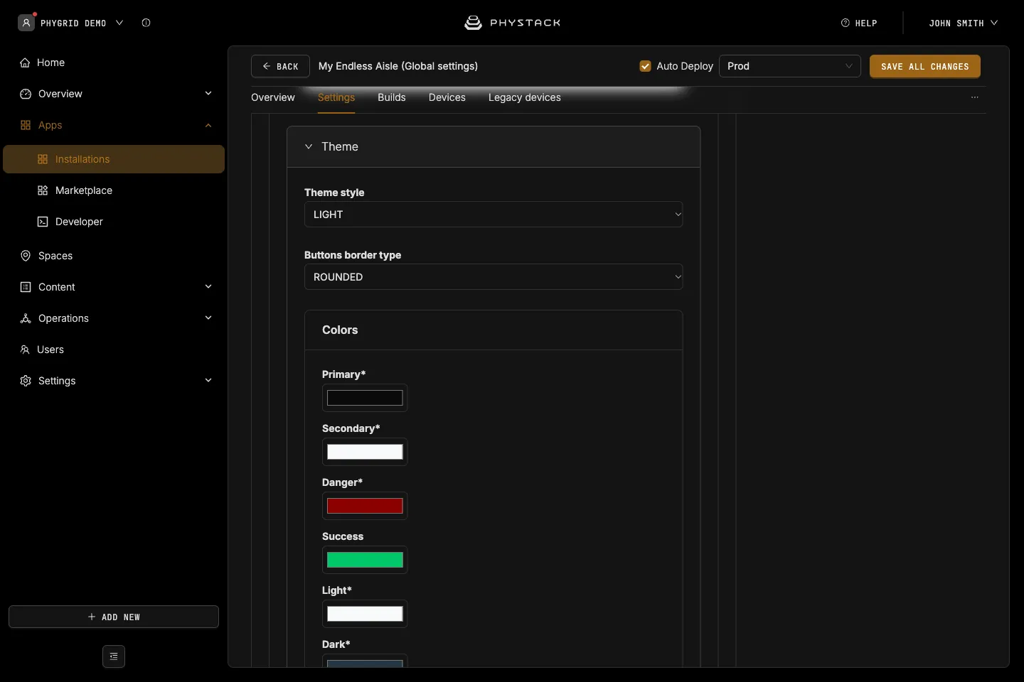
Theme
See Customise the look of Endless Aisle.
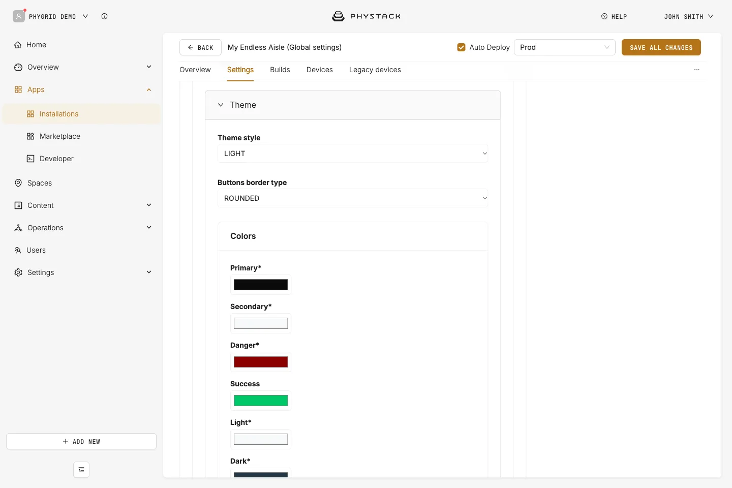
- Theme style: LIGHT (default) or DARK. Swaps light and dark text colours in several places
- Buttons border type: Corners of buttons, product cards, and dialogs, ROUNDED (default) or STRAIGHT
- Colors: All colours except Success are required
- Primary: Header bar, primary buttons, and accents. Default: #007bff
- Secondary: Secondary buttons. Default: #f8f9fa
- Danger: Errors and out-of-stock indicators. Default: #8B0000
- Success: In-stock indicators. Default: #00C76A
- Light: Light text and backgrounds, and button text on Primary. Default: #f8f9fa
- Dark: Main text colour. Default: #253746
- Promo: Promo price highlight. Default: #E07511
- Border: Dividers and borders. Default: #d1d1d1
- Ominibar and Keyboard Background Color: Default: #f8f9fa
- Main Screen Background Color: Page background. Default: #ffffff
- Secondary Screen Background Color: Dialogs and slide-out panels. Default: #f8f9fa
- Background for variant selector: Default: #d1d1d1
- Redirect icon indicator color: Default: #E07511
- Shadows: CSS box-shadow values for Small, Medium (banner and category tiles, dialogs), and Large
Save options
- Auto Deploy: If selected, changes are saved, and a build is created and deployed to connected devices (see Glossary)
- Environment: The deployment environment
- Save all changes: Saves your current configuration