

Some Endless Aisle settings accept CSS, so you can change how one element looks, for example the text size on a banner. There’s no field for CSS across the whole app: each CSS field styles one element and the elements inside it.
How CSS fields work
-
Write CSS declarations for the element the field belongs to, without a selector:
border-radius: 0; background-colour: #000; -
To style an element inside it, use a nested rule with one of its stable class names:
.icon { width: 60px; height: 60px; } -
Your CSS only applies to that element, so it can’t break other parts of the kiosk
-
Only target the class names listed on this page. Other class names are generated when the app is built and change with each new version
Which settings accept CSS
| Setting | Styles | Class names inside |
|---|---|---|
| Layout → Customize Omnibar with CSS | The bar at the bottom of the screen, on all screens except search | .omnibar-background, .omnibar-search-field |
| Banner Styles → Container, Content, Title, Description, Call to action | One banner: the whole tile, its text block, the title, the description, and the call-to-action row | .icon in Call to action |
| Category Styles → Container, Content, Title | One category tile, its title bar, and the title | .icon in Content |
| Product Card Style Override → Container, Image, Brand, Name, Price, Promo Price | Every product card: the card, the image, the brand, the name, the price, and the promotional price | img.lazyload in Image |
| Powered by logo → Customize with CSS | The “powered by” logo on the idle screen | .powered-by-image |
| Guided selling assistant → Customize Heading with CSS, Customize Footer with CSS, Customize Chat Box Container/Content with CSS | The assistant on a category’s product list | .heading, .text, .sub-text, .divider, .btn-reset, .btn-close, .content, .chat-question, .chat-response, .chat-bubble-option, .chat-recommendation |
| Theme → Shadows | Shadow values, not full CSS: for example 0 8px 16px rgba(0, 0, 0, .15) |
Banner and category titles are white by default. Change their colour with the Title style field of each banner or category.
How to style a banner
-
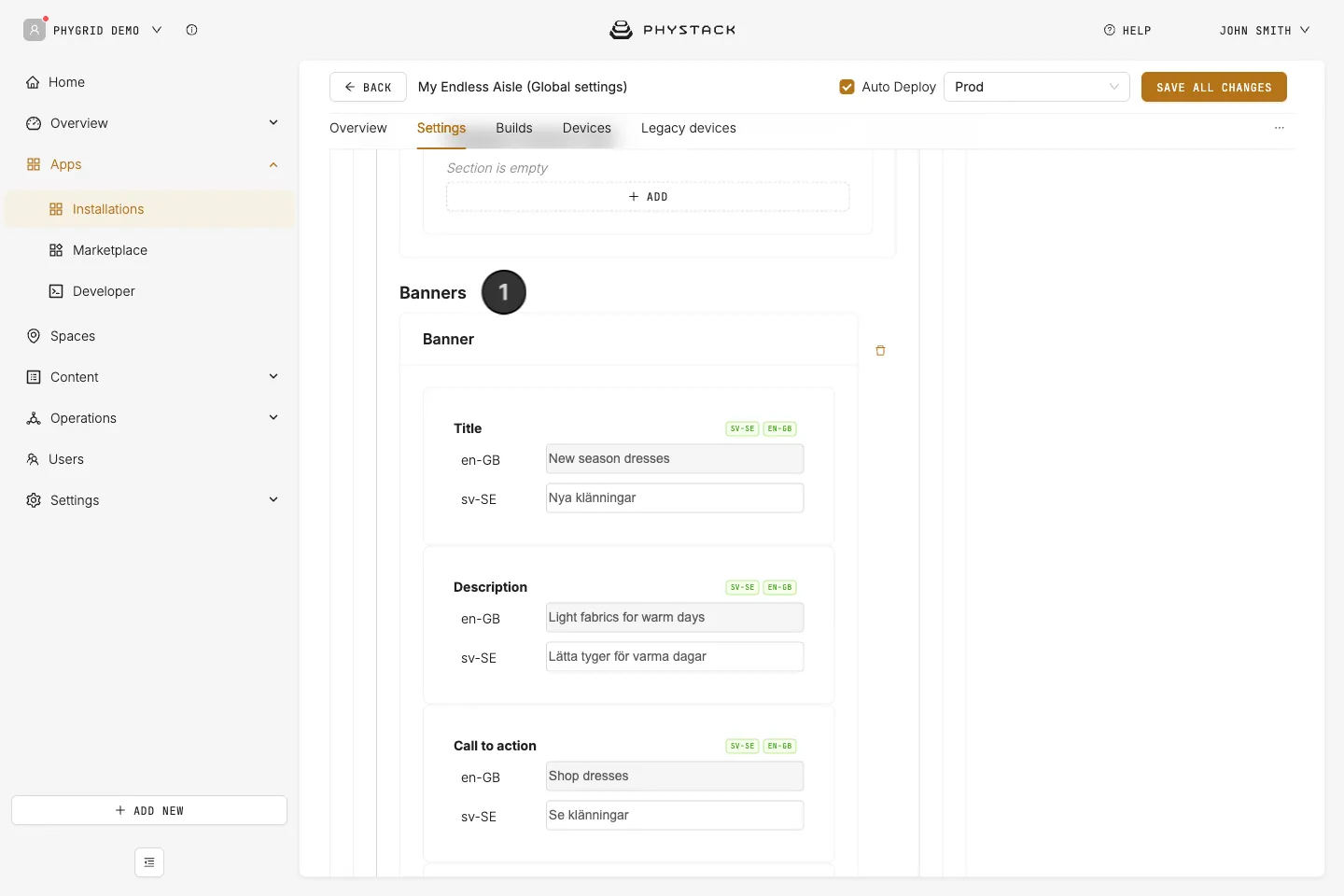
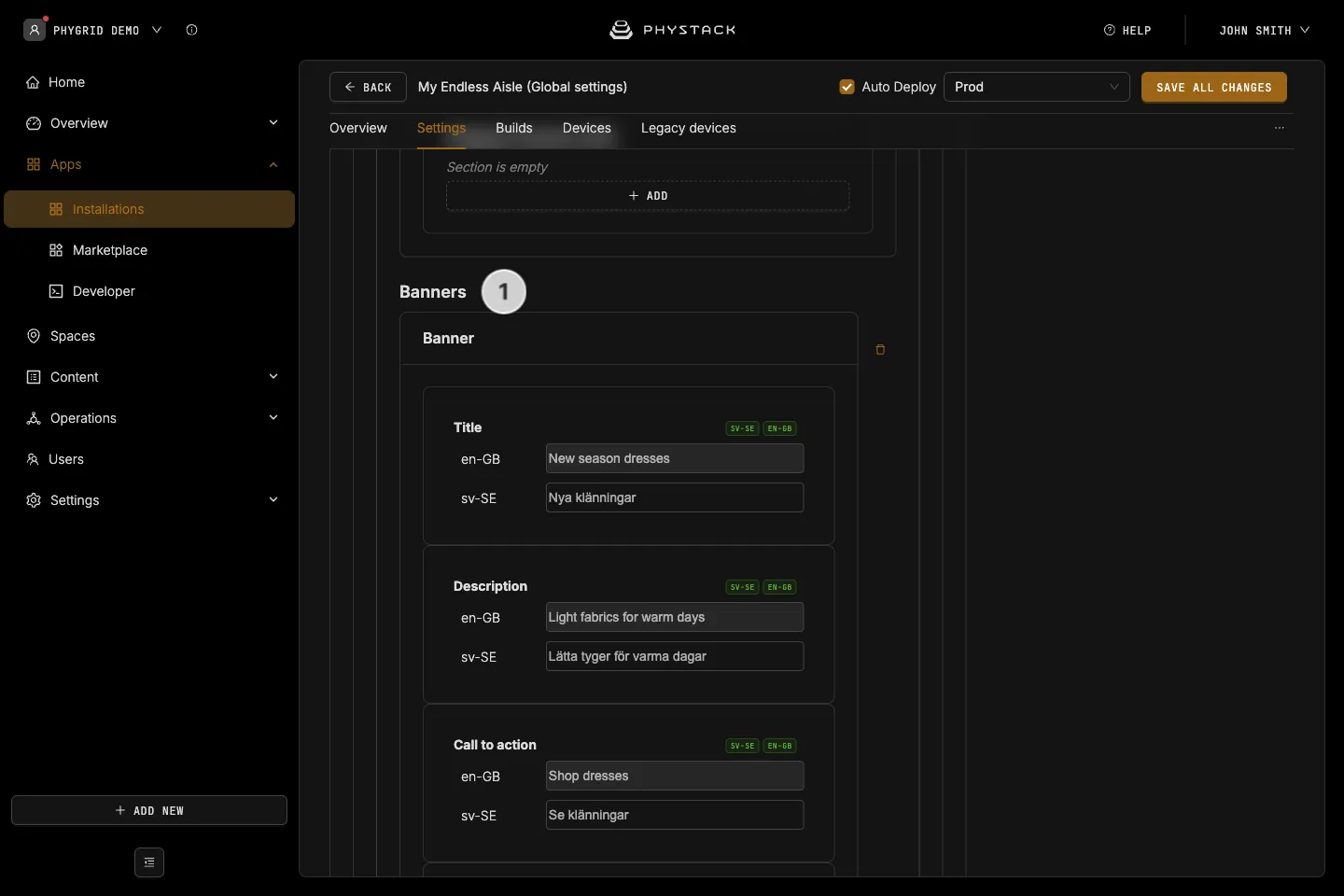
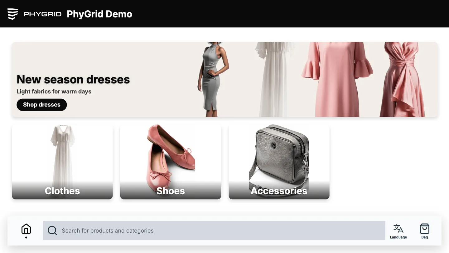
Expand Active → Home → Banners and open the banner
-
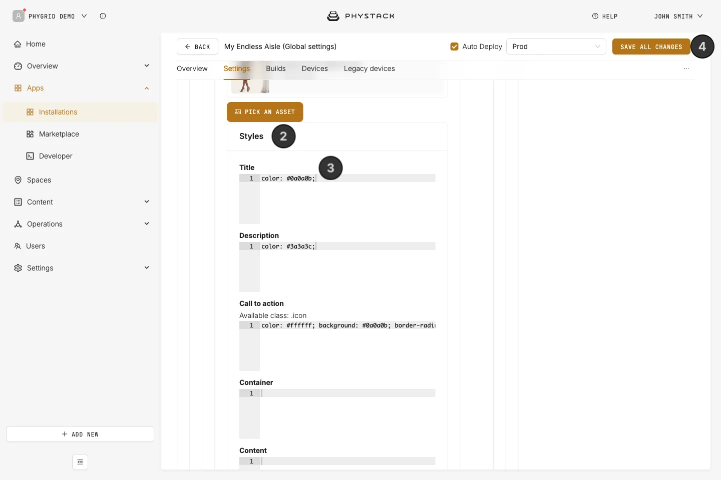
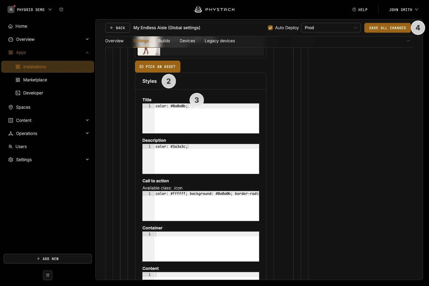
Expand Styles
-
Enter CSS in the field for the part you want to change, for example in Title:
font-size: 48px; colour: #1a1a1a; text-transform: uppercase; -
Click Save all changes and check the result on the kiosk
How to change the layout of tiles
The home screen lays out banners and categories on a grid of 12 columns, or 6 columns on a portrait screen. Each tile takes a number of columns:
- Banners: the full width, 12 columns, or 6 on a portrait screen. 320 px high, or 554 px on a portrait screen
- Categories: 3 columns, so four fit in a row, or two on a portrait screen. 320 px high, or 15% of the screen height on a portrait screen
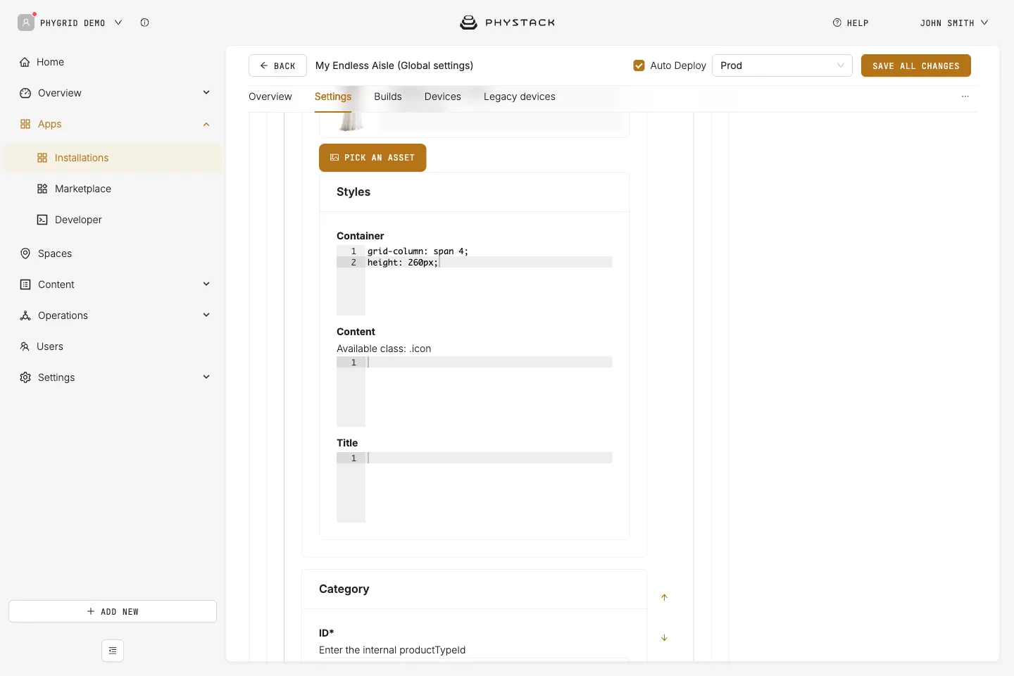
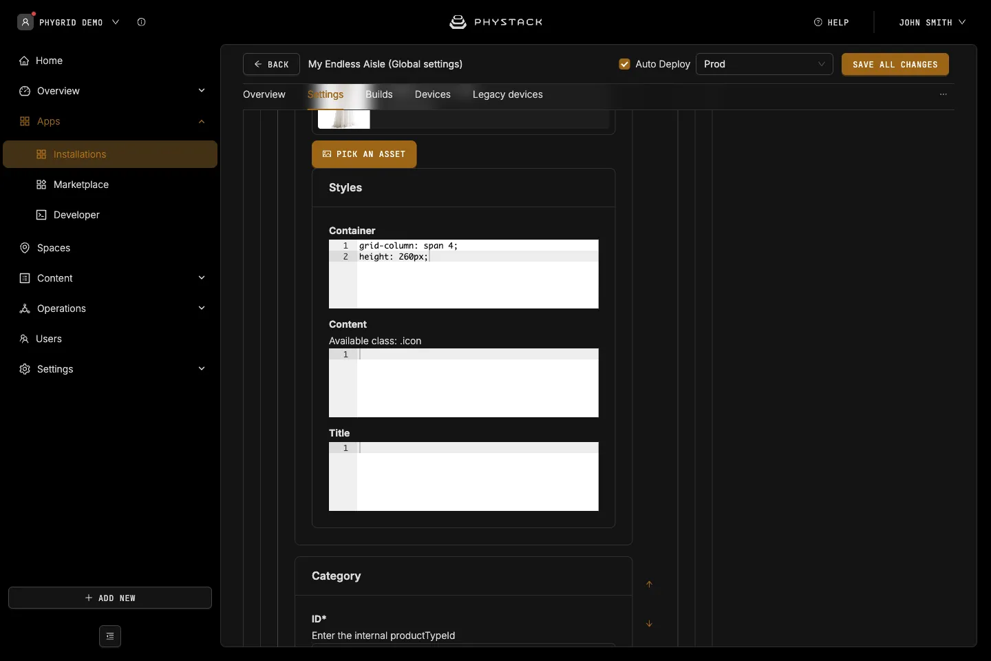
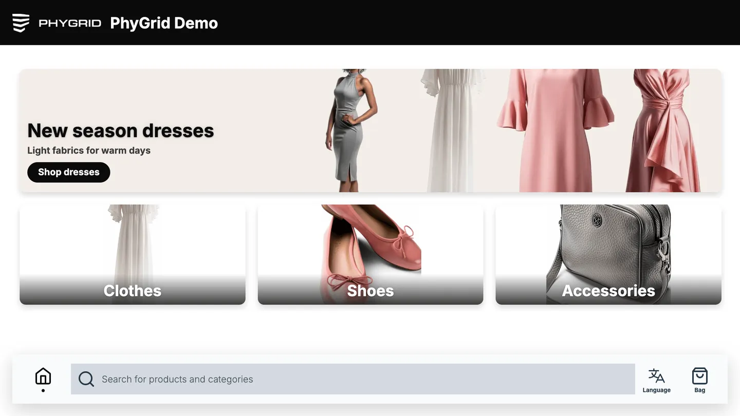
The Container style field of a banner or category is applied to the tile itself, so you can change how many columns it takes and its size. For example, to fit three categories in a row instead of four, add this to the Container field of each category:
grid-column: span 4;
height: 260px;
Columns per tile (grid-column) | Tiles per row, landscape |
|---|---|
span 12 | 1 |
span 6 | 2 |
span 4 | 3 |
span 3 (default for categories) | 4 |
span 2 | 6 |
To put two banners side by side, give both grid-column: span 6;.
A portrait screen has 6 columns instead of 12. To set a different layout for portrait, add a media query to the same field:
grid-column: span 4;

@media (orientation: portrait) {
  grid-column: span 3;
}
Use the same value on every tile in a row, so the row stays even. Inside a tile, the Content field styles the text block, which you can arrange with flexbox, for example align-items: center; to centre the title.
How to style all product cards
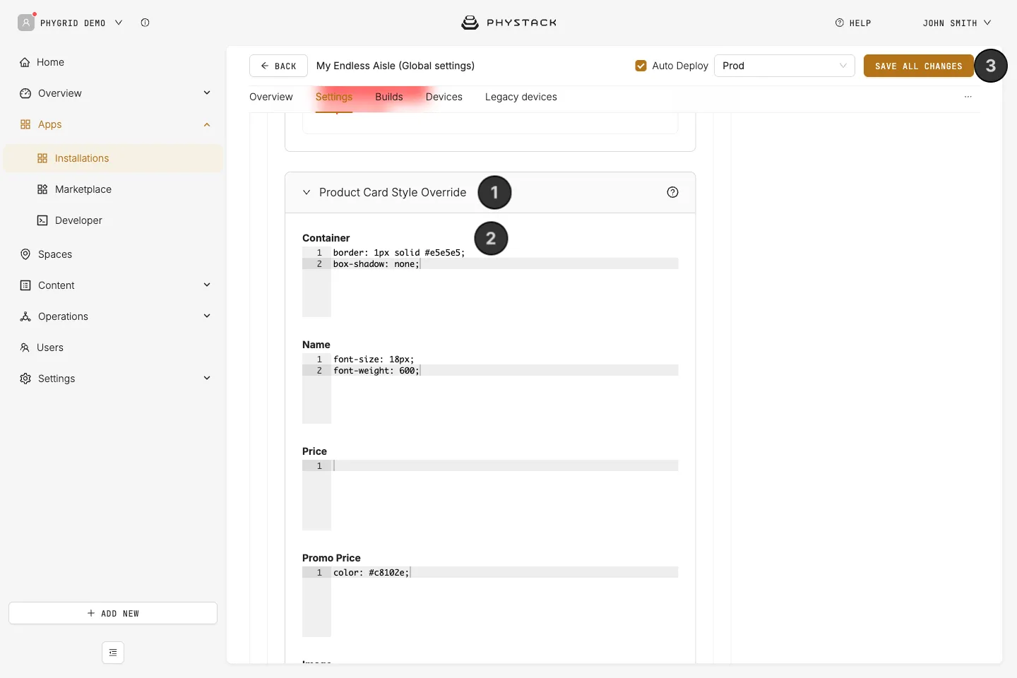
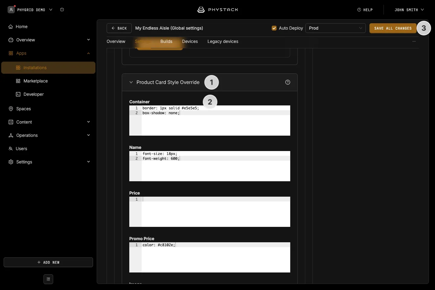
- Expand Product Card Style Override
- Enter CSS in the fields for the parts you want to change, for example:
- Container:
border: 1px solid #e5e5e5; box-shadow: none; - Name:
font-size: 18px; font-weight: 600; - Promo Price:
color: #c8102e;
- Container:
- Click Save all changes
The changes apply to product cards everywhere: category lists, search results, and recommendations.
Tips
- Prefer the theme colours, fonts, and shapes for brand-wide changes, and use CSS for exceptions on single elements. See Customise the look of Endless Aisle
- Test on the kiosk screen in its real orientation. Banners and tiles have different sizes in portrait and landscape
- Keep a copy of your CSS outside the Console, so you can restore it after testing changes