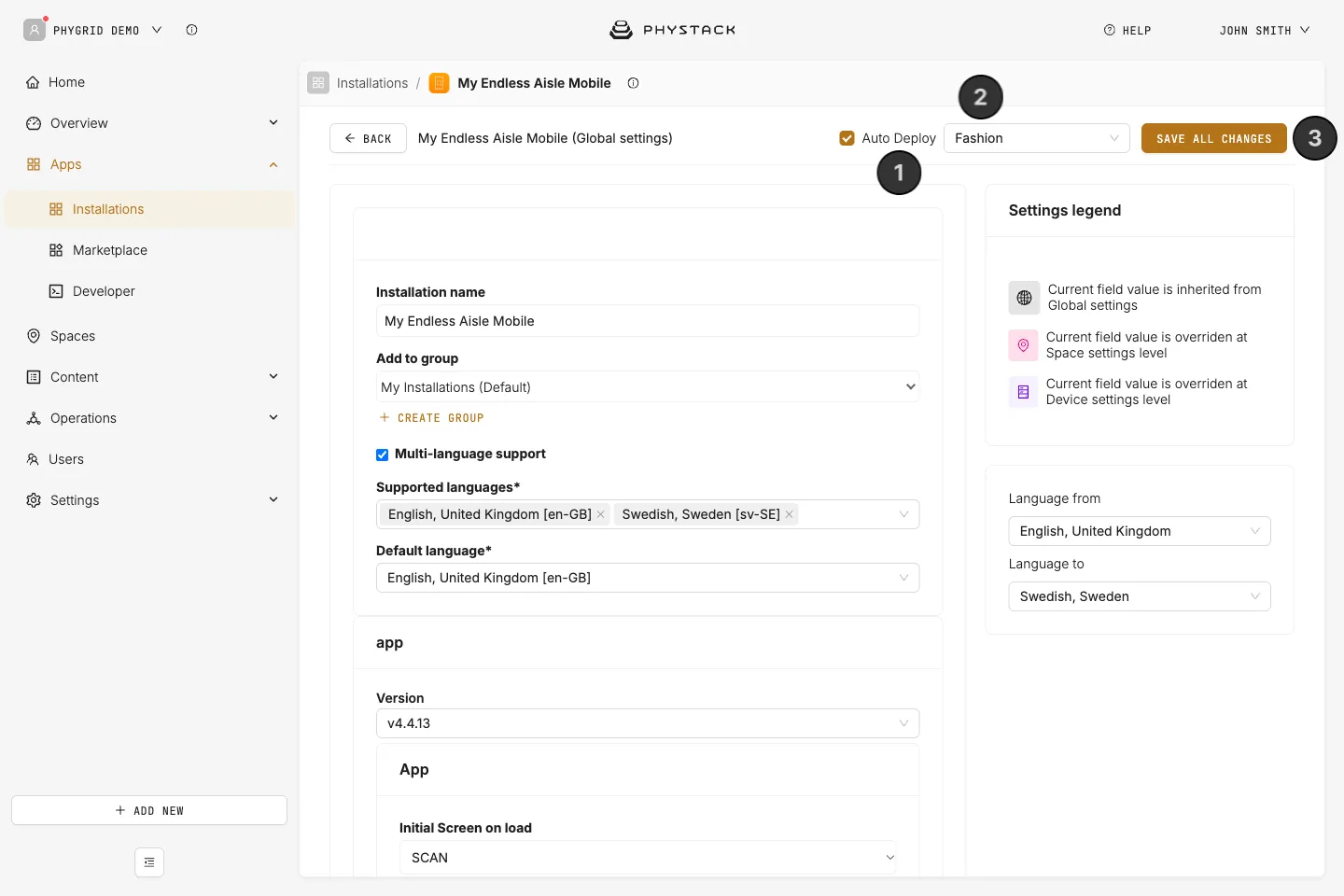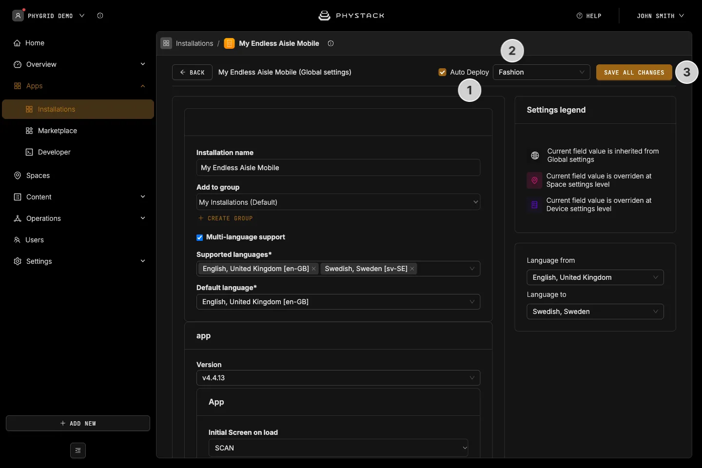

Endless Aisle Mobile is a web app that shoppers open on their own phone. Settings are listed in the order the Console shows them. See Set up Endless Aisle Mobile.
Console settings
- Installation name: The installation name shown in Apps → Installations
- Add to group: The installation group it belongs to in Apps → Installations
- Multi-language support: The languages the app can show and you can write texts in. Languages come from the installation, not from the app settings below (see Glossary)
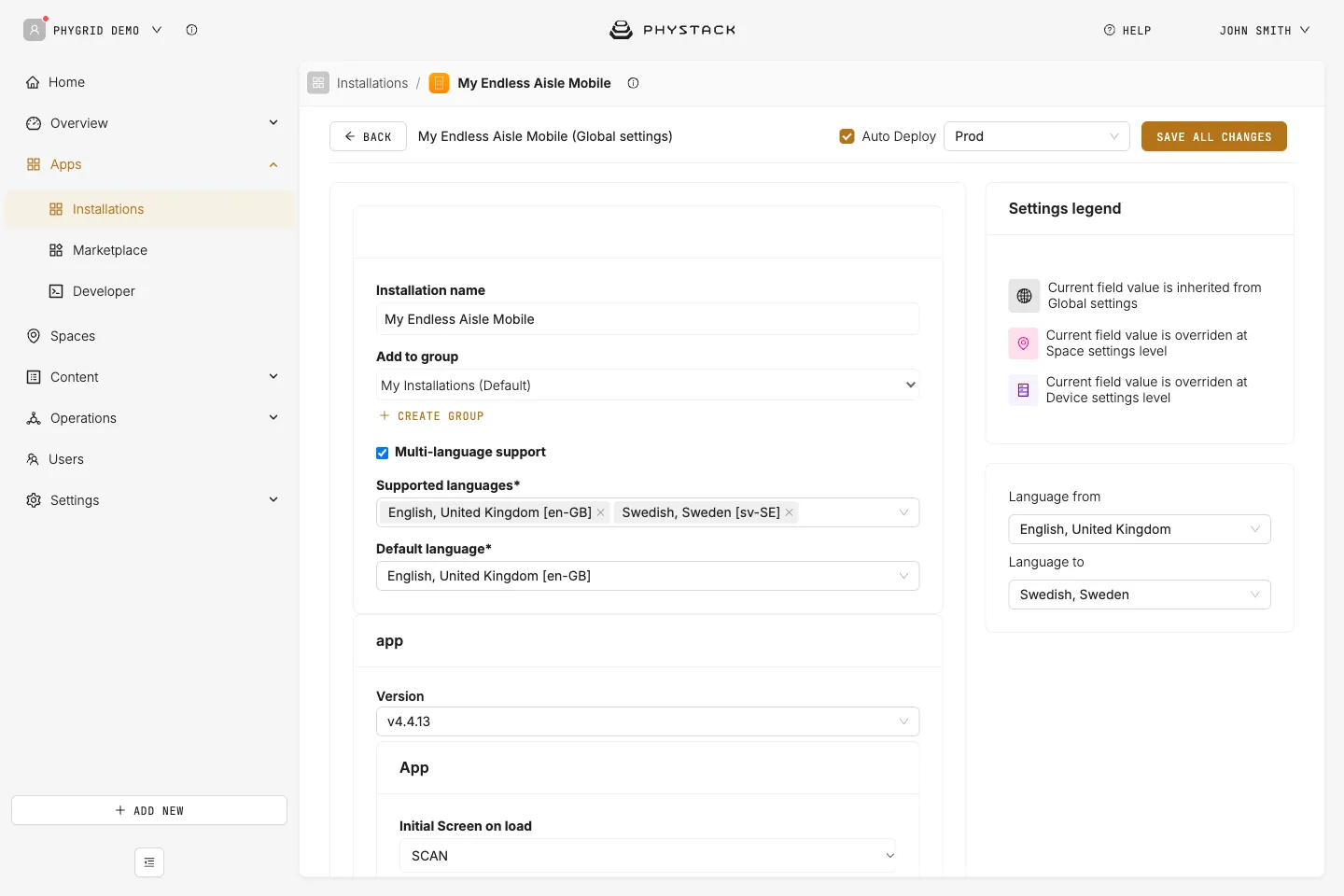
App version
Changing the app version can add or remove certain options related to the specific version.
- Version: The app version used by your installation
App
- Select Barcode Scanner to use: Not used by the current app version. The app scans barcodes with the phone camera
- Initial Screen on load: The first screen shoppers see, SCAN (default) for the barcode scanner or HOME for the home screen
- Show Powered by Ombori: Shows a small “powered by” logo. Default: off
- Customize with CSS: CSS for the logo. Available class:
.powered-by-image
- Customize with CSS: CSS for the logo. Available class:
- Include data from specific spaces: Adds products from other spaces to the mobile endpoint’s own space. Default: off
- Device Space Id (the one configured in device settings for In-store): Title to be displayed for the specified space for the endpoint’s own space
- Additional Spaces: Space ID and Title to be displayed for the specified space for each extra space
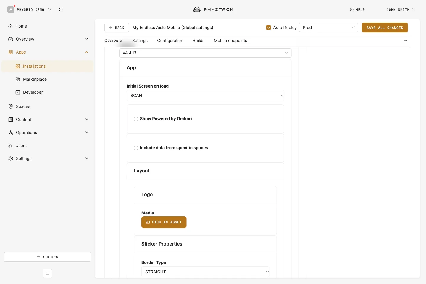
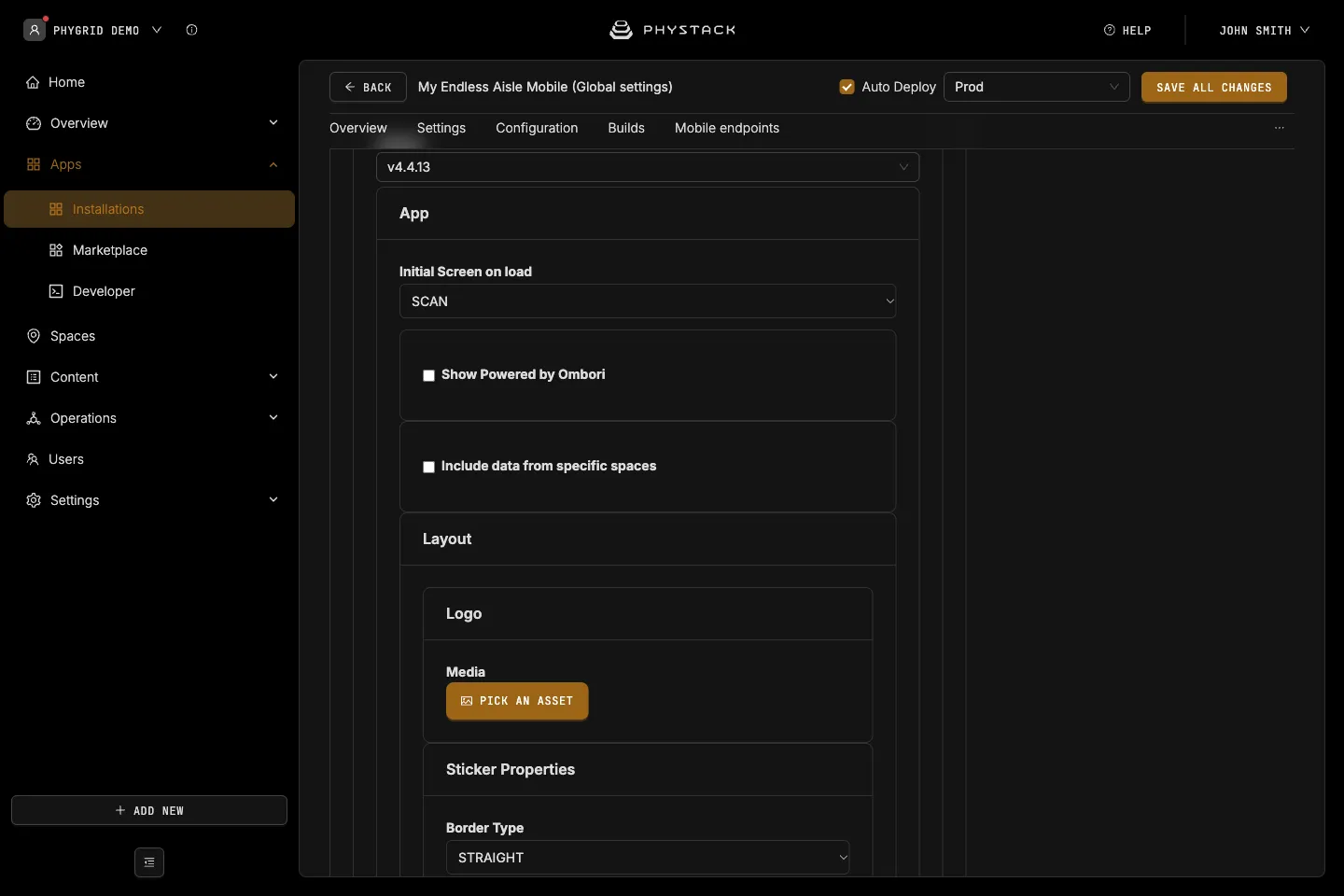
Layout
- Logo: Your logo (PNG, JPEG, or SVG)
- Sticker Properties → Border Type: Shape of the product label stickers, ROUNDED or STRAIGHT. Default: STRAIGHT
- Sticker Properties → Custom style on sticker value: Colours a sticker whose text matches Sticker value, with a Background color (default #cf2b1f) and Text color (default #ffffff)
- Omnibar Version: Default or Scan Focus, a bottom bar layout that emphasises scanning. Default: Default
- Omnibar Layout type: Shape of the bottom bar, ROUNDED or STRAIGHT. Default: STRAIGHT
- Product description placement: Shows the description inline (BUILT-IN, default) or in a slide-out panel (SLIDE-OUT)
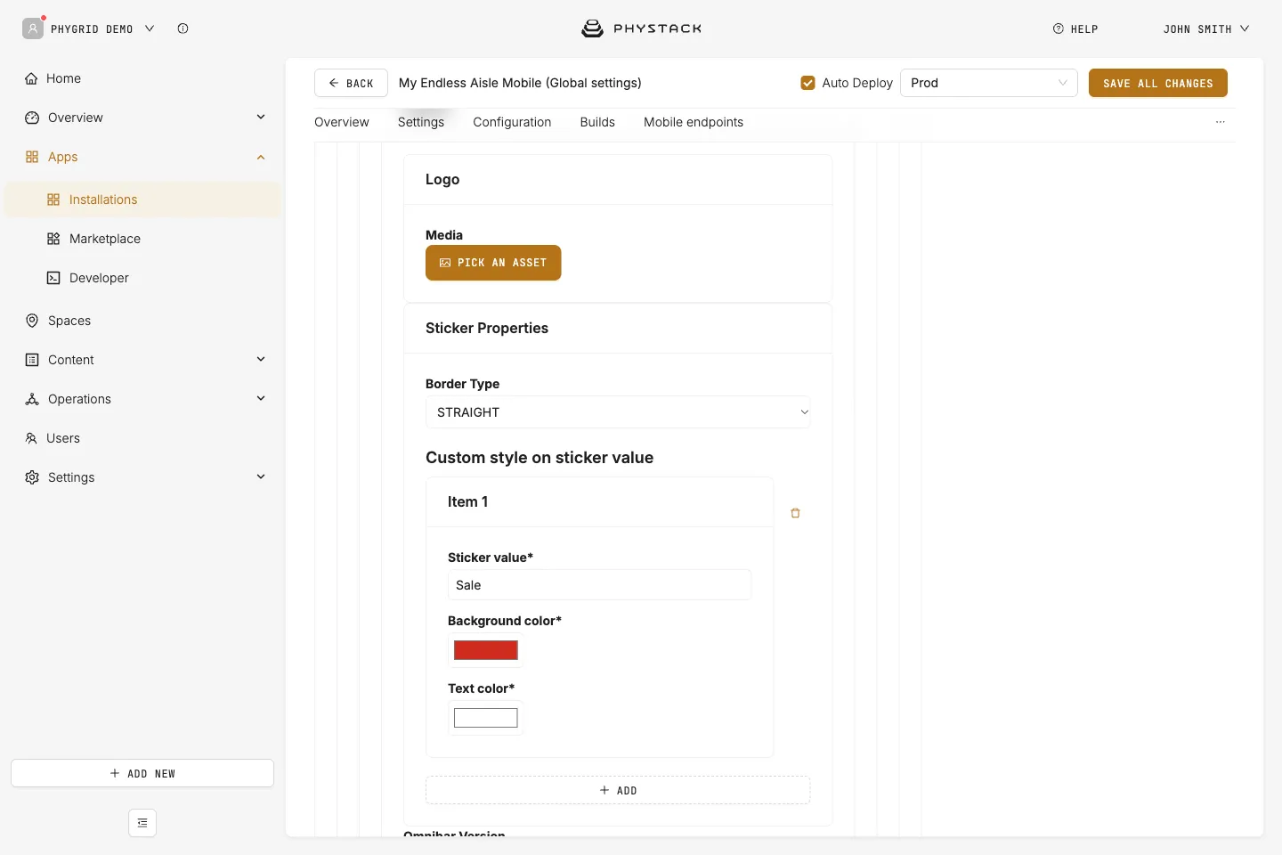
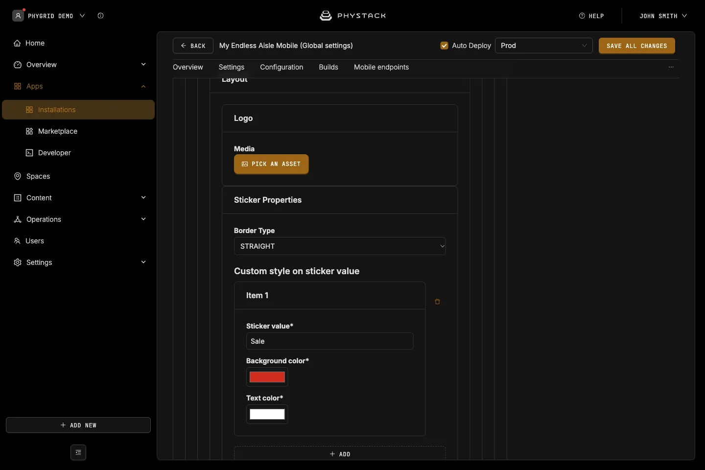
Features
- Language Picker: Shows a language picker when the installation has two or more languages with built-in translations. Default: off
- Filter: Shows filters in the product list. Default: off
- Filter Option Keys: Each filter has a Label and a Key, a product feature type from your catalogue
- Button Theme: Style of the filter buttons, primary (default), secondary, light, or custom
- Inventory availability check: Shows variants without stock in the app’s spaces as out of stock. Default: on
- Display suggested retail price: Shows the suggested retail price on product cards. Default: off
- Use suggested retail price as base price: Uses it as the product’s base price. Default: off
- Flights: Opens a flight information page when a boarding pass is scanned. Departure Airport Code and Aviationstack api key are required. Default: off
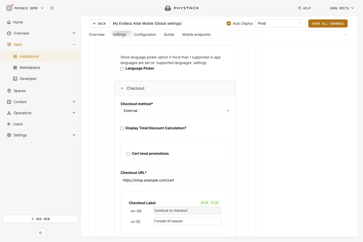
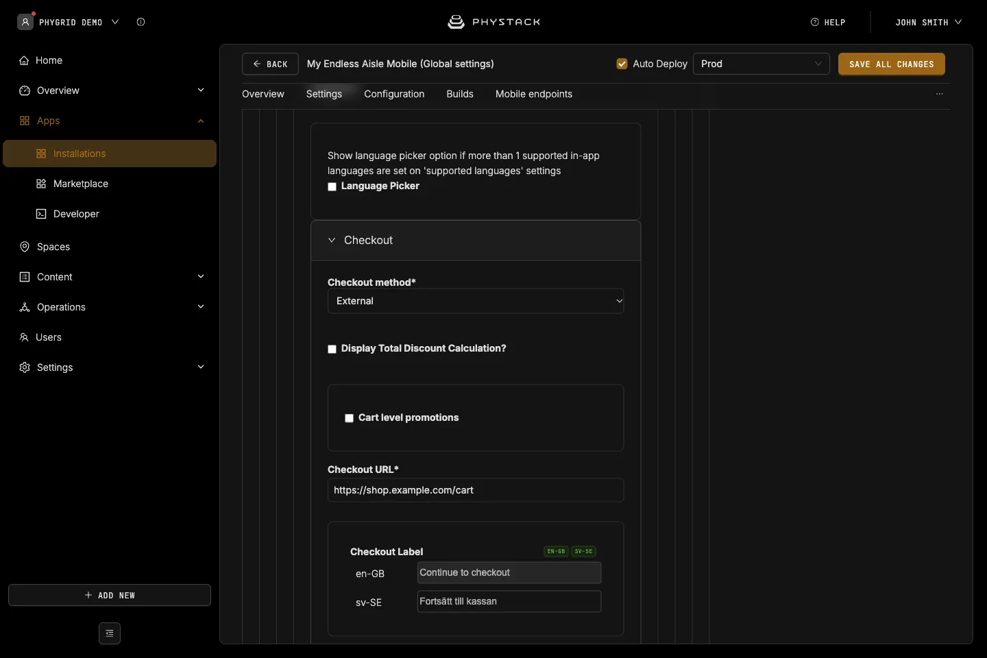
Checkout
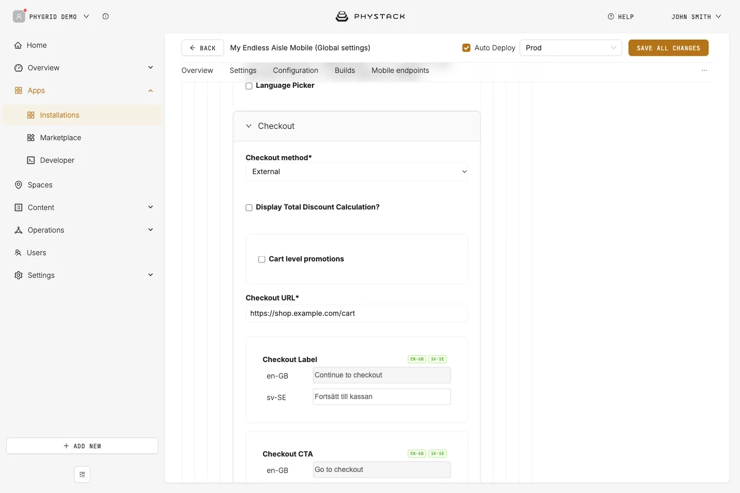
- Checkout method: How the shopper completes the order. Required. Default: None
- External: Opens your web shop in a new tab with the bag contents, then empties the bag. The only checkout method the mobile app supports. See Set up external checkout
- Tasks App: Listed, but checkout with Tasks doesn’t work in the mobile app
- None: No bag. Customers can browse and scan products, but the bag and the add to bag button are hidden
- Display Total Discount Calculation?: Shows the original total and discount lines in the order summary. Default: off
- Cart level promotions: Rechecks bag prices against the promotions API. Default: off
- Custom Store id: Overrides the store ID sent to the promotions API
- Checkout URL (External): Your checkout address. The bag is added as a
cartparameter. Required - Checkout Label (External): Heading of the checkout dialog. Required
- Checkout CTA (External): Text of the button that opens your web shop
- Additional Parameters (External): Key and Value pairs added to the checkout address
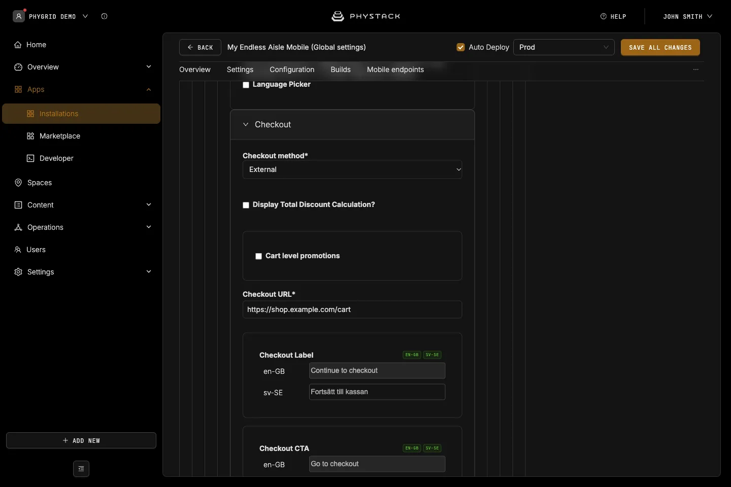
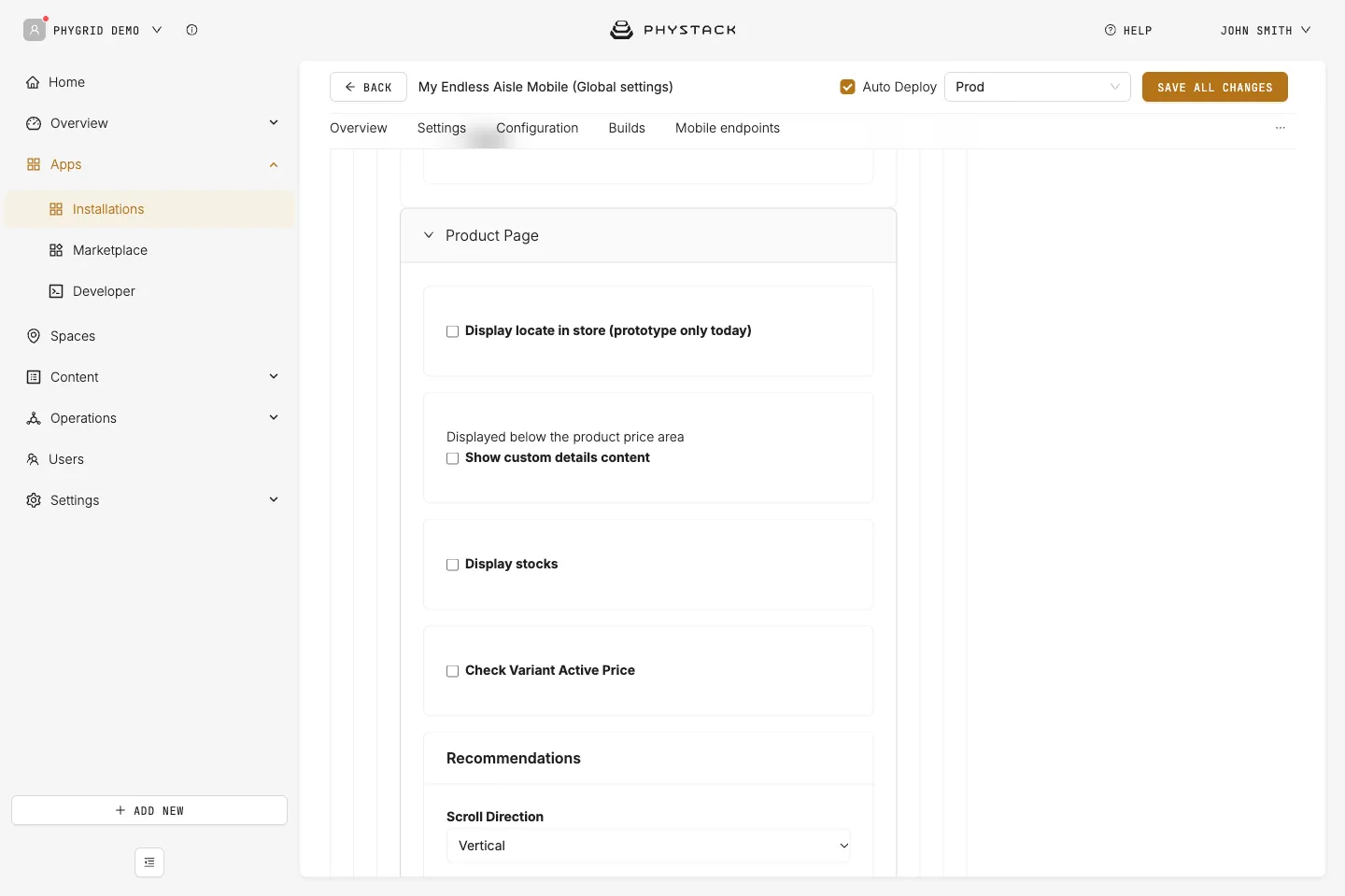
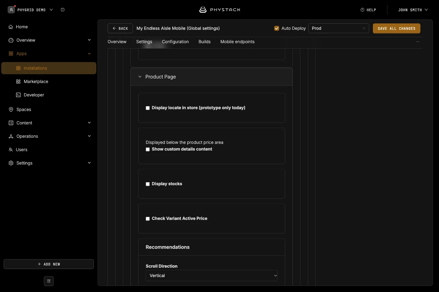
Product Page
- Display locate in store (prototype only today): Adds a Find in Store option to the product page. Default: off
- Show custom details content: Shows the HTML Content below the price. Default: off
- Display stocks: Shows the stock quantity on the product page. Default: off
- Check Variant Active Price: Rechecks the selected variant’s price against the promotions API. Default: off
- Custom Store id: Overrides the store ID sent to the promotions API
- Recommendations → Scroll Direction: Vertical (default) or Horizontal
- Recommendations → Source: Default (your product catalogue) or Streamoid. Default: Default
- Streamoid Refresh Token and Inclusion: Required for Streamoid. Inclusion is Similar Items and Complete the Look, Similar Items, or Complete the Look
- Displayed Product Feature: Product feature types shown on the product page
- Customize display if feature value matches a specific value?: Shows Custom Content (text or HTML) instead when the feature has a given Product Feature Value
Product types
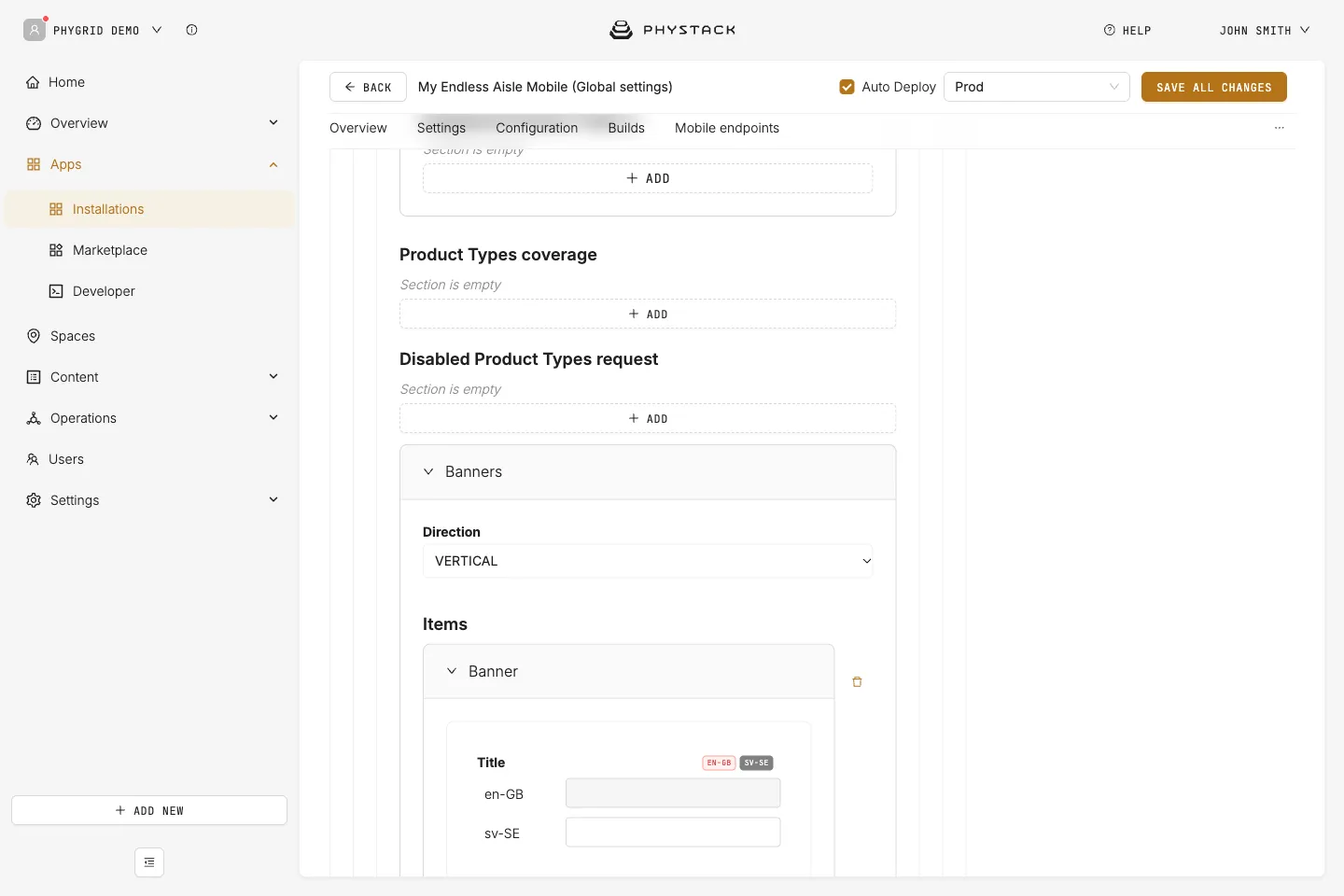
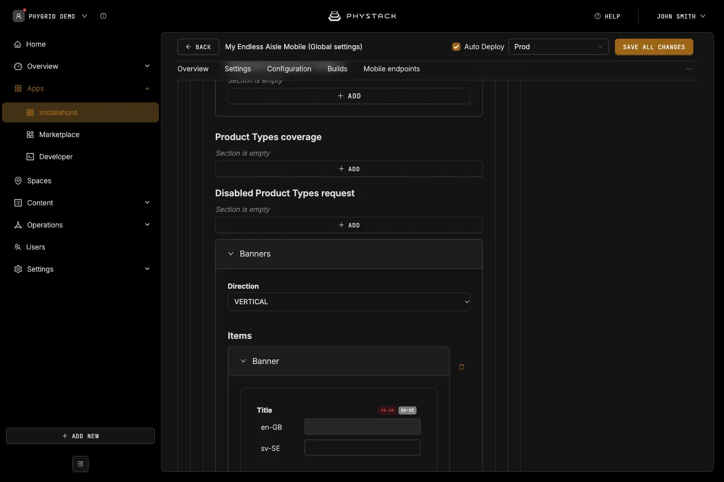
- Product Types coverage: Product type IDs the app includes, with their child types. Shows all product types if empty
- Disabled Product Types request: Product type IDs, with their child types, whose products can’t be added to the bag
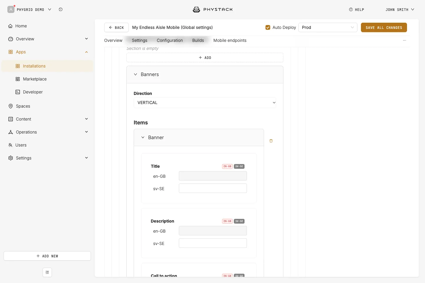
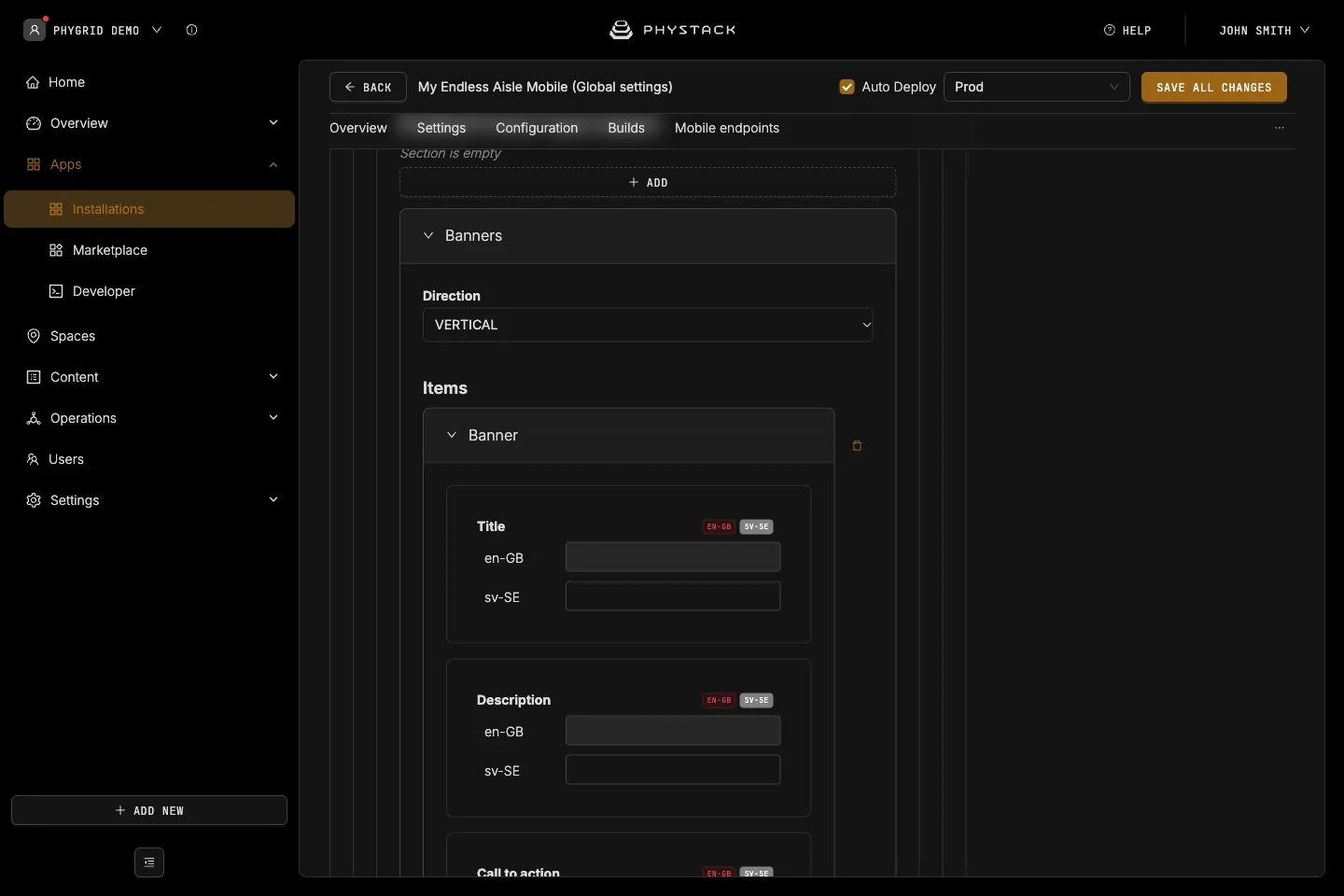
Banners
Tiles on the home screen. Required.
- Direction: How banners are arranged, VERTICAL (default) or HORIZONTAL
- Items → Title, Description, Call to action: Texts on the banner
- Items → Banner Background: Image or video behind the banner
- Items → On click → Type: What tapping the banner does
- Redirect to Website: Opens the Source address in a new tab
- Show Category: Opens the product list of a Category ID (a product type ID)
- Show Product: Opens the product page of a Product ID
- Custom Home Screen: Opens a secondary home screen with its own banners and featured categories, identified by Home screen ID
- Flights Departure: Opens the flight information page
- Custom Modal: Shows Modal HTML content in a dialog
- Scan Modal: Shows Modal HTML content in a dialog with a button that opens the scanner
- None: The banner isn’t clickable
- Items → Styles: CSS for the banner’s Title, Description, Call to action, Container, and Content
Featured Categories
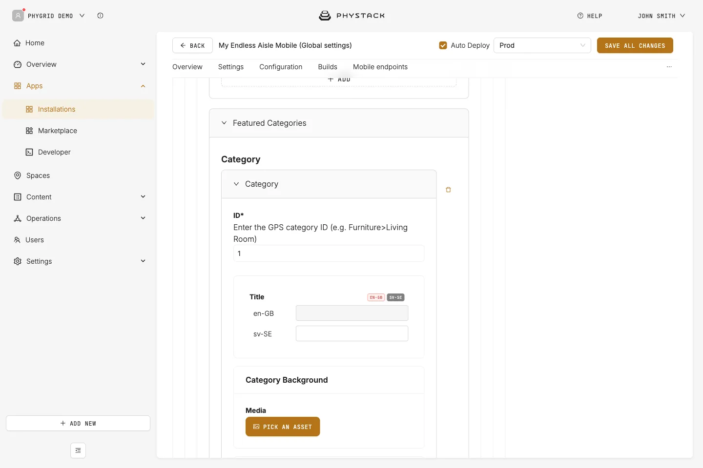
Tiles on the home screen that open a product list. Required.
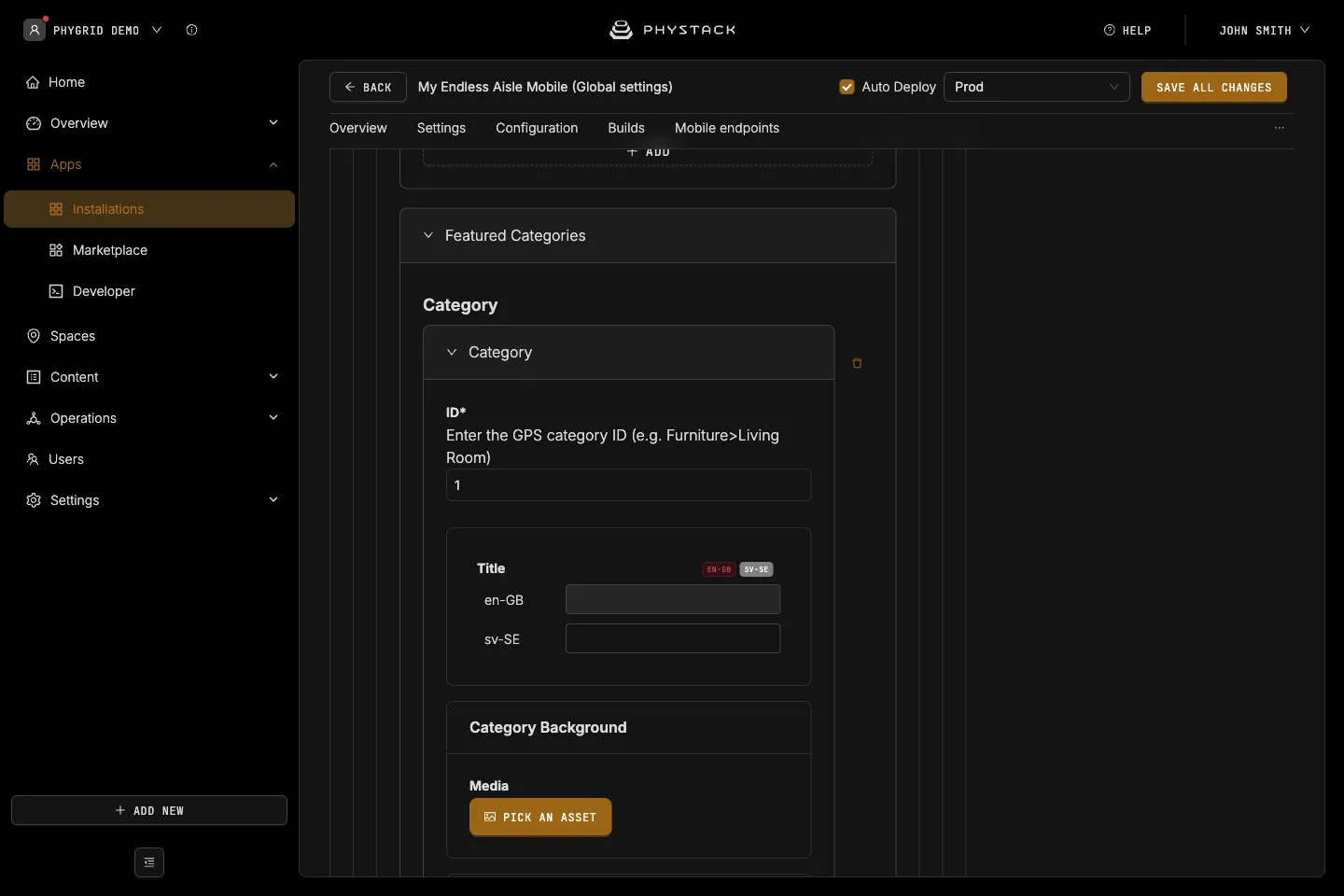
- ID: The product type ID the tile opens. Required
- Title: Text on the tile. Required
- Category Background: Image or video behind the tile. Required
- Styles: CSS for the tile’s Container, Content, and Title
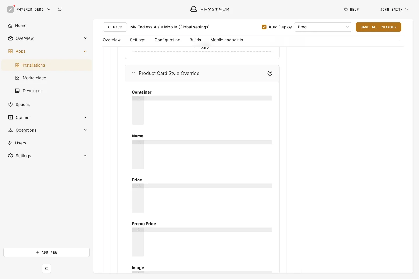
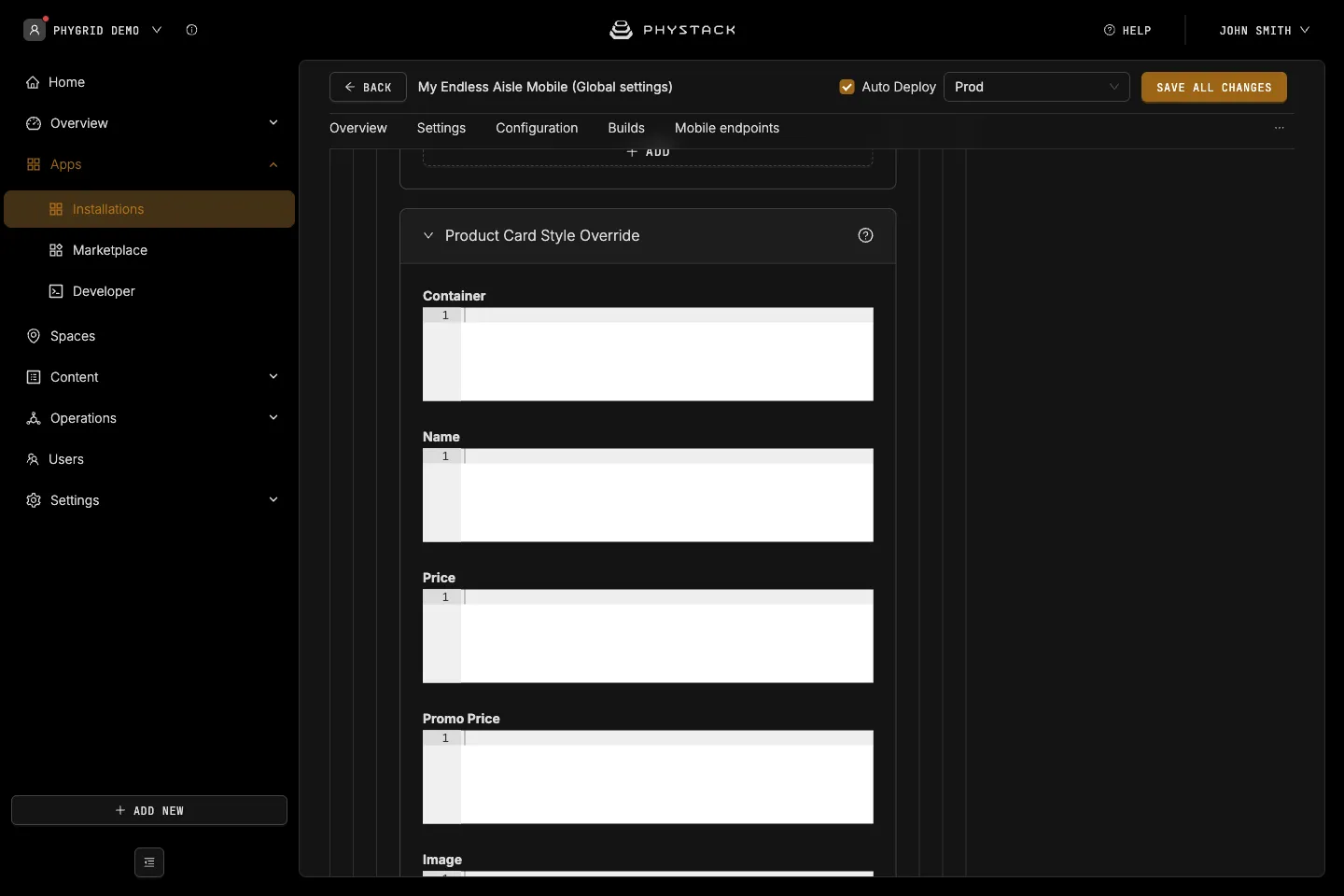
Product Card Style Override
- Container, Name, Price, Promo Price, Image, Brand: CSS for each part of the product card
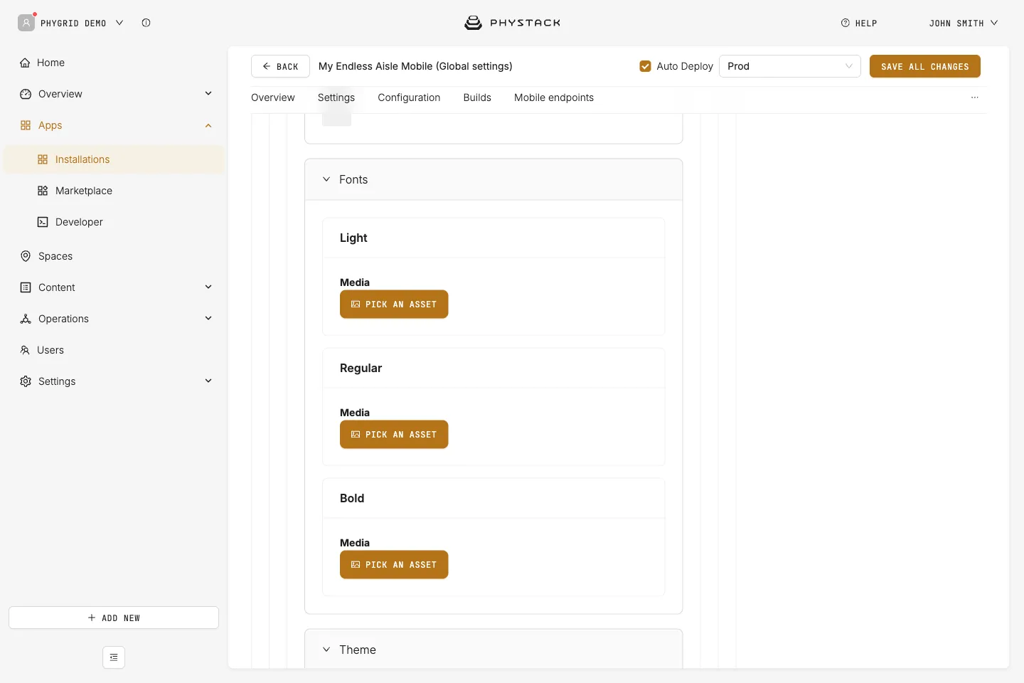
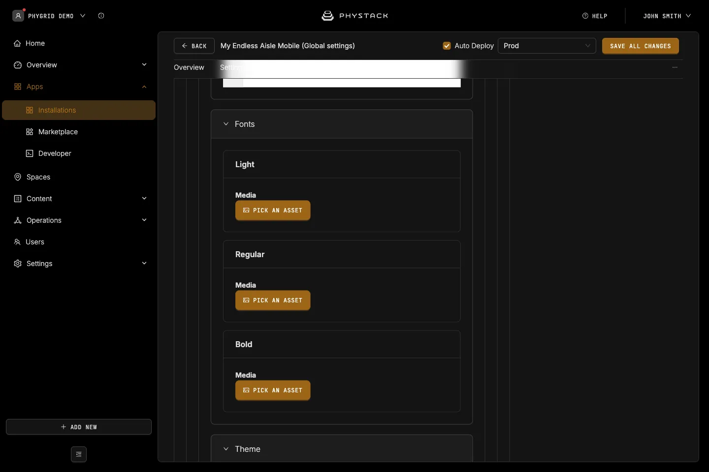
Fonts
- Light, Regular, Bold: Font files (OTF, TTF, WOFF, or WOFF2) applied to all text. Empty weights use the system font
Theme
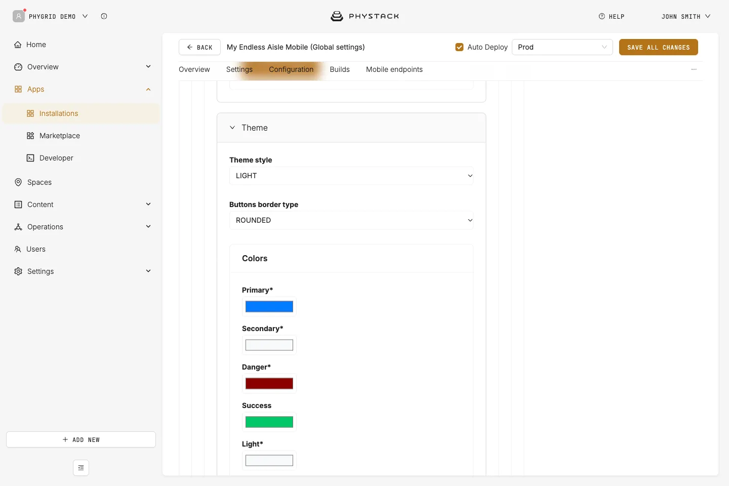
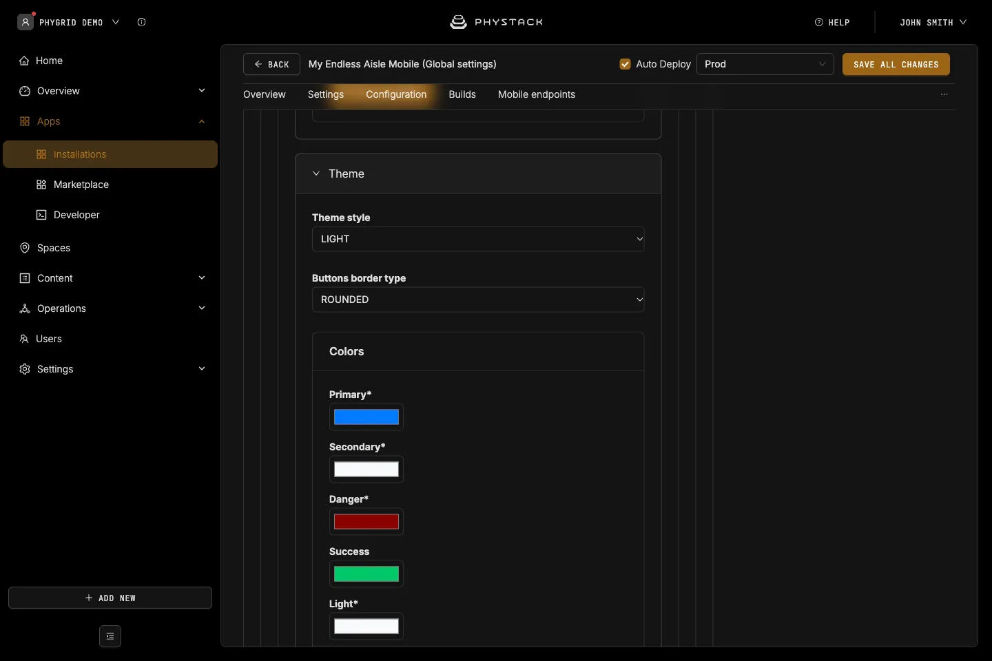
The same theme settings as the kiosk. See Endless Aisle Kiosk settings explained.
- Theme style: LIGHT (default) or DARK
- Buttons border type: ROUNDED (default) or STRAIGHT
- Colors: Primary (#007bff), Secondary (#f8f9fa), Danger (#8B0000), Success (#00C76A), Light (#f8f9fa), Dark (#253746), Promo (#E07511), Border (#d1d1d1), Ominibar and Keyboard Background Color (#f8f9fa), Main Screen Background Color (#ffffff), Secondary Screen Background Color (#f8f9fa), Background for variant selector (#d1d1d1), Redirect icon indicator color (#E07511)
- Shadows: CSS box-shadow values for Small, Medium, and Large
Save options
- Auto Deploy: If selected, changes are saved, and a build is created and deployed (see Glossary)
- Environment: The deployment environment
- Save all changes: Saves your current configuration