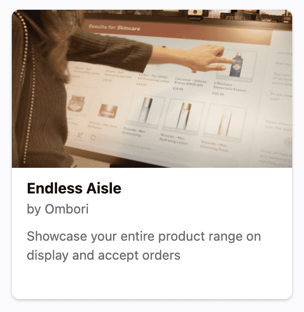
Endless Aisle is one of the pre-built apps developed by Ombori on top of the Ombori Grid.
Before setting up the kiosk endless aisle, you first need to integrate your products data into our Grid Products service which will be consumed by the application.
Setting up
To set up a Kiosk Endless Aisle screen, find the Endless Aisle app in the Marketplace.
Installation
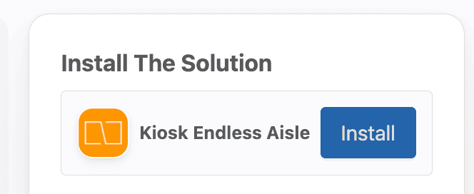
Open it up, and proceed to the install button of Kiosk Endless Aisle below the header
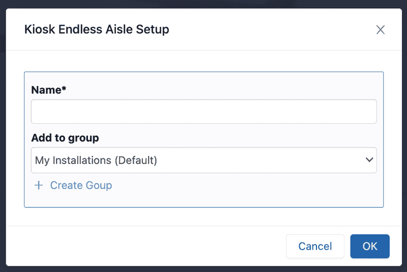
Click install, and fill out the popup and choose how you want it organized
Configuration
Now you've completed the installation, it's time to configure it. First, find your installation in the sidebar where you've installed it.
Once you've opened it you can configure your kiosk endless aisle application.
As a start, go to "Settings" tab and make sure to set the following:
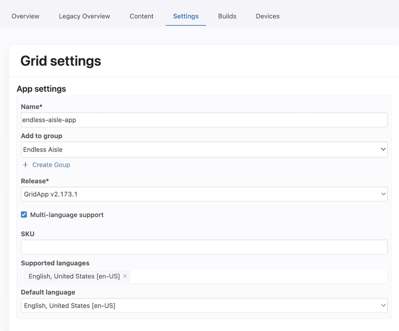
- Release: Should be GridApp v2.170.0 or above (latest version as much as possible)
- Supported Languages
- Default Language - will be used by the application (we support 1 language for now on app usage)
You can then start with adding content, or you can start by adding a device.
Device Setup Instructions
After adding content and configurations above are done, here are important steps to assure that correct data is being loaded to the kiosks/devices.
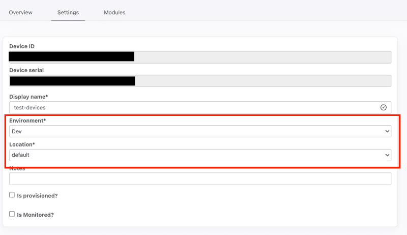
- Make sure that
Environmentof the device matches with the environment in Grid Products where you pushed your data - Make sure that
Locationof the device matches the equivalentspaceIdsandspaceIdfields from Grid Products model that you pushed. Grid Products will filter down the products returned based on the device's Space (id).
Adding content
You can add update the content and configuration to a Kiosk Endless Aisle by clicking on the Content tab inside your installation.
Prerequisite: Make sure you have integrated with Grid Products before setting up the kiosk endless aisle to have populated data on the application.
App Configurations

- App Timeout in seconds - time when screen is idle before the app resets the session and goes back to idle screen
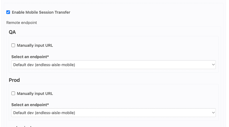
- Enable Mobile Session Transfer - flag that allows the Kiosk Endless Aisle to transfer the session and shopping bag content to the configured Mobile Endless Aisle app (you can identify which Mobile Endless Aisle a specific environment will redirect to)
Layout
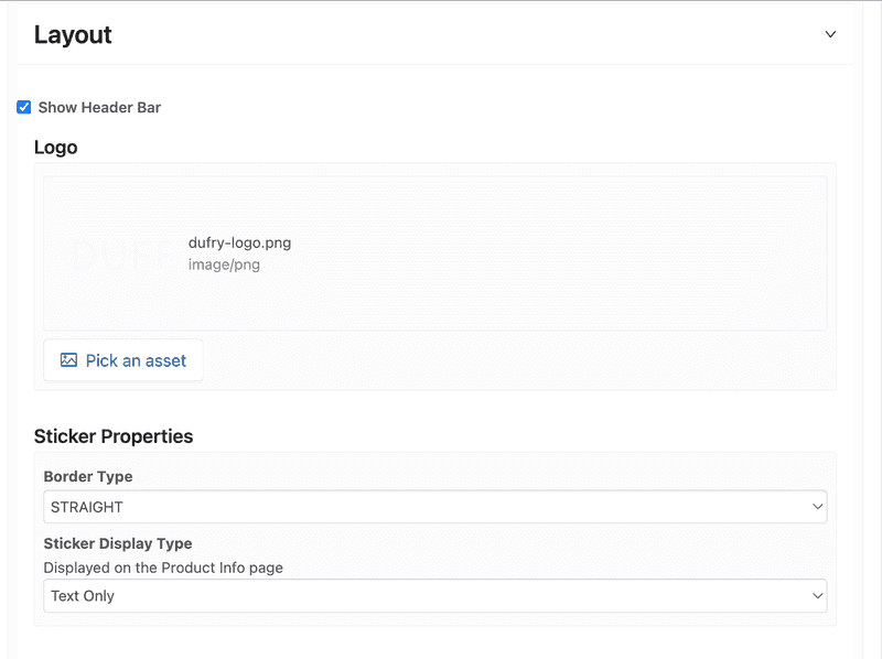
- Logo - logo to be displayed on the home screen of the application
Sticker Properties
-
Border Type - type of sticker display
- ROUNDED: displayed on upper left of product card
- STRAIGHT: displayed on bottom part of product card
-
Sticker Display Type - how sticker is presented in Product Info Page
- Text Only: displayed as text above the product name
- Beside Price: displayed sticker beside the price label
-
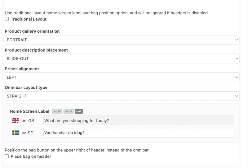
Traditional Layout
- Checked: Logo is placed on home screen's top center followed by banners and categories
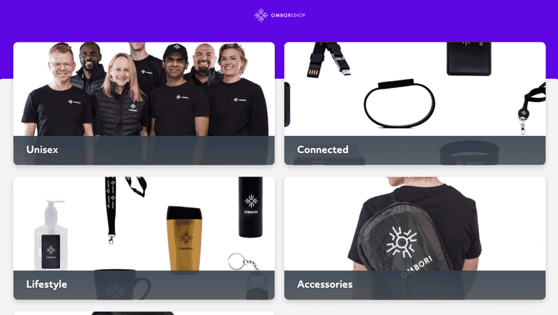
- Unchecked: Logo is placed on home screen's header with option to place header label
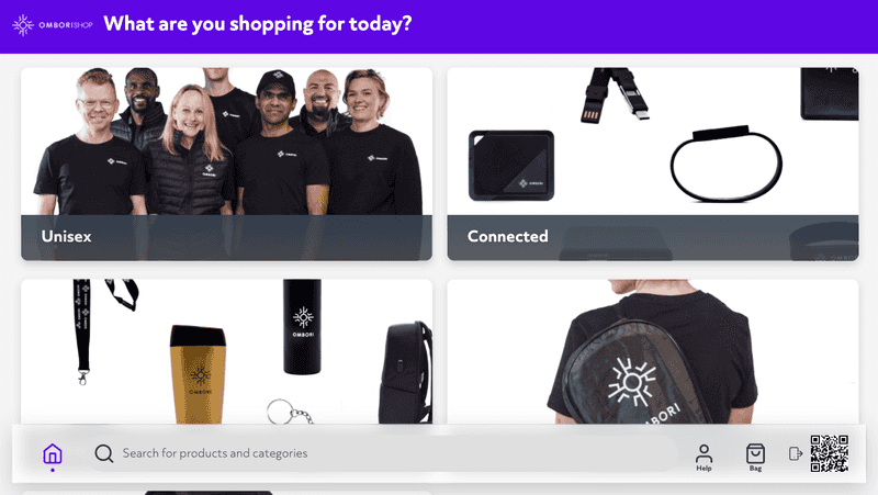
-
Product Gallery Orientation
- LANDSCAPE
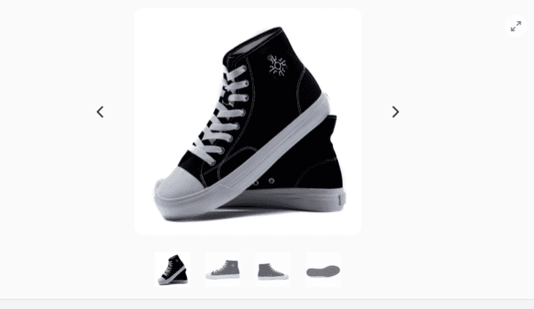
- PORTRAIT
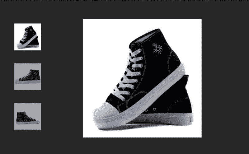
- LANDSCAPE
-
Product Description Placement
- SLIDE-OUT - display description sliding out from the left with a click of a button
- BUILT-IN - display description within the container (toggable)
-
Prices alignment - price alignment on product listing and product info page
-
Omnibar Layout
- ROUNDED - with border radius display
- STRAIGHT - with straigth borders
Features
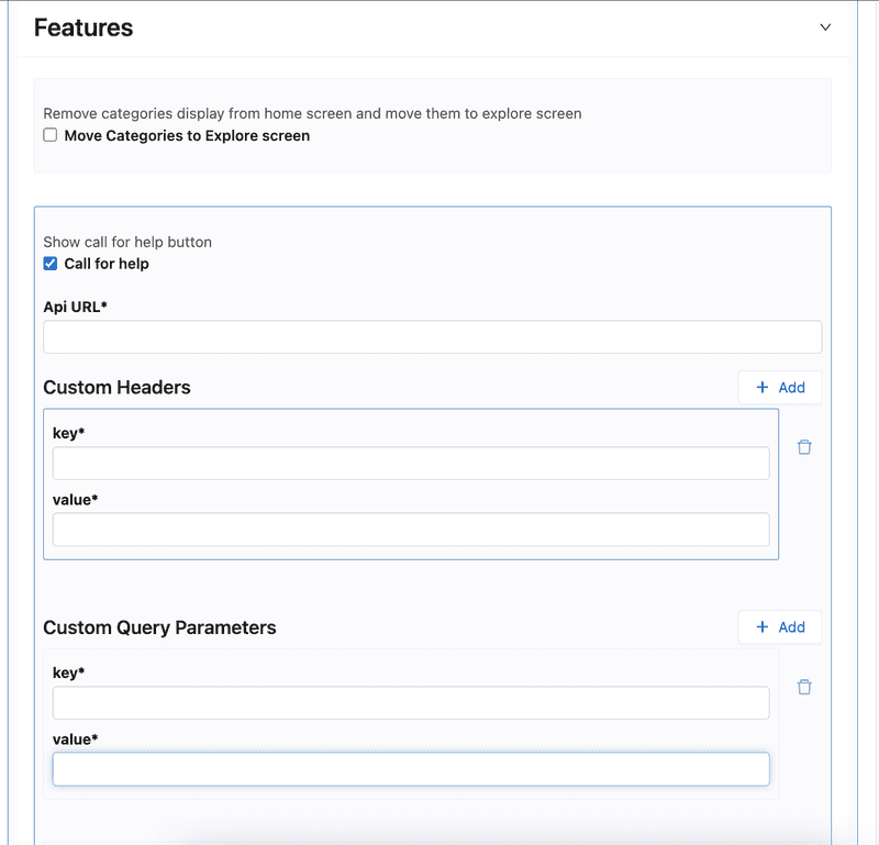

- Move Categories to Explore screen
- Checked - new "Explore" button in the Omnibar appears that redirects to a page with the configured categories
- Unchecked - Configured categories are displayed on Home Screen below the configured banners
Help
- Call for help - displays "Help" button in omnibar that calls an external API to inform that help is needed on the kiosk. Request parameters, headers, and modal labels are configurable.

Shopping Bag
-
Show Bag Button - enables shopping bag / cart features
-
ENABLED:
-
Display Total Discount Calculation - displays "Discount" row and value in order summary
-
Type of Notification (when product is added to bag)
- TOAST - displays notification on header area

- OMNIBAR - displays animation on omnibar

- TOAST - displays notification on header area
-
Checkout Method
- External - enables handover of items to external URL by passing shopping bag content as parameters. Modal labels, and additional parameters could be configured.
- Print Barcode - integrate with thermal printer to print out shopping bag info on receipt with corresponding barcode values.
- Print Barcode with Customer Info, and Queue - same with Print Barcode, but allows user to input user information on screen, and integrates with Task App.
-
-
Filter
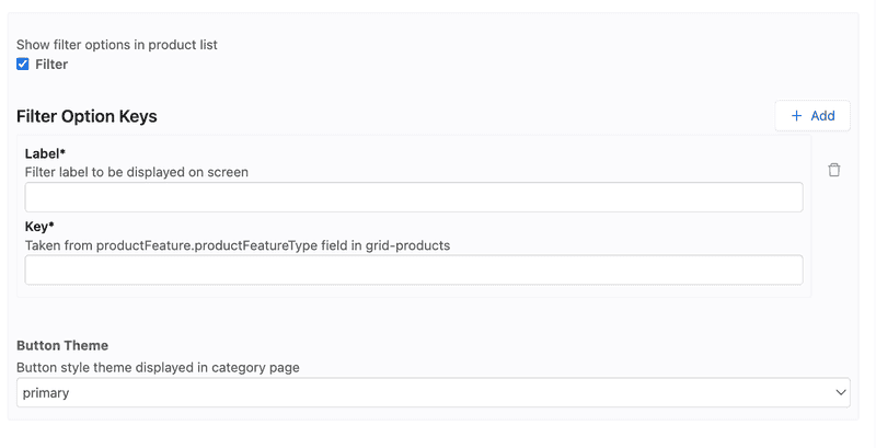
- Filter - enables showing of filter options in product listing page
- Filter Option Keys
- Label - label to be displayed on filter option on screen
- Key - productFeature[].productFeatureType field where option is extracted from Grid Products
- Filter Option Keys
Others

-
Inventory availability check
- Checked - add to shopping bag will be displayed if product inventory is out of stock
- Unchecked - product can be added to shopping bag regardless of inventory count
-
Display suggested retail price
- Checked - the product's "Standard" suggestedListPrice will be displayed as slashed out price if it's lesser than the listPrice value ("Promotional" price display logic applies) - Unchecked - only the product's "Standard" listPrice will be displayed by default ("Promotional" price display logic applies)
- Checked - the product's "Standard" suggestedListPrice will be displayed as slashed out price if it's lesser than the listPrice value ("Promotional" price display logic applies) - Unchecked - only the product's "Standard" listPrice will be displayed by default ("Promotional" price display logic applies)
Idle
-
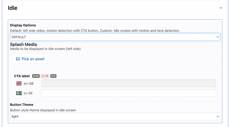
Display options
- DEFAULT - divides screen into half. Left side contains image/video media, right side contains primary color with CTA button
- CUSTOM - displays Home screen as overlay, and blinks when kiosk detects motion and face.
-
Splash Media - the image/video to be displayed on screen (for Default display option)
-
CTA label - configurable Call to action button label
-
Button Theme - color of the Call to action button based on theme
Product Page
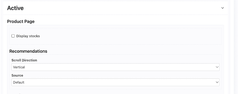
- Display stock - display product's available stock

Recommendations
- Scroll Direction
- Vertical - displays product recommendations in a 3 column grid
- Horizontal - displays product recommendations in a single row that's scrollable horizontally
- Source
- Default - data taken from Grid Products directly (
relatedProductGroupsfield) - Streamoid - data taken from Streamoid service. Needs streamoid refresh token.
- Default - data taken from Grid Products directly (
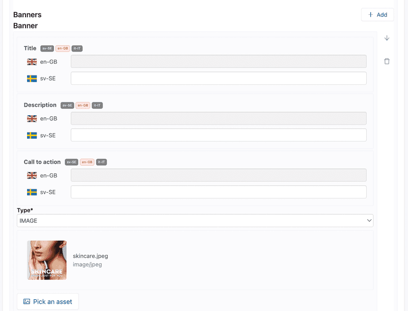
Banners
-
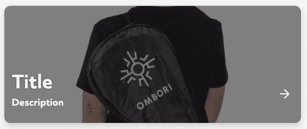
Title - banner title on large font
-
Description - label displayed on smaller font size
-
CTA - label for the call to action button
-
Type - either image or video media. Click on
Pick an assetto upload and choose the media to display
Styles and On Click
-
Default banner display
-
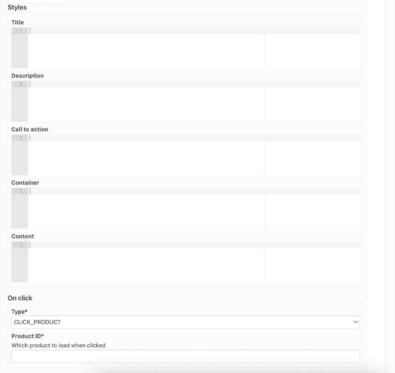
Styles - overrides CSS styling for the banner element (Banners container make use of Grid layout)
-
On click
- CLICK_PRODUCT - redirects to product info page. Need to specify
productGroupIdfrom Grid Products - CLICK_CATEGORY - redirects to product listing page for selected category. Need to specify
productTypeIdfrom Grid Products product types data - NONE - no action
- CLICK_PRODUCT - redirects to product info page. Need to specify
Categories
-
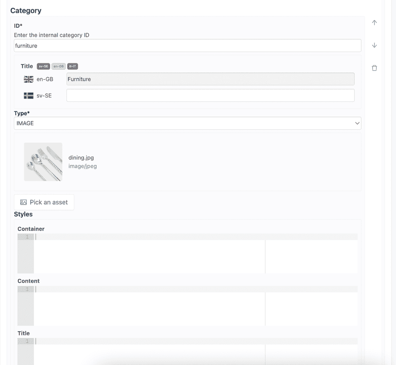
ID - specify the
productTypeIdfrom Grid Products product types data. On category click, redirects to the product listing page for the configured category. -
Title - label to be displayed on the tile
-
Type - either image or video media. Click on
Pick an assetto upload and choose the media to display -
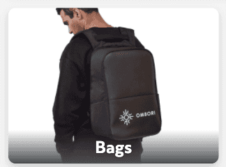
Default category display
-
Styles - overrides CSS styling for the category element (Categories container make use of Grid layout)
Fonts
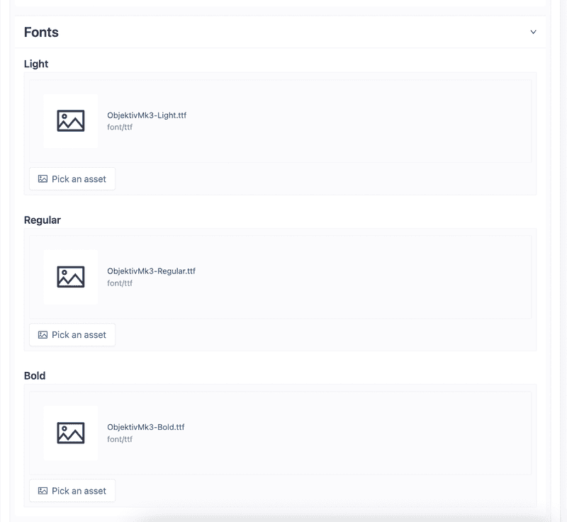
- Set font files for light, regular, and bold font weights.
- Click on
Pick an assetto upload and choose a valid font file for app to use
Product Card Style
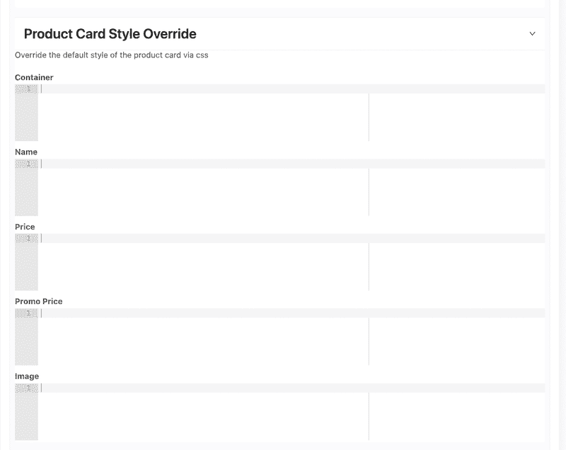
- Allows overriding the CSS styles of different elements of the product card displayed on product listing page
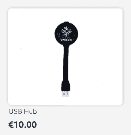
- Default product card display
Theme
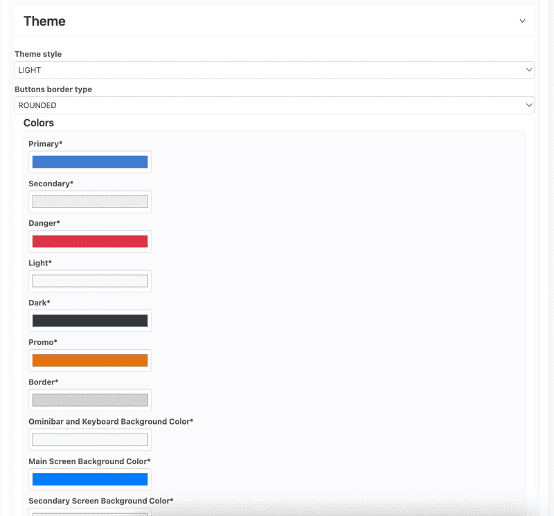

-
Theme style - either
LIGHTorDARKwhich inverts the text colors based on configured theme colors. -
Buttons border type
- ROUNDED - all button elements will have rounded corners
- STRAIGHT - all button elements will have sharp/straight corners
-
Colors
- Primary - used on buttons, headers, stickers, active buttons
- Secondary - used on buttons, notifications, loading indicators
- Danger
- Light - used on texts, buttons
- Dark - used on texts, buttons
- Promo - used on promotional price label
- Border - user on border styles
- Omnibar and Keyboard Background - used in omnibar and keyboard
- Main Screen Background - used as default background color and most parts of the app
- Secondary Screen Background - used as background color on most parts of the app
- Background for variant selector - used on variant selector (inactive)
-
Shadows
- Configuration for shadow css styling in app
Publishing to device
Now that you have updated the content and configuration of your app, you can publish a build to your Kiosk Endless Aisle device. If you don't have a device attached to your installation, do so now.
To learn more about how to add a device to the Ombori grid, visit the Add a device documentation.
Also please take note of the Additional device setup instructions
Save all changes button appears when you do any update on the content tab.
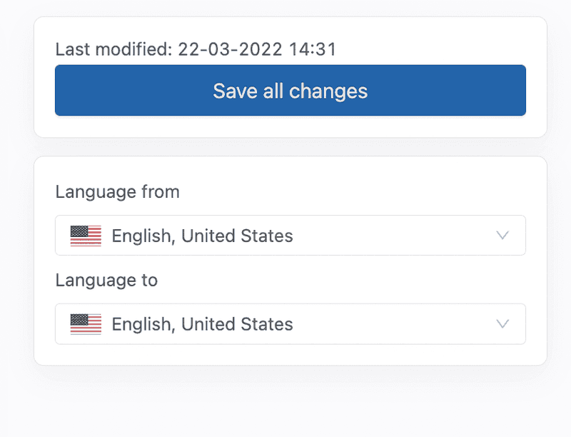
After you've pressed Save all changes a new button appears, this is the Publish button.
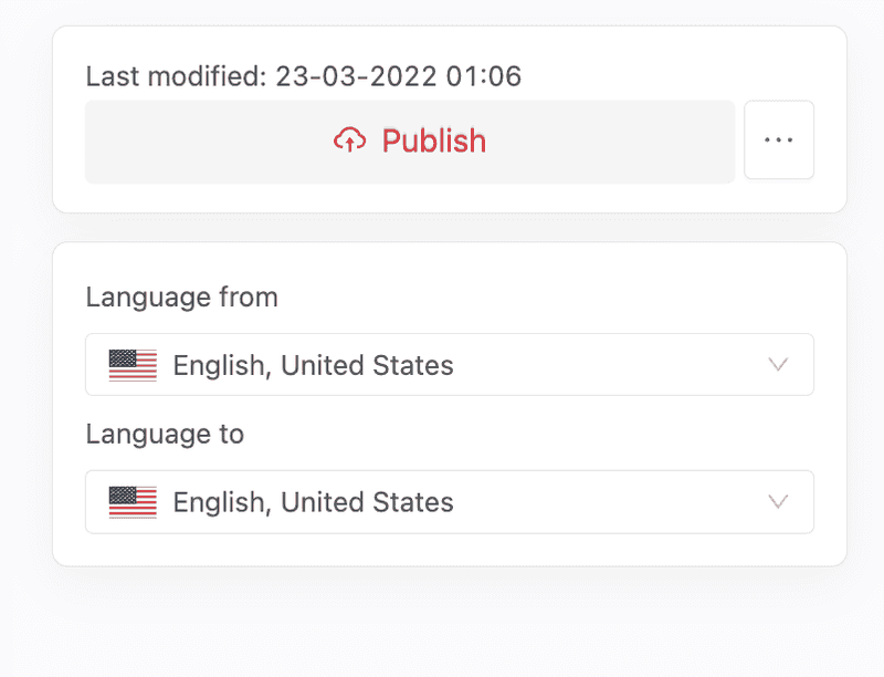
Once you press Publish button, the Kiosk Endless Aisle application will start building, and then will be automatically downloaded to the devices added to the installation having Prod environment settings.
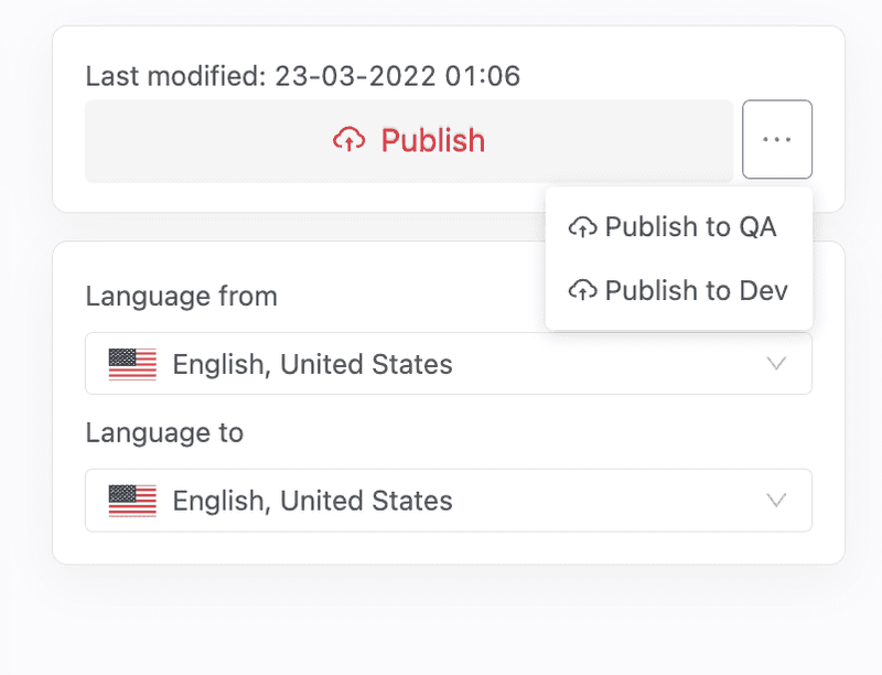
You can also deploy your application to other environments (other than Prod) after saving changes. Click on the 3 dots button beside "Publish" and choose what environment you want to deploy, it will then be automatically downloaded to the devices having the specified environment settings.
You will notice on the screen of your device a progress bar will display notifying you of it downloading the assets, and then it will start showing the content you've configured.
Enabling Barcode Scan
If you intend to integrate Barcode scanner to your Endless Aisle Installation, go to the Grid OS device with an attached barcode scanner
- Go to the device's
Modulestab - Click
Add moduleand search forBarcode Scanner - Once the module is added, press
Save Changesand make sure the barcode scanner is connected to the Grid OS device
Enabling RFID Scan
To learn more about how to add a RFID Reader, visit the RFID Reader Setup documentation.